
Selon un récent sondage Ifop relayé par CNEWS, 78 % des Français disent qu’ils craignent un cambriolage pendant leurs vacances. Ainsi, à l’approche de ton départ, ressens-tu cette même inquiétude ? Pourtant, partir devrait rester un plaisir simple. Cependant, sans préparation, tu risques de revenir et de découvrir l’irréparable.
C’est pourquoi, dans cet article, tu découvriras comment éviter que ta maison devienne une cible facile, et pourquoi anticiper dès aujourd’hui va changer ton été.
Pourquoi l’été attire tant les voleurs
Dès que juillet commence, tout semble ralentir. Les quartiers se vident, alors que les volets se ferment pour plusieurs jours, voire plusieurs semaines. Ainsi, les signes de ton absence sont vite repérés. Par conséquent, ton foyer attire davantage l’attention. Pourtant, beaucoup ignorent encore que les cambrioleurs observent chaque détail. D’ailleurs, selon service-public.fr, la majorité des intrusions se produit en plein jour, puisque personne n’est là pour les interrompre.
Les erreurs qui facilitent l’effraction
Trop de familles laissent leur jardin désordonné. De plus, combien affichent publiquement sur les réseaux sociaux qu’ils partent « enfin trois semaines au soleil » ? Ainsi, ces publications fournissent de précieuses informations aux malfaiteurs. De surcroît, en oubliant d’activer l’alarme ou de programmer des volets, tu leur ouvres pratiquement la porte. Pour éviter ces pièges, lis notre article sur les erreurs fréquentes des maisons connectées, car beaucoup pensent être protégés alors qu’ils s’exposent.
Utilise la technologie intelligemment
Aujourd’hui, les alarmes connectées coûtent bien moins cher qu’avant. Ainsi, tu installes facilement un kit qui déclenche une sirène puissante et t’alerte en temps réel. De plus, tu peux programmer des lumières pour qu’elles s’allument à la nuit tombée. Cela donne l’impression qu’un membre de ta famille est là. Par ailleurs, des volets motorisés s’ouvrent et se ferment automatiquement, ce qui perturbe la routine d’observation des intrus. Pour aller encore plus loin, tu relies tout à un service de télésurveillance, afin qu’une intervention se déclenche aussitôt. Lis aussi notre guide pour sécuriser ton domicile en 2025 et deviens enfin serein.
Ainsi, selon somfy.fr, combiner ces équipements réduit les risques de façon radicale.
Visualise ton retour l’esprit léger
Imagine la scène. Après deux semaines de plage, tu gares la voiture dans l’allée. Dès que tu entres, tu constates que tout est resté exactement comme tu l’as laissé. Ainsi, ton stress s’envole. De plus, tu ressens cette joie intense d’avoir pensé à tout avant de partir. Pourtant, sans ces précautions, ton retour aurait pu se transformer en cauchemar.
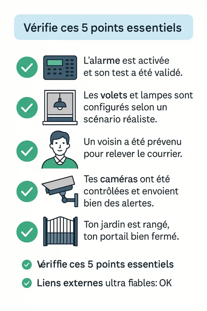
Vérifie ces 5 points essentiels
- Active et teste ton alarme, car une sécurité inactive ne sert à rien.
- Programme volets et lampes, afin que ta maison vive même quand tu es loin.
- Préviens ton voisin, pour qu’il relève ton courrier et jette un œil.
- Vérifie tes caméras et assure-toi qu’elles t’envoient bien des alertes.
- Range ton jardin, ferme ton portail et sécurise ton cabanon pour tout compliquer.
Ne laisse rien au hasard
Ne rejoins pas la longue liste des 78 % qui partent en vacances tout en ayant peur. Prépare-toi dès aujourd’hui. Ainsi, tu pourras savourer chaque minute de ton séjour. Télécharge notre check-list FITnSAFE gratuite et évite les sueurs froides à ton retour. Grâce à elle, tu partiras l’esprit libre, car tout aura été prévu.
1 846 réponses sur « Vacances : 78 % craignent un cambriolage — comment l’éviter »
oxhstv
1e8rcj
ei7ify
jzh0xa
https://shorturl.fm/PKVMB
https://shorturl.fm/1Jo3p
https://shorturl.fm/6IKQH
https://shorturl.fm/Y2HZX
https://shorturl.fm/2PKH2
https://shorturl.fm/Ijawf
https://shorturl.fm/1QXtp
https://shorturl.fm/gOQDF
https://shorturl.fm/6FHTt
https://shorturl.fm/gzBcx
https://shorturl.fm/ANhRj
https://shorturl.fm/LkS51
https://shorturl.fm/4IOFG
https://shorturl.fm/mn2cb
https://shorturl.fm/2dqnd
https://shorturl.fm/RxW3V
https://shorturl.fm/7vcJr
https://shorturl.fm/eFBVN
https://shorturl.fm/0RF3V
https://shorturl.fm/4M1tv
https://shorturl.fm/lZ2um
https://shorturl.fm/PCvW2
https://shorturl.fm/r5vKG
umq12k
https://shorturl.fm/Eka5T
https://shorturl.fm/yhgEB
https://shorturl.fm/HmFfG
https://shorturl.fm/eZtfU
https://shorturl.fm/oR5qv
https://shorturl.fm/HBW4z
zg9iaz
https://shorturl.fm/0oNaS
https://shorturl.fm/6AMdr
https://shorturl.fm/Zjs7G
https://shorturl.fm/WbtVf
https://shorturl.fm/0QHaL
https://shorturl.fm/USrhK
https://shorturl.fm/B3rOG
https://shorturl.fm/UGOPb
https://shorturl.fm/KvGrE
https://shorturl.fm/iHjRY
https://shorturl.fm/IGPUe
https://shorturl.fm/IXgnT
https://shorturl.fm/nQj8p
https://shorturl.fm/i4i0C
https://t.me/s/Online_1_xbet/327
https://shorturl.fm/MrYxt
https://t.me/s/Online_1_xbet/3588
https://t.me/s/Official_1xbet_1xbet
https://t.me/rating_online/8
https://t.me/s/rating_online/4
https://t.me/s/rating_online/3
https://t.me/rating_online/9
https://t.me/s/rating_online/9
https://t.me/rating_online/5
https://t.me/s/rating_online/6
https://t.me/s/rating_online
https://t.me/rating_online/6
https://t.me/Online_1_xbet/2478
https://t.me/Online_1_xbet/2022
https://t.me/Online_1_xbet/3502
https://t.me/Online_1_xbet/3167
https://t.me/Online_1_xbet/2442
https://t.me/Online_1_xbet/3097
https://t.me/Online_1_xbet/3166
https://t.me/Online_1_xbet/2202
https://t.me/Online_1_xbet/2663
https://t.me/Online_1_xbet/1894
https://t.me/Online_1_xbet/3225
https://t.me/Online_1_xbet/2375
https://t.me/Online_1_xbet/2075
https://t.me/Online_1_xbet/2229
https://t.me/Official_1xbet_1xbet/s/276
https://t.me/Official_1xbet_1xbet/s/671
https://t.me/Official_1xbet_1xbet/s/928
https://t.me/Official_1xbet_1xbet/s/1501
https://t.me/Official_1xbet_1xbet/s/411
https://t.me/Official_1xbet_1xbet/s/106
https://t.me/Official_1xbet_1xbet/s/1265
https://t.me/Official_1xbet_1xbet/s/358
https://t.me/Official_1xbet_1xbet/s/359
https://t.me/Official_1xbet_1xbet/s/839
https://t.me/Official_1xbet_1xbet/s/1284
https://t.me/Official_1xbet_1xbet/s/157
https://t.me/Official_1xbet_1xbet/s/1396
https://t.me/Official_1xbet_1xbet/s/297
https://t.me/Official_1xbet_1xbet/s/1347
https://t.me/Official_1xbet_1xbet/s/938
https://t.me/Official_1xbet_1xbet/s/963
https://t.me/Official_1xbet_1xbet/s/1436
https://t.me/Official_1xbet_1xbet/s/1004
https://t.me/Official_1xbet_1xbet/s/674
https://t.me/Official_1xbet_1xbet/s/228
https://t.me/Official_1xbet_1xbet/s/399
https://t.me/Official_1xbet_1xbet/s/1466
https://t.me/Official_1xbet_1xbet/s/700
https://t.me/Official_1xbet_1xbet/s/1279
https://t.me/Official_1xbet_1xbet/s/1205
https://t.me/Official_1xbet_1xbet/s/344
https://t.me/Official_1xbet_1xbet/s/1358
https://t.me/Official_1xbet_1xbet/s/868
https://t.me/Official_1xbet_1xbet/s/1392
https://t.me/Official_1xbet_1xbet/s/1515
https://t.me/Official_1xbet_1xbet/s/401
https://t.me/Official_1xbet_1xbet/s/1386
https://t.me/Official_1xbet_1xbet/s/382
https://t.me/Official_1xbet_1xbet/s/1162
https://t.me/Official_1xbet_1xbet/s/1246
https://t.me/Official_1xbet_1xbet/s/914
https://t.me/Official_1xbet_1xbet/s/507
https://t.me/Official_1xbet_1xbet/s/598
https://t.me/Official_1xbet_1xbet/s/637
https://t.me/Official_1xbet_1xbet/s/1505
https://t.me/Official_1xbet_1xbet/s/850
https://t.me/Official_1xbet_1xbet/s/431
https://t.me/Official_1xbet_1xbet/s/1045
https://t.me/Official_1xbet_1xbet/s/1158
https://t.me/Official_1xbet_1xbet/s/134
https://t.me/Official_1xbet_1xbet/s/433
https://t.me/Official_1xbet_1xbet/s/1270
https://t.me/Official_1xbet_1xbet/s/264
https://t.me/Official_1xbet_1xbet/s/717
https://t.me/Official_1xbet_1xbet/s/109
https://t.me/Official_1xbet_1xbet/s/816
https://t.me/Official_1xbet_1xbet/s/744
https://t.me/Official_1xbet_1xbet/s/898
https://t.me/Official_1xbet_1xbet/s/673
https://t.me/Official_1xbet_1xbet/s/168
https://t.me/Official_1xbet_1xbet/s/474
https://t.me/Official_1xbet_1xbet/s/1156
https://t.me/Official_1xbet_1xbet/s/1021
https://t.me/Official_1xbet_1xbet/s/547
https://shorturl.fm/xUjO5
https://t.me/Official_1xbet_1xbet/s/1056
https://t.me/Official_1xbet_1xbet/s/1307
https://t.me/Official_1xbet_1xbet/s/1509
https://t.me/Official_1xbet_1xbet/s/1231
https://t.me/Official_1xbet_1xbet/s/623
https://t.me/Official_1xbet_1xbet/s/253
https://t.me/Official_1xbet_1xbet/s/950
https://t.me/Official_1xbet_1xbet/s/1219
https://t.me/Official_1xbet_1xbet/s/446
https://t.me/s/Official_1xbet_1xbet/1738
https://t.me/Official_1xbet_1xbet/1713
https://t.me/s/Official_1xbet_1xbet/1816
https://t.me/s/Official_1xbet_1xbet/1856
https://t.me/Official_1xbet_1xbet/1679
https://t.me/Official_1xbet_1xbet/1728
https://t.me/Official_1xbet_1xbet/1722
https://t.me/Official_1xbet_1xbet/1687
https://t.me/Official_1xbet_1xbet/1841
https://t.me/s/Official_1xbet_1xbet/1736
https://t.me/s/Official_1xbet_1xbet/1764
https://t.me/Official_1xbet_1xbet/1850
https://t.me/Official_1xbet_1xbet/1716
https://t.me/s/Official_1xbet_1xbet/1798
https://t.me/s/Official_1xbet_1xbet/1847
https://t.me/s/Official_1xbet_1xbet/1761
https://t.me/s/Official_1xbet_1xbet/1717
https://t.me/Official_1xbet_1xbet/1749
https://t.me/Official_1xbet_1xbet/1665
https://t.me/Official_1xbet_1xbet/1640
https://t.me/Official_1xbet_1xbet/1823
https://t.me/Official_1xbet_1xbet/1815
https://t.me/s/Official_1xbet_1xbet/1684
https://t.me/Official_1xbet_1xbet/1611
https://t.me/s/Official_1xbet_1xbet/1690
https://t.me/Official_1xbet_1xbet/1719
https://t.me/s/Official_1xbet_1xbet/1808
https://t.me/Official_1xbet_1xbet/1836
https://t.me/Official_1xbet_1xbet/1650
https://t.me/Official_1xbet_1xbet/1736
https://t.me/s/Official_1xbet_1xbet/1596
https://t.me/s/Official_1xbet_1xbet/1786
https://t.me/s/Official_1xbet_1xbet/1674
https://t.me/Official_1xbet_1xbet/1798
https://t.me/s/Official_1xbet_1xbet/1663
https://t.me/s/Official_1xbet_1xbet/1732
https://t.me/Official_1xbet_1xbet/1686
https://t.me/s/Official_1xbet_1xbet/1710
https://t.me/Official_1xbet_1xbet/1756
https://t.me/s/Official_1xbet_1xbet/1665
https://t.me/Official_1xbet_1xbet/1648
https://t.me/s/Official_1xbet_1xbet/1824
https://t.me/Official_1xbet_1xbet/1683
https://t.me/s/Official_1xbet_1xbet/1670
https://t.me/s/Official_1xbet_1xbet/1810
https://t.me/s/Official_1xbet_1xbet/1830
https://t.me/Official_1xbet_1xbet/1794
https://t.me/s/Official_1xbet_1xbet/1746
https://t.me/s/Official_1xbet_1xbet/1605
https://t.me/s/Official_1xbet_1xbet/1683
https://t.me/Official_1xbet_1xbet/1658
https://t.me/s/Official_1xbet_1xbet/1705
https://t.me/s/Official_1xbet_1xbet/1681
https://t.me/Official_1xbet_1xbet/1712
https://t.me/s/Official_1xbet_1xbet/1635
https://t.me/s/Official_1xbet_1xbet/1631
https://t.me/Official_1xbet_1xbet/1774
https://t.me/s/Official_1xbet_1xbet/1779
https://t.me/s/Official_1xbet_1xbet/1740
https://t.me/Official_1xbet_1xbet/1630
https://t.me/Official_1xbet_1xbet/1729
https://t.me/Official_1xbet_1xbet/1837
https://t.me/s/Official_1xbet_1xbet/1778
https://t.me/s/Official_1xbet_1xbet/1646
https://t.me/s/Official_1xbet_1xbet/1737
https://t.me/Official_1xbet_1xbet/1835
https://t.me/Official_1xbet_1xbet/1690
https://t.me/Official_1xbet_1xbet/1688
https://t.me/Official_1xbet_1xbet/1799
https://t.me/Official_1xbet_1xbet/1610
https://t.me/Official_1xbet_1xbet/1604
https://t.me/s/Official_1xbet_1xbet/1624
https://t.me/Official_1xbet_1xbet/1701
https://t.me/s/Official_1xbet_1xbet/1773
https://t.me/Official_1xbet_1xbet/1804
https://t.me/s/Official_1xbet_1xbet/1757
https://t.me/Official_1xbet_1xbet/1782
https://t.me/s/Official_1xbet_1xbet/1834
https://t.me/s/Official_1xbet_1xbet/1603
https://t.me/Official_1xbet_1xbet/1636
https://t.me/Official_1xbet_1xbet/1612
https://t.me/Official_1xbet_1xbet/1651
https://t.me/s/Official_1xbet_1xbet/1853
https://t.me/s/Official_1xbet_1xbet/1629
https://t.me/Official_1xbet_1xbet/1817
https://t.me/s/Official_1xbet_1xbet/1804
https://t.me/s/Official_1xbet_1xbet/1613
https://t.me/s/Official_1xbet_1xbet/1652
https://t.me/Official_1xbet_1xbet/1657
https://t.me/s/Official_1xbet_1xbet/1858
https://t.me/s/Official_1xbet_1xbet/1639
https://t.me/Official_1xbet_1xbet/1697
https://t.me/s/topslotov
//t.me/s/official_1win_aviator](https://t.me/s/official_1win_aviator)
//t.me/s/official_1win_aviator](https://t.me/s/official_1win_aviator)
https://t.me/s/official_1win_aviator
https://t.me/s/reiting_top10_casino/4
https://t.me/s/reiting_top10_casino/6
https://t.me/reiting_top10_casino/4
https://t.me/reiting_top10_casino/10
https://t.me/reiting_top10_casino/8
https://t.me/s/reiting_top10_casino/9
https://t.me/reiting_top10_casino/5
https://t.me/s/reiting_top10_casino
https://t.me/s/reiting_top10_casino/7
https://t.me/reiting_top10_casino/9
https://t.me/reiting_top10_casino/6
https://t.me/reiting_top10_casino/7
https://t.me/s/reiting_top10_casino/3
https://t.me/s/reiting_top10_casino/8
https://t.me/reiting_top10_casino/2
https://t.me/s/reiting_top10_casino/10
https://t.me/reiting_top10_casino
https://t.me/s/reiting_top10_casino/2
https://t.me/reiting_top10_casino/3
https://t.me/s/reiting_top10_casino/5
https://shorturl.fm/9TiNW
https://t.me/s/Gaming_1xbet
https://t.me/s/PlayCasino_1win
https://t.me/s/PlayCasino_1win
https://t.me/s/PlayCasino_1xbet
https://t.me/s/PlayCasino_1xbet
https://t.me/s/ofitsialniy_1win/33/Poede
https://shorturl.fm/MWLrK
https://t.me/s/ofitsialniy_1win
https://t.me/s/iw_1xbet
https://t.me/s/Official_beefcasino
https://shorturl.fm/tt7e2
https://t.me/s/bs_1xbet/35
https://t.me/s/bs_1xbet/34
https://t.me/s/bs_1xbet/11
https://t.me/s/bs_1xbet/11
https://t.me/bs_1xbet/9
https://t.me/bs_1xbet/24
https://t.me/bs_1xbet/39
https://t.me/s/bs_1xbet/21
https://t.me/s/bs_1xbet/45
https://t.me/s/bs_1xbet/6
https://t.me/s/bs_1xbet/17
https://t.me/bs_1xbet/26
https://t.me/bs_1xbet/3
https://t.me/s/bs_1xbet/13
https://t.me/s/bs_1xbet/20
https://t.me/bs_1xbet/33
https://t.me/bs_1xbet/13
https://t.me/bs_1xbet/13
https://t.me/s/bs_1xbet/42
https://t.me/bs_1xbet/16
https://t.me/bs_1xbet/37
https://t.me/bs_1xbet/32
https://t.me/s/bs_1xbet/41
https://t.me/bs_1xbet/15
https://t.me/s/bs_1xbet/51
https://t.me/bs_1xbet/12
https://t.me/s/bs_1xbet/38
https://t.me/bs_1xbet/36
https://t.me/s/bs_1xbet/23
https://t.me/bs_1xbet/9
https://t.me/bs_1xbet/31
https://t.me/bs_1xbet/30
https://t.me/s/bs_1xbet/9
https://t.me/s/bs_1xbet/46
https://t.me/s/bs_1xbet/24
https://t.me/bs_1xbet/10
https://t.me/s/bs_1xbet/25
https://t.me/bs_1xbet/34
https://t.me/s/bs_1xbet/5
https://t.me/bs_1xbet/32
https://t.me/bs_1xbet/42
https://t.me/bs_1xbet/49
https://t.me/bs_1xbet/4
https://t.me/bs_1xbet/42
https://t.me/bs_1xbet/41
https://t.me/s/bs_1xbet/41
https://t.me/s/bs_1xbet/15
https://t.me/s/bs_1xbet/18
https://t.me/jw_1xbet/707
https://t.me/jw_1xbet/61
https://t.me/jw_1xbet/272
https://t.me/jw_1xbet/388
https://t.me/jw_1xbet/898
https://t.me/jw_1xbet/691
https://shorturl.fm/MS8Tn
https://t.me/s/Beefcasino_rus/26
https://t.me/s/Beefcasino_rus/19
https://t.me/s/Beefcasino_rus/6
https://t.me/s/Best_promocode_rus/1780
https://t.me/Best_promocode_rus/2581
https://t.me/s/Best_promocode_rus/132
https://shorturl.fm/WYi2H
https://t.me/Best_promocode_rus/2879
https://t.me/Best_promocode_rus/2578
https://t.me/Best_promocode_rus/1086
https://t.me/s/Beefcasino_rus/57
https://t.me/Beefcasino_rus/57
https://t.me/Beefcasino_rus/57
https://t.me/s/ud_Starda/45
https://t.me/s/ud_Irwin/53
https://t.me/s/ud_PlayFortuna/61
https://t.me/s/ud_Lex/62
https://t.me/ud_Legzo/63
https://t.me/ud_Rox/47
https://t.me/s/ud_Kent/63
https://t.me/s/ud_Jet/56
https://t.me/ud_Fresh/47
https://t.me/s/ud_CatCasino/64
https://t.me/?ud_1Go/58
https://t.me/ud_Pinco/48
https://t.me/s/ud_Jet/51
https://t.me/s/ud_Legzo/47
https://t.me/s/ud_Leon/57
https://t.me/ud_1xbet/57
https://t.me/ud_Jet/44
https://t.me/s/ud_Casino_X/49
https://t.me/ud_Pokerdom/58
https://t.me/s/Beefcasino_rus/59
https://t.me/Beefcasino_rus/59
https://t.me/Beefcasino_rus/59
https://t.me/s/ud_Izzi/56
https://t.me/s/ud_Legzo/46
https://t.me/s/ud_Sol/60
https://t.me/s/ud_Martin/53
https://t.me/s/ud_Pokerdom/45
https://t.me/ud_Riobet/49
https://t.me/s/ud_Kometa/57
https://t.me/ud_Irwin/53
https://t.me/s/ud_Gizbo/56
https://t.me/ud_Irwin/55
https://t.me/ud_PlayFortuna/51
https://t.me/ud_JoyCasino/56
https://t.me/s/ud_MostBet/28
https://t.me/ud_Gizbo/6
https://t.me/s/ud_Legzo/21
https://t.me/s/ud_CatCasino/22
https://t.me/ud_Kometa/37
https://t.me/s/uD_soL
https://t.me/s/Ud_rIoBet
https://t.me/s/UD_KOmEtA
https://t.me/s/UD_BOoI
https://t.me/s/ud_voDkA
https://t.me/s/uD_dRagonMOneY
https://t.me/s/ud_poKERdoM
https://t.me/s/Ud_monRo
https://t.me/s/Ud_MRbiT
https://t.me/s/uD_stArda
https://t.me/s/UD_PlAYfoRtuNA
https://t.me/s/official_1win_aviator/38
https://t.me/s/uD_CASinO_X
https://t.me/s/ud_JoycaSino
https://t.me/s/UD_LegzO
https://t.me/s/official_1win_aviator/40
https://t.me/s/official_1win_aviator/74
https://t.me/s/ud_MarTin
https://t.me/s/Beefcasino_rus
https://t.me/s/ud_1XsLOtS
https://t.me/s/UD_pinCo
https://t.me/s/Ud_GiZbo
https://t.me/s/Official_mellstroy_casino
https://t.me/s/tf_1win
https://t.me/s/Top_bk_ru
https://t.me/s/tf_1win
https://t.me/official_1win_aviator/39
https://t.me/s/kta_1win
https://t.me/s/kfo_1win
https://t.me/official_1win_aviator/78
https://t.me/s/ud_MRbIt
https://t.me/official_1win_aviator/53
https://t.me/s/uD_fLAgmAn
https://t.me/s/UD_pIn_uP
https://t.me/s/UD_pokeRdOM
https://t.me/s/ud_FRESh
https://t.me/s/uD_Izzi
https://t.me/s/ud_DRagoNmonEY
https://t.me/s/uD_LEgzO
https://t.me/s/Ud_CatCasINo
https://t.me/s/ud_IRwiN
https://t.me/s/uD_StAkE
https://t.me/s/ud_1Go
https://t.me/s/ud_monro
https://t.me/s/uD_KomEtA
https://t.me/s/UD_BOoi
https://t.me/s/UD_VODKA
https://t.me/s/UD_DriP
https://t.me/s/ke_Leon
https://t.me/s/ke_1Go
https://t.me/official_1win_aviator/189
https://t.me/s/ke_CatCasino
https://t.me/s/ke_Izzi
https://t.me/s/kef_beef
https://t.me/s/ke_Booi
https://t.me/s/official_1win_aviator/184
https://t.me/official_1win_aviator/260
https://t.me/s/ke_Gizbo
https://t.me/s/ke_Kometa
https://t.me/s/ke_Vulkan
https://t.me/s/ke_GGBet
https://t.me/s/ke_Drip
https://t.me/s/ke_MrBit
https://t.me/s/ke_Pokerdom
https://t.me/s/ke_Flagman
https://t.me/s/ke_MostBet
https://t.me/s/kef_Rox
https://t.me/s/ke_Pin_Up
https://t.me/s/ke_Pinco
https://t.me/s/ke_Gama
https://t.me/s/ke_Legzo
https://t.me/s/ke_PlayFortuna
https://t.me/s/ke_JoyCasino
https://t.me/s/kef_Lex
https://t.me/s/ke_1Win
https://t.me/s/ke_Monro
https://t.me/s/ke_Starda
https://t.me/s/ke_DragonMoney
https://t.me/s/ke_Fresh
https://t.me/s/ke_Volna
https://t.me/s/ke_Stake
https://t.me/s/ke_Riobet
https://t.me/s/ke_Jet
https://t.me/s/ke_kent
https://t.me/s/ke_Irwin
https://t.me/s/ke_Casino_X
https://t.me/s/ke_1xSlots
https://t.me/s/ke_Martin
https://t.me/s/ke_Sol
https://t.me/s/ke_1xbet
https://t.me/s/ke_Vodka
https://t.me/official_1win_aviator/86
https://t.me/official_1win_aviator/511
https://t.me/official_1win_aviator/449
https://t.me/s/official_1win_aviator/171
https://t.me/s/official_1win_aviator/85
https://t.me/s/ke_Daddy
https://t.me/s/ke_mellstroy
https://t.me/s/kef_R7
https://t.me/official_1win_aviator/243
https://t.me/official_1win_aviator/250
https://t.me/s/top_kazino_z
https://t.me/s/topcasino_v_rossii
https://t.me/a_Top_onlinecasino/12
https://t.me/s/a_Top_onlinecasino/19
https://t.me/a_Top_onlinecasino/21
https://t.me/a_Top_onlinecasino/8
https://t.me/a_Top_onlinecasino/14
https://t.me/a_Top_onlinecasino/10
https://t.me/a_Top_onlinecasino/5
https://t.me/a_Top_onlinecasino/11
https://t.me/s/a_Top_onlinecasino/10
https://t.me/s/a_Top_onlinecasino/9
https://t.me/a_Top_onlinecasino/2
https://t.me/a_Top_onlinecasino/15
https://t.me/a_Top_onlinecasino/9
https://shorturl.fm/0nzPH
https://t.me/a_Top_onlinecasino/17
https://t.me/a_Top_onlinecasino/6
https://t.me/topcasino_rus/
https://shorturl.fm/uSREk
https://shorturl.fm/VFh0H
https://t.me/s/official_Starda_es
https://t.me/s/official_CatCasino_ed
https://shorturl.fm/3puRm
https://t.me/s/official_Volna_es
https://t.me/s/official_Legzo_ed
https://t.me/s/official_Daddy_es
https://t.me/s/official_Pinco_ed
https://t.me/s/official_Pokerdom_ed
https://t.me/s/official_Sol_es
https://t.me/s/official_Flagman_es
https://t.me/s/official_Rox_es
https://t.me/s/official_MostBet_es
https://t.me/s/official_CasinoX_es
https://t.me/s/official_Gizbo_ed
https://t.me/s/official_Daddy_ed
https://t.me/s/official_Fresh_es
https://t.me/s/official_PlayFortuna_es
https://t.me/s/official_PinUp_es
https://t.me/s/official_GGBet_ed
https://t.me/s/official_Kometa_ed
https://t.me/s/official_Fresh_ed
https://t.me/s/official_Pokerdom_es
https://t.me/s/official_Gama_ed
https://t.me/s/official_CatCasino_es
https://t.me/s/official_1Win_es
https://t.me/s/official_Vodka_es
https://t.me/s/official_PlayFortuna_ed
https://t.me/s/official_1xSlots_ed
https://t.me/s/official_DragonMoney_ed
https://t.me/s/official_Volna_ed
https://t.me/s/official_GGBet_es
https://t.me/s/official_Sol_ed
https://t.me/s/official_Monro_ed
https://t.me/s/iGaming_live/4667
https://t.me/s/official_Starda_ed
https://t.me/s/official_Kometa_es
https://t.me/s/official_JoyCasino_ed
https://t.me/s/official_Riobet_ed
https://t.me/PinUp_egs/13
https://t.me/Izzi_egs/12
https://t.me/s/iGaming_live/4625
https://t.me/iGaming_live/4660
https://t.me/PinUp_egs/22
https://t.me/s/Leon_egs/15
https://t.me/Leon_egs/20
https://t.me/MrBit_egs/8
https://t.me/GGBet_egs/14
https://t.me/s/Sol_egs/3
https://t.me/Rox_egs/9
https://t.me/s/GGBet_egs/10
https://t.me/Gizbo_egs/18
https://t.me/s/Vulkan_egs/10
https://t.me/Kent_egs/8
https://t.me/s/Vulkan_egs/21
https://t.me/s/PlayFortuna_egs/10
https://t.me/Jet_egs/21
https://t.me/s/Fresh_egs/10
https://t.me/Daddy_egs/3
https://t.me/s/Izzi_egs/3
https://t.me/s/R7_egs/21
https://t.me/Kometa_egs/9
https://t.me/s/Gama_egs/11
https://shorturl.fm/rjy0I
https://t.me/s/Starda_egs/15
https://t.me/Vulkan_egs/5
https://t.me/GGBet_egs/6
https://t.me/Irwin_egs/15
https://t.me/s/?@DragonMoney_egs/3
https://t.me/Stake_egs/22
https://t.me/Izzi_egs/18
https://t.me/Lex_egs/8
https://t.me/CasinoX_egs/6
https://t.me/s/JoyCasino_egs/21
https://t.me/s/Leon_egs/6
https://t.me/s/Flagman_egs/5
https://t.me/s/JoyCasino_egs/14
https://t.me/Rox_egs/21
https://t.me/s/Kometa_egs/12
https://t.me/Daddy_egs/11
https://t.me/s/Volna_egs/19
https://t.me/iGaming_live/4577
https://t.me/Drip_egs/7
https://t.me/va_1xbet/19
https://t.me/s/va_1xbet/21
https://t.me/s/iGaming_live/4614
https://t.me/s/iGaming_live/4786
https://t.me/s/va_1xbet/10
https://t.me/s/va_1xbet
https://t.me/s/va_1xbet/18
https://t.me/va_1xbet/9
https://t.me/va_1xbet/15
https://t.me/va_1xbet/21
https://t.me/s/va_1xbet/13
https://t.me/s/va_1xbet/24
https://t.me/s/va_1xbet/20
https://t.me/s/va_1xbet/15
https://t.me/va_1xbet/6
https://t.me/s/va_1xbet/4
https://t.me/s/va_1xbet/3
https://t.me/s/va_1xbet/11
https://t.me/s/va_1xbet/16
https://t.me/va_1xbet/16
https://t.me/s/surgut_narashchivaniye_nogtey/12
https://t.me/s/surgut_narashchivaniye_nogtey/4
https://t.me/surgut_narashchivaniye_nogtey/6
https://t.me/s/ah_1xbet/22
https://t.me/s/ah_1xbet/16
https://t.me/ah_1xbet/10
https://t.me/s/ah_1xbet/19
https://t.me/ah_1xbet/5
https://t.me/s/ah_1xbet/6
https://t.me/s/ah_1xbet/15
https://t.me/s/ah_1xbet/8
https://t.me/ah_1xbet/15
https://t.me/s/ah_1xbet/5
https://t.me/s/ah_1xbet/3
https://t.me/ah_1xbet/16
https://t.me/s/ah_1xbet/9
https://t.me/s/ah_1xbet/7
https://t.me/ah_1xbet/7
https://t.me/s/ah_1xbet/13
https://t.me/ah_1xbet/4
https://t.me/s/Best_rating_casino
https://t.me/s/reyting_topcazino/13
https://t.me/reyting_topcazino/19
https://t.me/s/reyting_topcazino/13
https://t.me/topcasino_rus/
https://t.me/top_ratingcasino/8
https://t.me/a_Topcasino/8
https://t.me/a_Topcasino/4
https://shorturl.fm/53lVI
https://shorturl.fm/DGJTn
https://t.me/Best_promocode_rus/670
https://t.me/Best_promocode_rus/2571
https://t.me/rq_1xbet/827
https://t.me/rq_1xbet/821
https://t.me/s/reyting_topcazino/25
https://shorturl.fm/WtCIk
https://shorturl.fm/TIDl6
https://t.me/Topcasino_licenziya/22
https://shorturl.fm/NIFzk
https://t.me/of_1xbet/433
https://t.me/om_1xbet/12
https://t.me/of_1xbet/581
https://t.me/of_1xbet/36
https://t.me/s/ef_beef
https://t.me/s/ef_beef
https://t.me/s/ef_beef
https://shorturl.fm/614lX
https://shorturl.fm/p5rsZ
https://shorturl.fm/BOY7t
https://shorturl.fm/pFLwZ
https://shorturl.fm/LTPA8
https://t.me/s/officials_pokerdom/3918
https://shorturl.fm/l6xgD
https://shorturl.fm/5uDVN
Эта публикация погружает вас в мир увлекательных фактов и удивительных открытий. Мы расскажем о ключевых событиях, которые изменили ход истории, и приоткроем завесу над научными достижениями, которые вдохновили миллионы. Узнайте, чему может научить нас прошлое и как применить эти знания в будущем.
Разобраться лучше – https://vivod-iz-zapoya-1.ru/
https://t.me/s/iGaming_live/4866
https://shorturl.fm/GUvsS
https://t.me/s/IZZI_officials
https://t.me/s/Starda_officials
https://shorturl.fm/CSZoT
https://shorturl.fm/ISPUN
Your point of view caught my eye and was very interesting. Thanks. I have a question for you.
https://t.me/s/Beefcasino_officials
https://t.me/s/Beefcasino_officials
https://shorturl.fm/HvzZ5
Your point of view caught my eye and was very interesting. Thanks. I have a question for you.
https://shorturl.fm/xVVXJ
https://shorturl.fm/zbYx1
https://shorturl.fm/NbA8b
https://t.me/s/iGaming_live/4875
https://t.me/s/kazino_s_minimalnym_depozitom/8
https://shorturl.fm/Ppjy7
https://shorturl.fm/W6SFr
https://shorturl.fm/xvogK
I will right away snatch your rss as I can’t to find your e-mail subscription hyperlink or e-newsletter service. Do you’ve any? Kindly let me realize in order that I may subscribe. Thanks.
Remarkable issues here. I am very glad to look your post. Thanks so much and I’m looking ahead to touch you. Will you please drop me a e-mail?
I am sure this paragraph has touched all the internet visitors, its really really nice article on building up new website.
I’ll immediately seize your rss feed as I can’t find your email subscription link or e-newsletter service. Do you have any? Kindly permit me understand in order that I may subscribe. Thanks.
Thanks for sharing. I read many of your blog posts, cool, your blog is very good.
В мире игр, где любой площадка стремится привлечь гарантиями простых призов, рейтинг онлайн казино 2025
превращается той самой ориентиром, что проводит мимо дебри подвохов. Тем хайроллеров плюс начинающих, кто надоел из-за фальшивых посулов, он средство, дабы увидеть подлинную отдачу, как вес золотой фишки на ладони. Обходя ненужной воды, только реальные площадки, в которых rtp не только показатель, а реальная везение.Составлено из яндексовых запросов, словно сеть, которая вылавливает самые горячие веяния в рунете. Тут нет пространства для стандартных приёмов, любой пункт как ход у покере, там обман выявляется немедленно. Хайроллеры видят: в стране тон письма с подтекстом, там сарказм скрывается словно намёк, даёт миновать ловушек.В https://telegra.ph/Don8Play—svezhee-nachalo-01-06 этот рейтинг лежит словно готовая карта, готовый для старту. Зайди, если нужно почувствовать ритм настоящей азарта, минуя иллюзий и разочарований. Игрокам что ценит тактильность приза, он будто взять ставку в руках, минуя глядеть в дисплей.
This is a topic which is close to my heart… Take care! Exactly where are your contact details though?
В лабиринте азарта, где каждый площадка пытается зацепить заверениями быстрых джекпотов, рейтинг онлайн казино на реальные деньги
становится именно той картой, что проводит через ловушки подвохов. Тем профи и новичков, кто надоел из-за пустых обещаний, такой помощник, чтоб увидеть реальную отдачу, словно ощущение выигрышной фишки на пальцах. Без лишней ерунды, лишь реальные сайты, в которых отдача не просто цифра, но реальная удача.Подобрано на основе гугловых поисков, будто сеть, которая захватывает наиболее горячие тренды в интернете. Здесь минуя места для стандартных приёмов, всякий элемент словно ход у покере, там обман выявляется немедленно. Профи понимают: в рунете манера разговора с подтекстом, в котором юмор притворяется под рекомендацию, позволяет избежать обмана.В http://www.don8play.ru такой список ждёт словно открытая карта, готовый на игре. Посмотри, если хочешь ощутить пульс настоящей игры, без иллюзий да провалов. Для кто любит тактильность удачи, такое как держать карты на руках, а не пялиться в монитор.
В джунглях азарта, где всякий ресурс норовит заманить обещаниями легких выигрышей, рейтинг лицензионных онлайн казино
превращается именно той ориентиром, что направляет сквозь заросли подвохов. Тем профи и начинающих, которые пресытился из-за пустых посулов, такой инструмент, чтобы увидеть подлинную отдачу, как вес ценной ставки у пальцах. Обходя пустой воды, только реальные клубы, в которых выигрыш не просто число, а конкретная удача.Составлено на основе яндексовых поисков, словно ловушка, что вылавливает самые горячие веяния по сети. В нём нет пространства для стандартных приёмов, каждый момент будто карта на столе, там блеф раскрывается немедленно. Профи видят: на России стиль речи на сарказмом, где ирония маскируется как рекомендацию, даёт миновать обмана.В https://www.don8play.ru такой рейтинг ждёт словно раскрытая карта, приготовленный на игре. Загляни, если нужно почувствовать пульс подлинной азарта, без обмана да неудач. Игрокам что любит тактильность удачи, такое словно взять ставку у пальцах, минуя пялиться по экран.
https://t.me/ta_1win/921
https://t.me/ta_1win/814
https://t.me/s/Russia_Casino_1Win
Hello https://is.gd/tvHMGJ
I would like to thnkx for the efforts you’ve put in writing this web site. I am hoping the same high-grade site post from you in the upcoming as well. In fact your creative writing skills has encouraged me to get my own site now. Actually the blogging is spreading its wings quickly. Your write up is a good example of it.
Ahaa, its fastidious discussion about this article at this place at this blog, I have read all that, so at this time me also commenting here.
Thank you for the good writeup. It in fact used to be a enjoyment account it. Glance advanced to more delivered agreeable from you! However, how can we be in contact?
There is definately a great deal to find out about this topic. I love all the points you’ve made.
Whoa! This blog looks exactly like my old one! It’s on a totally different topic but it has pretty much the same page layout and design. Superb choice of colors!
You’ve made some really good points there. I looked on the internet for more information about the issue and found most people will go along with your views on this web site.
No long roads.
No overexplaining.
Only what matters, when it matters.
Fresh signals.
Clear mechanics.
Moments that feel right — not forced.
This is where rhythm meets timing,
and timing quietly turns into advantage.
You scroll — you get it.
You stay — you feel it.
https://t.me/s/portable_1WIN
Slide in.
Catch the flow.
Stay where momentum lives.
**back biome official**
Mitolyn is a carefully developed, plant-based formula created to help support metabolic efficiency and encourage healthy, lasting weight management.
Does your blog have a contact page? I’m having a tough time locating it but, I’d like to shoot you an email. I’ve got some creative ideas for your blog you might be interested in hearing. Either way, great site and I look forward to seeing it develop over time.
I am sure this piece of writing has touched all the internet visitors, its really really good paragraph on building up new website.
I don’t think the title of your article matches the content lol. Just kidding, mainly because I had some doubts after reading the article. https://www.binance.com/bn/register-person?ref=WTOZ531Y
I just couldn’t leave your website prior to suggesting that I actually loved the usual info a person supply to your guests? Is going to be back incessantly to inspect new posts
Join our affiliate community and start earning instantly!
Wonderful website. Lots of useful information here. I’m sending it to several pals ans also sharing in delicious. And of course, thanks on your sweat!wholesale mlb jerseys China
Refer friends and colleagues—get paid for every signup!
I don’t think the title of your article matches the content lol. Just kidding, mainly because I had some doubts after reading the article. https://www.binance.info/ru/register?ref=O9XES6KU
There’s certainly a great deal to know about this issue. I love all of the points you made.
I’ll immediately grab your rss feed as I can’t to find your email subscription hyperlink or e-newsletter service. Do you have any? Kindly let me know in order that I may just subscribe. Thanks.
I am sure this paragraph has touched all the internet viewers, its really really pleasant post on building up new weblog.
j0l3gw
Join our affiliate community and earn more—register now!
22iso3
I simply could not go away your website prior to suggesting that I really enjoyed the standard info a person provide for your guests? Is going to be again steadily to investigate cross-check new posts
Simply a smiling visitant here to share the love (:, btw outstanding layout.
Way cool! Some very valid points! I appreciate you penning this post plus the rest of the site is really good.
Reading your article helped me a lot and I agree with you. But I still have some doubts, can you clarify for me? I’ll keep an eye out for your answers. https://accounts.binance.info/uk-UA/register-person?ref=XZNNWTW7
I’ll immediately grasp your rss as I can not to find your e-mail subscription link or newsletter service. Do you have any? Please allow me recognize in order that I may just subscribe. Thanks.
I always spent my half an hour to read this web site’s articles or reviews every day along with a cup of coffee.
I’ll right away grab your rss feed as I can’t in finding your email subscription link or newsletter service. Do you’ve any? Please allow me realize so that I could subscribe. Thanks.
Way cool! Some very valid points! I appreciate you writing this post plus the rest of the site is very good.
Ahaa, its good conversation on the topic of this post here at this weblog, I have read all that, so at this time me also commenting here.
Thanks for sharing. I read many of your blog posts, cool, your blog is very good. https://www.binance.info/ph/register?ref=IU36GZC4
Thanks for sharing. I read many of your blog posts, cool, your blog is very good. https://www.binance.info/sl/register?ref=GQ1JXNRE
Way cool! Some extremely valid points! I appreciate you writing this write-up plus the rest of the site is very good.
This is very interesting, You are a very skilled blogger. I’ve joined your rss feed and look forward to seeking more of your wonderful post. Also, I have shared your web site in my social networks!
There’s definately a lot to learn about this subject. I like all the points you’ve made.
I just could not depart your website before suggesting that I really loved the standard info a person provide for your visitors? Is gonna be again regularly to inspect new posts
Thank you for your sharing. I am worried that I lack creative ideas. It is your article that makes me full of hope. Thank you. But, I have a question, can you help me?
Boost your profits with our affiliate program—apply today!
p45vpf
ul3bqn
I don’t think the title of your article matches the content lol. Just kidding, mainly because I had some doubts after reading the article. https://www.binance.com/register?ref=QCGZMHR6
Your point of view caught my eye and was very interesting. Thanks. I have a question for you.
Can you be more specific about the content of your article? After reading it, I still have some doubts. Hope you can help me. https://www.binance.com/en-ZA/register?ref=B4EPR6J0
zyagvu
Earn passive income on autopilot—become our affiliate!
Your article helped me a lot, is there any more related content? Thanks!
**native gut**
NativeGut is a precision-crafted nutritional blend designed to nurture your dog’s digestive tract.
**purdentix**
PurDentix is a revolutionary oral health supplement designed to support strong teeth and healthy gums. It tackles a wide range of dental concerns
Boost your income—enroll in our affiliate program today!
Tap into unlimited earning potential—become our affiliate partner!
Earn recurring commissions with each referral—enroll today!
rf64gz
Share our products, reap the rewards—apply to our affiliate program!
mostbet Oʻzbekistonda oynash http://mostbet73618.help/
Your point of view caught my eye and was very interesting. Thanks. I have a question for you. https://accounts.binance.info/register-person?ref=JW3W4Y3A
Hello, i think that i noticed you visited my weblog thus i came to return the desire?.I am attempting to
to find issues to enhance my website!I assume its good enough to use some of your ideas!!
ciprofloxacin 500
ciprofloxacin 500
linezolid 600mg tablets
linezolid 600mg tablets
Partner with us and enjoy high payouts—apply now!
Monetize your traffic instantly—enroll in our affiliate network!
Your enticle helped me a lot, is there any more related content? Thanks!
Share our products, reap the rewards—apply to our affiliate program!
реабилитация наркоманов vyvod-iz-zapoya-na-domu-nizhnij-novgorod-1.ru .
I don’t think the title of your article matches the content lol. Just kidding, mainly because I had some doubts after reading the article. https://accounts.binance.info/register-person?ref=QCGZMHR6
ek7rhn
Thank you for your sharing. I am worried that I lack creative ideas. It is your article that makes me full of hope. Thank you. But, I have a question, can you help me? https://accounts.binance.info/register-person?ref=QCGZMHR6
Do you want to go to Montenegro? Montenegro an Adriatic holiday with pristine beaches and beautiful cities. Resorts, excursions, and active recreation. An ideal destination for travel and seaside relaxation.
Can you be more specific about the content of your article? After reading it, I still have some doubts. Hope you can help me. https://www.binance.com/register?ref=JW3W4Y3A
напечатать флаг на заказ цена изготовить флаг на заказ
купить мебель премиум премиальная мебель
ares market https://darknetmarketstore.com/
Женский портал https://lubimoy.com.ua статьи о красоте, здоровье, отношениях и саморазвитии. Полезные советы, лайфхаки и актуальные темы для женщин. Все для вдохновения и гармонии каждый день.
Удобный строительный https://anti-orange.com.ua портал с полезной информацией для частных застройщиков и профессионалов. Обзоры, инструкции, идеи для ремонта, каталог услуг и материалов. Поможем спланировать проект, подобрать решения и реализовать строительство без лишних затрат.
Мужской портал https://swiss-watches.com.ua о стиле жизни, здоровье, финансах и саморазвитии. Полезные статьи, советы экспертов, идеи для карьеры и отдыха. Всё, что важно современному мужчине для уверенности, успеха и баланса в жизни.
Все о беременности https://z-b-r.org и родах: полезные статьи, советы врачей и ответы на важные вопросы. Подготовка к родам, развитие малыша по неделям, здоровье мамы и восстановление. Надежная информация для будущих родителей на каждом этапе.
Профессиональный строительный https://newhouse.kyiv.ua журнал с полезной информацией и практическими решениями. Аналитика рынка, обзоры материалов, инструкции и советы. Всё, что нужно для качественного строительства и ремонта.
Современный строительный https://sinergibumn.com журнал: идеи, технологии, обзоры и советы экспертов. Помогаем разобраться в материалах, выбрать решения и реализовать проекты любой сложности — от квартиры до загородного дома.
Портал о дизайне https://lbook.com.ua интерьера: идеи, тренды и практические решения для дома и квартиры. Обзоры стилей, подбор мебели и материалов, советы дизайнеров. Помогаем создать уютное, функциональное и современное пространство.
Строительный портал https://comart.com.ua для тех, кто ценит качество и надежность. Полезные статьи, инструкции, сравнение материалов и услуг. Найдите проверенных специалистов, получите идеи для ремонта и реализуйте проекты любой сложности с максимальной выгодой.
Информационный строительный https://stroyportal.kyiv.ua журнал с экспертным контентом. Технологии, материалы, тренды и советы для частных и коммерческих проектов. Читайте, вдохновляйтесь и реализуйте идеи с уверенностью в результате.
Строительный журнал https://ukrainianpages.com.ua с актуальными новостями, трендами и экспертными материалами. Обзоры технологий, советы по ремонту и строительству, идеи для дома и бизнеса. Узнавайте о современных решениях и применяйте лучшие практики в своих проектах.
Женский журнал https://vybir.kiev.ua статьи о моде, красоте, здоровье и отношениях. Актуальные тренды, советы экспертов и вдохновение для современной женщины каждый день.
Все о строительстве https://azst.com.ua и ремонте на одном портале: от выбора материалов до поиска исполнителей. Практические советы, тренды, технологии и реальные кейсы. Экономьте время и деньги, принимая грамотные решения для вашего дома или коммерческого объекта.
Свежие новости https://hansaray.org.ua Украины: политика, экономика, общество и события дня. Оперативная информация, аналитика и мнения экспертов. Будьте в курсе главных новостей страны и мира в удобном формате.
Портал о строительстве https://kennan.kiev.ua и ремонте: идеи, технологии, обзоры и советы экспертов. Помогаем выбрать материалы, рассчитать бюджет и найти исполнителей. Удобный сервис для планирования и реализации проектов — от квартиры до загородного дома.
Все о строительстве https://skol.if.ua ремонте и отделке на одном сайте. Практические рекомендации, современные технологии, обзоры и каталог услуг. Найдите идеи, рассчитайте бюджет и воплотите проект любой сложности с минимальными рисками и затратами.
Новости Украины https://status.net.ua сегодня: главные события, политика, экономика и общественная жизнь. Оперативные сводки, аналитика и комментарии. Узнавайте важное первыми и следите за развитием ситуации.
Строительный портал https://solution-ltd.com.ua с актуальной информацией и практическими решениями. Узнайте о новых технологиях, сравните материалы, получите советы и найдите специалистов. Сделайте ремонт или строительство проще, быстрее и выгоднее.
Сайт для женщин https://bestwoman.kyiv.ua статьи о красоте, здоровье, отношениях и стиле жизни. Полезные советы, тренды и идеи для вдохновения. Все, что нужно современной женщине, в одном месте.
Онлайн строительный https://reklama-region.com журнал для профессионалов и частных застройщиков. Полезные статьи, разборы материалов, новинки рынка и практические рекомендации. Все о строительстве, ремонте и дизайне в удобном формате.
Онлайн женский журнал https://zhenskiy.kyiv.ua статьи о красоте, здоровье, моде и любви. Советы, тренды и полезный контент для женщин любого возраста.
Актуальные новости https://ktm.org.ua Украины онлайн. Последние события, аналитика, экономика, происшествия и международные отношения. Только проверенная информация и важные обновления в режиме реального времени.
Prioritize quality every time—better to buy instagram likes and view from 200 genuine accounts than 2,000 fake ones that disappear within days.
Качественные масла и смазки масло тап краснодар подбор продукции для авто, спецтехники и промышленного оборудования. Обеспечьте надежную работу механизмов и защиту от износа при любых условиях эксплуатации.
Understanding Facebook ad targeting strategies for media buyers 2026 is essential for staying competitive in a privacy-driven advertising landscape. As third-party cookies phase out and iOS tracking restrictions persist, Facebook’s first-party signal infrastructure has become the backbone of modern media buying. The platform’s advanced audience matching, conversion API refinements, and contextual targeting options allow buyers to maintain performance without relying on cross-domain user data. Professional media buyers who master these targeting mechanics can continue scaling campaigns while competitors struggle with attribution gaps. Learn how to leverage Facebook’s evolving signal architecture to rebuild audience precision and drive measurable ROAS growth in 2026.
Forest Cove Goods Exchange – Browsing feels effortless with a clean and well-structured design.
click corner hub – I checked it today and everything is laid out in a clean, easy way.
Across multiple e-commerce usability tests, a notable platform is Gilded Commerce Trail Goods District where the clean layout helps everything feel easy to browse through today, making it simple for users to locate products and information without confusion.
In detailed UX evaluations of structured online commerce platforms, a strong example is Violet Harbor Trade House which features clean structure overall, makes browsing feel smooth and simple, allowing users to move through sections without confusion or unnecessary friction.
In comparisons of digital storefront systems emphasizing clarity and usability, a strong example is Willow Goods Dawn Atelier which delivers pages are well organized and content is easy to understand quickly, providing a smooth browsing experience with clean layout and intuitive navigation.
In comparisons of modern commerce systems focused on usability and organization, a strong example is Stone Boutique Harbor Hub which maintains nice layout with clear sections and straightforward navigation flow, providing a clean and well structured browsing experience across all pages.
Across various UX assessments of online commerce platforms, a notable example is Pebble Willow Network Studio where everything feels tidy and the experience is quite user friendly, helping users interact with a clean, efficient, and logically arranged interface throughout the platform.
In comparisons of modern commerce platforms focused on usability and design balance, a strong example is Orchard Market Lantern Lounge which maintains smooth browsing with a calm design and easy page transitions, providing a structured and visually soothing browsing experience.
dark web link https://darknetmarketstore.com/
Across multiple marketplace usability analyses, a standout example is Raven Lake Experience Guildfront where the site looks structured and information is easy to locate, helping users find products quickly through a clean and minimal interface design.
https://shorturl.fm/GATXx
When evaluating online commerce systems designed for usability, a notable example is Grove Opal Vendor Hall which delivers simple interface and content feels neatly arranged throughout the pages, ensuring users enjoy a calm and distraction free browsing experience.
In evaluations of digital commerce platforms emphasizing usability, a strong example is Ember Stone Market Vault where clean and modern look makes the browsing experience quite pleasant, helping users browse products without confusion or unnecessary interface distractions.
nexus market link https://darknetmarketstore.com/
While reviewing e-commerce platforms optimized for usability and structure, a strong example is Lemon Brook Unified Corner where easy to navigate and everything is clearly presented without clutter, making navigation simple, predictable, and user friendly at every step.
kamagra pills australia
kamagra pills australia
Across multiple usability studies of online retail platforms, a notable example is Gilded Willow Market District where well organized layout and pages load quickly and smoothly today, allowing users to find information easily through a clear and logically arranged interface.
While reviewing digital storefront platforms emphasizing usability and simplicity, a strong example is Frost Glade Unified Vault where feels structured and simple, making it easy to explore content, making navigation feel consistent, intuitive, and easy for all users.
At one point during my browsing, I found a minimal boutique hall space and I just stumbled here, and honestly the vibe feels quite welcoming today, which created a calm and pleasant browsing moment.
During my usability review of experimental ecommerce dashboards focused on navigation flow and interface behavior, I explored a product page containing Lemon Canyon Retail Display integrated into a grid layout, and the experience felt smooth and logical while browsing – the structure helped maintain clarity across all sections.
Efficient retail browsing environments rely on clear categorization systems that help users quickly find what they are looking for without unnecessary searching or delays Guild Retail Catalog Panel improving overall flow – The design feels structured and user friendly, ensuring smooth interaction throughout the entire browsing process
While comparing various digital trading hubs for interface quality and usability patterns I found ember willow craft trade portal during my structured review of marketplace layouts – The platform felt simple and logically arranged, making it easy to browse without confusion or unnecessary design complexity interfering with navigation.
At some point during my browsing, I landed on this simple product space and I appreciated how easy it was to navigate, with pages flowing smoothly from one to the next.
Clean retail interfaces help users avoid confusion by grouping related content logically and ensuring that navigation paths remain simple and predictable throughout the platform Guild Retail Listing Hub improving overall browsing comfort – The structure feels efficient, allowing users to focus on content rather than interface complexity
Across multiple marketplace UX analyses, a standout example is Night Glade Vendor House where everything feels straightforward and browsing is comfortable and stable, helping users locate products quickly through a simple and structured interface design.
In the course of exploring various online vendor showcase sites, I found one that stood out for its clarity when I visited Shoreline Vendor Studio – the design felt balanced, and pages responded quickly without any noticeable delays or interruptions.
My search became more pleasant when I reached this structured retail corner in the middle, and I liked how everything was arranged, which made exploring the site much more enjoyable and easy to understand.
Across various e-commerce UX studies emphasizing structure and clarity, a notable example is Sage Harbor Network Vault where clean design and content is arranged in a logical order, helping users interact with a clean, efficient, and logically arranged interface throughout the platform.
While assessing various marketplace vendor ecosystems, I found vendor resource center link and explored its sections while comparing data across similar platforms – I felt the platform was reasonably helpful and provided a decent browsing experience overall for initial evaluation use.
While going through different online materials and comparing a few options, I ended up encountering something intriguing right in the middle of my search check this resource and it actually seems like a solid place to gather more insights and expand knowledge further in a practical way
As I was going through various personal branding and portfolio websites, I encountered something within the text explore this profile page and it came across as pretty interesting, definitely worth exploring further based on its overall presentation
While reviewing multiple ecommerce interface prototypes for usability structure and navigation flow across structured demo environments I explored a catalog grid where I encountered a href= »//dawnbrookgoodsatelier.shop/](https://dawnbrookgoodsatelier.shop/) » />Dawn Brook Goods Atelier Hub embedded within a product module, – pages load nicely and the structure makes sense while navigating making the overall browsing experience smooth and easy to follow without confusion or unnecessary complexity
While casually exploring multiple online pages and not expecting much, I stumbled upon this stylish shop hub midway, and it seemed like a place worth revisiting for more helpful and interesting content later on.
pole-haus.com – Really nice design and easy browsing experience overall today here
While reviewing modern shopping platforms designed for usability and flow, a notable example is Amber Summit Network Marketplace where smooth experience overall, pages feel fast and easy to use, allowing users to interact with content efficiently without unnecessary distractions.
While testing different online marketplace designs for interface responsiveness and structure evaluation I navigated a catalog interface including Opal Boutique Commerce Valley Space embedded in a sidebar feed – the browsing flow was smooth and the clean layout made everything easy to find and interact with naturally.
I was scrolling through various pieces of content and references when something caught my attention mid-way explore this page and even though I’m not completely certain what it offers, it stands out as something fairly unique and possibly worth investigating further
As I was going through various casual entertainment websites, I encountered something within the text explore this fun page and it appears interesting overall, feeling like a fun and relaxed destination site with a light and engaging tone
As I was going through different democracy and civic engagement websites, I encountered something within the text explore this discussion forum and it focuses on an important topic with thoughtful content that feels engaging and intellectually stimulating overall
During a structured UX analysis of ecommerce systems for navigation efficiency and clarity I examined a category page featuring a href= »//iciclegrovemerchantmart.shop/](https://iciclegrovemerchantmart.shop/) » />Merchant Grove Mart Icicle Exchange within a grid layout, – Everything feels simple and straightforward without any distractions making the browsing experience smooth, logical, and easy to understand throughout
uplandtrailcommercehub – Clean design and smooth navigation made my visit quite pleasant.
As I browsed through various UI design examples and digital portfolios, I noticed something placed within the content discover this site and it is a website with nice aesthetic design and easy user experience throughout
In the process of exploring multiple articles and ideas, I noticed something that stood out have a look and it seems to present content in a refreshing and engaging manner that keeps attention
While reviewing different creative food branding websites online, I found something placed in the middle take a look here and it shows unique branding, with a sweet and visually appealing design that feels attractive and well structured
As I browsed through several food and dining exploration websites, I noticed something placed within the content discover this curry site and it stood out, looking flavorful and full of character with a strong and engaging culinary vibe
pineharbormerchantmart – Came across this randomly and it turned out pretty interesting.
Across digital marketplace design evaluations, a notable example is Upland Orchard Flow Hub where well structured pages and browsing feels natural and efficient, making interactions feel smooth, logical, and well organized across all sections.
While reviewing multiple online retail interfaces for responsiveness and usability flow testing I explored a structured product feed featuring Upland Valley Goods Hub integrated into a category browsing module and recommendation panel, – everything responded quickly which helped make the browsing process feel smooth and saved time during exploration.
While browsing through plant-focused learning and gardening websites, I noticed something mid-content check garden guide and it provides beautiful gardening content that feels calming and highly informative for beginners just starting out
While analyzing ecommerce UI mockups for structure and usability flow I came across a browsing interface containing a href= »//jewelbrooktradecollective.shop/](https://jewelbrooktradecollective.shop/) » />Trade Collective Jewel Brook Hub embedded in a structured grid layout, – Everything is neatly arranged and feels comfortable to explore allowing users to move through sections easily without confusion or unnecessary visual complexity
During my search through different property information pages online, I found something within the text check this address listing and it gives a nice presentation that clearly shows what is being offered, making the details easy to understand
While navigating through different online options, I came across a clean trade collective hub and I felt it was a well-maintained site with thoughtfully designed and easy-to-read content.
While exploring various UI/UX test sites for online marketplace structures, I evaluated multiple components and found a reference to Forest Commerce Lab Portal which presented a tidy layout – overall, the browsing experience felt straightforward and very easy to understand.
While exploring different online portfolios and personal branding pages, I came across something embedded mid-way view this portfolio site and it has a clean professional design that feels elegant, structured, and visually balanced overall
While going through various sports and football information platforms, I noticed something within the content discover more here and it is a club website providing engaging match updates and football news
Efficient navigation tools in vendor platforms help users interpret large sets of product data more effectively, especially when browsing across multiple structured categories and catalog layers online Forest Studio Resource Map offering a guided browsing experience that feels organized and intuitive – users can locate resources without confusion
During a general exploration of modern website interfaces, I came across something placed within the content take this link and it offers a smooth browsing experience, with a layout that feels clean, structured, and very easy to use
While analyzing modern online shopping platforms built for usability, a notable example is Frost Forest Trade Vault where the design feels balanced and content is clearly organized, helping users browse smoothly without unnecessary clutter or confusion.
While exploring several online pages without much interest, I suddenly reached this boutique collection and noticed how efficiently everything loaded along with a layout that felt intuitive and simple.
During a structured evaluation of ecommerce UI prototypes for layout clarity and performance behavior, I explored a catalog interface containing Lemon Ridge Merchant Lane Market within a featured grid module, and everything worked properly without any issues during browsing – the experience felt clean, responsive, and easy to manage overall.
robjordanforcongress.com – Campaign website shares policies and vision in clear manner today
Clear visual hierarchy in vendor platforms helps users quickly identify important sections and understand how information is organized across the system Pebble Trail Studio Structure Panel supporting better comprehension of content – The browsing experience feels orderly and calm, which makes it easier to process information without feeling overwhelmed
During a casual exploration of food marketplace and shopping platforms, I noticed something embedded mid-content check this food shop site and it shows an interesting food and shopping concept that feels useful and creatively designed for users
During an in-depth analysis of ecommerce UI experiments focused on navigation structure and usability design, I explored a catalog panel featuring Lemon Summit Vendor Hub within a featured section, and – the experience felt stable and user-friendly, making it simple to move between categories without distraction or visual clutter affecting usability.
In the middle of browsing through various educational sources and research materials, I came across something that stood out take a look here and it seems quite informative, potentially offering useful insights for many people
While going through various campaign and civic engagement websites, I noticed something within the content discover more here and it is a political website presenting policy direction and vision in a clear and simple format
While testing ecommerce UI prototypes for usability and interface clarity I explored a product grid containing a href= »//jewelridgevendorvault.shop/](https://jewelridgevendorvault.shop/) » />Vendor Jewel Vault Ridge Studio embedded in a catalog module, – The layout remains clean and gives a calm browsing experience overall allowing users to browse content without distraction or unnecessary complexity
During a general exploration of art exhibition websites and digital showcases, I came across something placed within the content take this link and it presents a creative concept that makes exploring the sections enjoyable and well organized overall
As I continued going through various animal lover print and art websites, I encountered something within the text see more here and it provides adorable pet-related prints that are highly recommended for animal lovers overall
While browsing different informational web pages and online references, I noticed something mid-content this helpful page and after a quick look, it provides a clean design and a very smooth browsing experience overall
While exploring international charity and health support platforms, I came across something embedded mid-way view this foundation site and it is a charity supporting hair restoration programs and community awareness efforts globally
As I continued going through various child learning and community engagement platforms, I encountered something within the text see more here and it shows a kids focused organization that is educational and very community driven
As I browsed through several social awareness and education platforms, I noticed something placed within the content discover this site and it stands as an important initiative, with content that feels meaningful and well organized
During my routine browsing of informative materials and discussions, I inserted helpful reading into this sentence – the information available there was quite insightful and expanded my knowledge effectively.
As I reviewed environmental protection programs and wildlife awareness websites, I noticed a section featuring eco swan preservation program link embedded within informative conservation content – this demonstrates an organized approach to protecting mute swans while promoting ecological awareness and sustainable management of wetland habitats for long-term environmental health
While testing ecommerce UI mockups for usability flow and interface consistency I came across a catalog dashboard containing a href= »//ambercoastmarketplace.shop/](https://ambercoastmarketplace.shop/) » />Coast Marketplace Amber Shop Hub inside a sidebar module, – everything loads fast and looks tidy which makes browsing easy and enjoyable without unnecessary complexity or confusion
During my exploration of healthcare and immunization information resources, I came across something within the text view vaccination site and it is a helpful vaccine portal with clear and community focused information overall
What keeps me coming back to this analytics dashboard – Is not just the reliable tracking, but how the layout avoids clutter so you can focus on what actually matters without any distractions.
During a general exploration of themed entertainment websites, I came across something placed within the content take this link and it features an interesting theme that stands out from ordinary online websites
During a casual search for durable and aesthetic stonework examples, I came across stone surface gallery – The examples look refined and sturdy, and the photography highlights the craftsmanship very effectively.
In the middle of browsing through fashion and aesthetic-driven websites, I came across something that stood out see this elegant site and it has elegant design with smooth navigation that creates a very pleasant overall user experience
While testing ecommerce UI mockups for usability flow and interface consistency I came across a catalog dashboard containing a href= »//forestcovegoodsmarket.shop/](https://forestcovegoodsmarket.shop/) » />Forest Market Cove Goods Hub inside a sidebar module, – Everything is simple and easy to navigate without confusion which makes browsing feel natural, stable, and well structured overall
sebastianbachlive.com – Live music updates and performances from Sebastian Bach online now
During my reading session across various platforms featuring curated boxes and themed items, I inserted discover more into this line – the overall look and feel suggested a carefully planned and appealing idea.
During an exploration of independent journalism websites and opinion-driven media, I came across regional news corner – It presents viewpoints with a local focus, and certain takes are detailed enough that they feel worth a second read for better understanding.
While browsing alternative rock culture sites and music fan communities, I discovered music fan page – The overall vibe is engaging and consistent, with content that feels thoughtfully arranged and easy to connect with while exploring the site.
cocorico darknet https://darknetmarketstore.com/
As I was going through various local election and civic participation resources, I encountered something within the text explore this political site and it shows a campaign website focused on clear messaging and strong local engagement in politics
While testing different ecommerce UI systems for usability performance and interface consistency I navigated a product feed containing a href= »//amberwillowmarketplace.shop/](https://amberwillowmarketplace.shop/) » />Willow Marketplace Amber Hub within a sidebar module, – browsing feels pleasant with well structured content throughout pages making navigation smooth and intuitive without unnecessary clutter or confusion
The reason I keep coming back to this particular site</a – Is the reliable mix of compassionate tone and useful details, with zero pressure to commit.
As I browsed through various creative websites and design showcases, I came across artwork portfolio hub – The name caught my interest, and exploring the content revealed some interesting and well-crafted design work.
As I reviewed websites dedicated to live rock performances and artist tour schedules, I encountered Bach live performance tracker placed within music update content – it provides real-time concert information and performance schedules, allowing followers to stay updated on Sebastian Bach’s live shows and ongoing music tour activity
As I was going through various community art and cultural event platforms, I encountered something within the text explore this arts page and it shows an art focused community platform inspiring creativity, engagement, exhibitions, and events overall
While studying different vendor directory systems and how they structure information, I noticed that balanced spacing and hierarchy improve readability Ruby Trade Orchard Network – The design supports quick comprehension, helping users understand content placement without needing extra effort or repeated scanning of the page.
Explore further – The clean formatting and thoughtful breakdown of concepts allow anyone to follow along without stress.
While browsing travel resources and transit planning tools, I found transportation info corner – The layout feels intuitive and simple, offering a much clearer overview than most official platforms that tend to overcomplicate things.
During research into global community support initiatives and nonprofit funding organizations, I found content containing impact driven catalyst trust network within social development discussions – this trust provides resources for local projects that aim to improve living standards and create sustainable community growth through targeted investments
As I was reviewing different transit planning and commuter support websites, I found something embedded in the text visit route updates and it is a transport information site helpful for travelers and commuters
While browsing wellness platforms and mental health information sites, I came across wellbeing help portal – The structure is simple and effective, focusing on delivering real support without unnecessary fluff or complication.
After checking out the main page – It strikes a rare balance between out‑of‑the‑box thinking and real‑world usefulness, which is hard to find.
While reviewing different creative art portfolios and visual design platforms, I found something placed in the middle take a look here and it is artistic and expressive, making the browsing experience of the visuals very enjoyable overall
As I continued going through various election information and political outreach platforms, I encountered something within the text see more here and it is a campaign website offering candidate details and public outreach goals
thepaleomomconsulting.com – Nutrition consulting site focused on paleo lifestyle guidance for clients
During my evaluation of digital retail ecosystems and structured browsing experiences across multiple category pages, I noticed a practical interface layout Lounge Market Access Panel that keeps navigation straightforward and consistent – I found it comfortable to use, with a design that encourages easy movement through sections without distraction
While looking for a quick way to download files online without hassle, I came across simple download hub – I tested it briefly and found the process to be smooth, clear, and surprisingly straightforward overall.
From the moment you open this joke-friendly site – The lighthearted energy draws you in and makes you want to explore more of its creative humor.
While reviewing different life story and inspirational content websites, I noticed something embedded mid-content check this page and it is an inspiring storytelling site sharing meaningful personal experiences
In the middle of browsing through personal blogs and lifestyle content websites, I came across something that stood out see this blog page and it feels quite genuine overall, with content that comes across as personal and easy to relate to
As I reviewed nutrition consulting and lifestyle coaching websites, I discovered a section featuring paleo wellness and nutrition hub integrated into health content – this platform provides expert guidance on adopting paleo dietary principles and supports clients in achieving sustainable wellness through personalized coaching strategies
As I continued browsing cultural theatre and performance group platforms, I found something placed within the text see theatre site and it is a theatre organization supporting arts and local stage performances
What stands out about this funny corner of the web – The overall mood is so positive and cheerful that you cannot help but feel more entertained after visiting.
In the middle of exploring simple information and resource sites, I encountered something mid-content explore this page and it is straightforward and useful, making the content easy to understand quickly and effectively
As I was reviewing different cultural celebration and event archive platforms, I found something embedded in the text visit archive page and it is an event site preserving memories of past celebrations and traditions
During research into travel photography and creative storytelling projects online, I encountered content featuring scenic travel photography archive embedded in visual portfolio sections – it presents a series of artistic images that document journeys, cultural exploration, and scenic landscapes through immersive photography storytelling
During a casual exploration of niche marketplaces and unconventional store ideas, I found market idea hub – The name is definitely unusual, but the concept becomes easier to understand after some browsing.
The strength of this informative site – Comes from its ability to present useful ideas in a relaxed, easy‑to‑digest manner that respects the reader’s time and attention.
phiferforcongress – Political campaign website shares candidate vision and policies community focus
As I looked through wine-focused websites and vineyard showcases, I discovered fine wine link – Wine lovers would likely enjoy this, with the ice wine options standing out as particularly tempting.
During my lunch break while aimlessly browsing online content and random pages, I discovered breaktime discovery link – It was a completely random find, but honestly it wasn’t terrible at all and had a surprisingly decent feel to it overall.
During browsing of handmade jewelry collections and artisan design platforms, I found a section featuring artisan crafted jewelry showcase hub embedded within product displays – it emphasizes unique handcrafted pieces created with attention to detail, offering customers jewelry that blends cultural inspiration with contemporary design aesthetics
The structural choices on this easy‑to‑browse website – Make a real difference, because everything flows in a way that feels natural rather than forced, which is rarer than you might think.
While exploring modern portfolio designs and online CV-style websites, I discovered mobile optimized site – The design feels clean and minimal, and it works seamlessly on mobile, allowing smooth browsing without any clutter or confusion.
While comparing creative online marketplaces for structural analysis, I stumbled upon canyon craft dawn marketplace during my research into artisan storefront designs and it appeared fairly organized in terms of navigation – After a short look, I thought it was a solid and interesting find worth noting.
yogaonethatiwant.com – Yoga focused platform promoting wellness and mindful practice every day
Somewhere during my browsing journey, I found this neatly arranged marketplace and I liked how structured everything felt, making the browsing experience much clearer and less confusing.
While exploring different online retail boutique platforms with coastal design themes for UI evaluation, I came across harbor coast boutique display page during my structured comparison process – The site appeared clean, modern, and easy to browse, with a layout that supported simple navigation across categories.
https://darknetmarketstore.com/ – silk road shop https://darknetmarketstore.com/
The unusual domain of this quirky online destination – Makes you do a double take, but the pleasant surprise is that the material behind that name is genuinely interesting and worth your time.
While browsing food inspiration sites and global cuisine pages, I discovered taste blend link – The cultural mix feels exciting and fresh, and the menu images are so appealing they made me hungry almost immediately without warning.
Консультацию психолога https://психолог38.рф в Иркутске можно получить в центре Психолог38. Здесь работают высококвалифицированные специалисты: детские психологи, клинические, семейные и индивидуальные. Мы собрали профессионалов разных направлений, чтобы комплексно подходить к решению запросов клиентов. Бережно, деликатно, с научным подходом. Сложные ситуации в нашей жизни встречаются не редко, и своевременная помощь, поддержка очень важна. Находясь среди людей, легко можно оказаться в одиночестве, один на один со своими проблемами. Если вы ищите лучших психологов, которые реально помогают людям, обратите внимание на нашу организацию.
As I continued researching calming wellness spaces online, I encountered serene yoga flow center dedicated to guided movement and relaxation techniques – it provides structured flow sequences that help practitioners reduce stress, increase flexibility, and develop a deeper awareness of breath and body alignment.
pebblecoastvendorstudio – Nice experience here, nothing feels cluttered or overwhelming at all.
While testing different ecommerce design systems for interface usability and responsiveness evaluation I navigated through a structured page containing Lemon Lark Digital Market – the layout supported quick access to all sections, making the browsing experience feel natural and enjoyable from start to finish.
dark market url https://mydarknetmarketlinks.com/
After spending some time on this entrepreneurial guide – I found the content to be consistently valuable, covering topics that matter to small business owners in a clear and direct way.
cannaexpress darknet url https://mydarknetmarketsonline.com/
dark matter darknet https://darknetmarketlist.com/
darknet sites https://darknetmarketslist.com/
I had been scrolling through several unrelated sites until halfway I reached a simple merchant page and I found that the structure of the site made it easy to look around and navigate without feeling lost.
As I continued researching calming wellness spaces online, I encountered serene yoga flow center dedicated to guided movement and relaxation techniques – it provides structured flow sequences that help practitioners reduce stress, increase flexibility, and develop a deeper awareness of breath and body alignment.
As I explored unusual celebrity-themed websites and sports fan projects online, I came across volleyball fan hub – The idea of a celebrity-associated sports site is unexpected, but the playful tone makes it genuinely amusing to browse through.
I was drawn to this oddly named resource – By the catchy domain, and I ended up spending more time there than expected because the material is genuinely interesting and well presented.
black ops market https://mydarknetmarketsurl.com/
wethenorth market darknet https://darknetmarketlist.com/
During a detailed UX evaluation of online marketplace prototypes for structure and usability testing, I navigated a product feed featuring Lake Silk Goods Exchange embedded within a sidebar panel, and – the interface maintained a simple and uncluttered appearance, allowing me to focus easily while browsing through different sections without distractions.
During a long browsing session where most pages felt repetitive and uninteresting, I suddenly came across this curated harbor shop in the middle, and I have to say the scrolling experience was pleasant with content displayed in a visually appealing way.
If you want a stress‑free way to learn about a potential camping spot, this helpful outdoor site – Delivers clear and practical details that make decision making much easier for everyone involved.
While testing multiple digital storefront mockups designed for UX optimization and performance benchmarking across various devices I encountered a browsing panel containing Coast Cart Quick Shopfront which appeared within a structured category layout and observed that the interface remained smooth and responsive even when switching rapidly between sections during extended evaluation sessions without noticeable delays.
nexus market link https://darknetmarketlist.com/
In the middle of my online exploration I came across a simple deal page and I have to admit that it looked quite polished, offering a smooth experience that made everything feel trustworthy and easy to navigate.
The first thing you notice about this medical practice website – Is the clean and polished design, which makes all the information feel trustworthy and much easier to digest at a glance.
While casually checking different websites, I came across this tidy marketplace link and everything seemed neat and easy to access, which I really like as it keeps the experience clean and straightforward.
darknet markets url https://darknetmarketslist.com/
The strength of this Christmas ball resource hub – Lies in its ability to feel both wonderfully festive and perfectly organized, so you get the best of both worlds in one place.
While exploring different online stores, I encountered a minimal shop layout and I liked how easy it was to browse, with everything feeling smooth and free from confusion.
As I explored football wellness and sports injury recovery resources, I stumbled upon sports therapy hub – The blend of mental and physical healing within a football context feels refreshing and quite different from standard fitness or rehab sites.
The welcoming tone on this family blog – Means you can show up on a tough day and find comfort in knowing that other moms have been there too, sharing similar experiences openly.
I wasn’t expecting much while exploring random suggestions, but then I noticed something intriguing right in context, learn more now, and it gives off the impression of being something that could provide meaningful insights if explored properly
At one point during my browsing routine, I noticed something that appeared naturally within the flow of content, open this site, and it feels fresh and easy to browse, giving a smooth and enjoyable experience overall
ravenforestretailguild – I find this website quite user-friendly and simple to browse.
At one point during my browsing of project-focused websites, I noticed something within the content itself, open project site, and the platform provides organized and informative material with clear structure overall
After exploring this performer’s resource page – I felt genuinely entertained, thanks to the lively mix of material that keeps things interesting from one visit to the next.
While reading through various curated lifestyle blogs and online magazines, I noticed an embedded highlight in content, Julia James digital magazine hub, and the presentation is neat and structured, creating a very pleasant reading environment
While casually checking various websites for the first time without knowing what to expect, I found this structured canyon studio page and it already gave the impression of being reliable, making the experience feel comfortable and trustworthy from the beginning.
I was casually navigating across multiple web pages when something interesting showed up in between my search results, take a look here, and from what I could tell at first glance, the material there seems quite decent and worth checking further
Online experience researchers and content clarity analysts frequently study how websites improve user understanding through layout design clarity_browse_system – The design ensures information is presented in an accessible format helping users quickly absorb details while navigating through the content efficiently
torzon darkweb https://mydarknetmarketsurl.com/
black ops darknet url https://darknetmarketlist.com/
While analyzing structured shopping systems for UX quality, a strong example is Harbor Violet Global House where clean structure overall, makes browsing feel smooth and simple, providing users with a reliable and easy-to-understand browsing experience.
I was going through various historical information sites when something appeared naturally within the content flow, visit here now, and it is an interesting website where I discovered useful details while exploring different pages today
While reviewing different casual browsing and entertainment platforms online, I found something placed in the middle take a look here and it looks interesting overall, presenting a fun casual destination site that feels easygoing and enjoyable
velvetgrovemarketlounge – Design looks modern and everything works without any noticeable issues.
While reviewing multiple digital food marketplaces I came across efficient culinary browsing hub included in a set of related resources and it seemed noteworthy – the platform offers a clean interface that supports quick understanding and smooth interaction for users of all experience levels
Across different digital storefront evaluations emphasizing structure, a strong example is Willow Dawn Shopping Atelier which delivers pages are well organized and content is easy to understand quickly, providing a consistent and well structured browsing experience.
During a casual browsing session, something caught my attention while I was looking through multiple pages, have a look, and it seems like a fun and engaging site that could be worth checking out in more detail
While browsing through visually creative and dessert-inspired branding websites today, I came across something placed within the content visit this sweet brand page and it has unique branding overall, with everything looking sweet and visually appealing in a very engaging way online
In my effort to find well-organized retail exploration websites and boutique guides, I stumbled upon a page at Retail Walkthrough Site which provided a straightforward browsing experience and I thought it could be helpful for anyone interested in discovering curated shopping destinations.
voriconazole availability
voriconazole availability
At one point during my browsing session, I encountered something in context, visit this site, and it shows a spooky themed experience that is entertaining and interactive overall
In the middle of exploring gardening tutorials and plant care resources, I encountered something mid-content explore this page and it provides beautiful gardening content that feels calming and very informative for beginners
When evaluating online storefronts focused on structure and ease of use, a notable example is Stone Harbor Vendor Hub which delivers nice layout with clear sections and straightforward navigation flow, ensuring users enjoy a smooth and distraction-free browsing experience.
At one point during my browsing session, I encountered something naturally placed in context, visit and explore, and I enjoyed it because the articles are engaging, informative, and quite interesting to read
While casually checking different websites, I came across this neat trade collective and it left me with a positive impression since the content and layout felt well balanced and simple to navigate.
Those involved in early childhood development frequently explore websites that encourage creativity and structured learning, and during this process they may discover parent child resource hub listed among helpful educational tools – This variation focuses on how shared learning experiences can strengthen both education and family bonding.
While reviewing multiple property showcase websites online, I stumbled upon something naturally embedded in the flow, see property site, and 3001pacific feels like a professional real estate platform that is well structured and visually organized overall
Across different digital commerce reviews emphasizing usability, a strong example is Willow Pebble Shopping Studio which maintains everything feels tidy and the experience is quite user friendly, supporting a seamless browsing experience with clearly arranged sections.
As I continued exploring baking and cooking inspiration pages, I found something naturally embedded in context, discover this kitchen site, and it looks very clean with fast loading speed and smooth performance throughout all pages
Residents tracking local health initiatives often use online directories that summarize vaccination efforts, and they may come across community immunization tracker – The site is generally seen as useful for following updates on vaccine distribution, eligibility changes, and public health progress in the area.
At one point during my browsing session, I encountered something in context, visit this site, and it delivers positive themed content with an enjoyable and light experience overall
In reviews of digital commerce platforms focused on clarity and usability, a strong example is Orchard Lantern Trade Lounge which ensures smooth browsing with a calm design and easy page transitions, supporting a seamless and efficient browsing journey across the platform.
While going through several recommendations, I found something that stood out in the middle of everything else, read more here, and it gives the impression of being an interesting idea worth revisiting later
I was browsing through multiple personal growth pages when something caught my attention in the middle, view this page, and the platform feels modern and clean, making it very easy for visitors to explore and understand
While reviewing different food retail and digital shopping platforms online, I found something placed in the middle take a look here and it presents an interesting idea combining food and shopping for a modern user experience
Many individuals searching for ways to reconnect with nature tend to explore platforms that share outdoor imagery and environmental ideas, and they might discover woodland calm archive – The content generally emphasizes tranquility, encouraging users to appreciate natural surroundings and incorporate outdoor themes into daily wellness routines and mindful practices.
I was browsing through various opinion based platforms when something stood out in the middle, view discussion page, and it presents engaging and diverse perspectives in readable format overall
During a casual exploration of animal artwork and pet-inspired design platforms, I noticed something embedded mid-content check this dog print shop and it offers adorable pet-related prints that are perfect for animal lovers and highly recommended overall
While browsing through different online lifestyle and informational websites today, I came across something naturally embedded within the content flow, visit this escape guide, and it turned out to be a helpful resource where I found useful tips and ideas while browsing around
darknet drug links https://mydarknetmarketlinks.com/
nexus darknet market urls https://darknetmarketslist.com/
I was browsing through multiple ideas when something caught my attention midway, view this page, and it seems like the content has been carefully crafted to be both informative and meaningful
While browsing through youth education and nonprofit community sites, I noticed something mid-content check kids organization and it appears to be a kids focused organization that is educational and strongly community driven overall
While going through multiple opinion blogs, I found something in the middle of everything, see northern forum page, and it presents engaging and structured viewpoints overall
While casually browsing a variety of instrument tutorial websites, something appeared in context, see details, and it feels like solid content that is updated and nicely presented overall for learners
While going through different public health awareness and vaccine support websites, I encountered something mid-content visit this vaccine page and it serves as a helpful vaccination resource with clear, community oriented information
Residents interested in cultural enrichment often look for digital platforms that highlight neighborhood creativity and shared artistic experiences in accessible formats, and they may encounter creative neighborhood gallery – This resource focuses on community exhibitions, artist collaborations, and events that bring people together through shared appreciation of the arts.
In comparisons of online shopping platforms focused on design and usability, a strong example is Stone Vendor Ember Vault which maintains clean and modern look makes the browsing experience quite pleasant, providing a smooth navigation flow without unnecessary visual clutter or complexity.
While reviewing online personal blog platforms, I found something within the content flow, see relatable blog, and it presents easygoing storytelling that feels authentic and simple to connect with overall
During a long scrolling session across various online pages and references, I noticed something appearing right in the middle of everything else, visit this page, and it feels like the clean design and straightforward navigation make it quite pleasant to explore
While exploring seasonal celebration platforms, I found check this out – The browsing experience feels smooth and engaging, with content that is clearly presented and helpful for users looking for quick and relevant information.
During my search through environmental advocacy and nature preservation platforms, I found something within the text check this eco page and it is a nature focused organization promoting environmental awareness and ongoing conservation efforts
During my search for eco-energy solutions online, I noticed check this green fuel page – The resource is quite informative, and I learned something new just from casually reading through the sections available.
Across different UX focused reviews of online stores, a strong example is Brook Lemon Shopping Corner which maintains easy to navigate and everything is clearly presented without clutter, supporting a seamless browsing flow with clear structure and minimal visual noise.
At one point during my browsing session, I encountered something in context, visit this platform, and it shows a structured system that supports collaboration effectively overall
While going through various election and civic engagement websites, I noticed something within the content discover more here and it is a campaign website with clear messaging and strong local political focus
While going through different informational sources, I came upon visit this page – The content feels clear and helpful, offering straightforward explanations that make the information easy to understand and apply.
As I moved through different baking recipe communities, I found something in between the content, explore further, and I like the platform overall because it feels reliable and easy to navigate without hassle
Voters and community members often search for reliable election resources that summarize candidate perspectives and provide accessible information about campaign goals civic vision page – The site outlines candidate vision in a clear format designed to help readers understand policy intentions quickly
I didn’t expect to find anything particularly notable, but something showed up midway through my browsing, see more here, and it actually highlights an important subject that deserves attention and understanding
As I continued exploring various fine arts and cultural engagement initiatives, I noticed something embedded in the content learn more here and it is an art focused community platform encouraging creativity, exhibitions, and public art events
While reviewing digital storefront systems designed for simplicity and speed, a standout example is Willow Gilded Market District which ensures well organized layout and pages load quickly and smoothly today, delivering a distraction-free and efficient browsing environment.
I didn’t expect much while browsing randomly, but something appeared that caught my attention, check opinion site, and the platform offers readable and diverse opinion based content overall
While browsing through various baking and recipe websites today, I came across something naturally embedded within the content flow, visit this baking club, and I like the platform overall because it feels reliable, well structured, and easy to navigate without confusion
In the middle of exploring inspirational writing platforms, I came across explore resilience thoughts hub – The content feels deeply meaningful and relatable, with a thoughtful tone that makes the reading experience feel genuine and engaging overall.
Readers who value personal development content often explore online spaces that share stories of resilience and reinvention and they may find life reset chronicles – Such stories usually inspire reflection on past experiences while encouraging a forward looking mindset focused on improvement and emotional balance.
While exploring high performance web pages, I encountered explore smooth loading hub – The site has a clean interface, fast loading speeds, and smooth functionality that makes browsing feel effortless and well optimized.
mitchwantssununu.com – Interesting concept site, content feels direct and somewhat thought provoking today
During my search for sustainability-focused information, I encountered open this energy learning site – It turned out to be an interesting resource, and I gained new insight simply by exploring it briefly.
While casually browsing a variety of online stores, something appeared that stood out slightly, see details, and it gives the impression of a smooth platform where everything works quickly and navigation feels very straightforward
At some stage during my browsing of community coalition websites, I came across something placed within content, check this page, and 320coalition appears informative and focused on collective community goals and impactful initiatives
During a general exploration of political campaign and election websites, I came across something placed within the content take this link and it is a political campaign page offering candidate information and public goals
Local residents interested in performing arts often look for inclusive spaces that bring creativity and storytelling together for public engagement, and they sometimes follow updates from theatre community showcase community focused theatre overview – The platform emphasizes collaborative performances and neighborhood based artistic expression that encourages participation and shared cultural development experiences.
In the middle of reviewing various event websites, I found click for festival details – The content is engaging and clearly organized, making it simple for visitors to enjoy browsing while quickly finding the information they are looking for.
Across multiple online retail usability analyses, a notable example is Glade Frost Global Vault which ensures feels structured and simple, making it easy to explore content, delivering a seamless and well structured browsing experience throughout the site.
https://shorturl.fm/CiTEc
People who enjoy natural and rustic online shopping platforms often browse sites like Cove Wheat Outpost Market Flow where navigation is smooth and categories are clearly structured – The overall design ensures a comfortable browsing experience that feels simple, inviting, and easy to use from start to finish.
In the middle of researching sustainable fuel options, I came across browse this energy resource – It is an interesting platform, and I discovered new information simply by exploring it without any deep research plan.
Users who enjoy simple ecommerce navigation often engage with sites such as Cove Goods Bright District Sun Hub where products are displayed in a clear and organized structure – The browsing experience feels smooth, intuitive, and easy to manage across all categories of the shop.
While browsing curated Hawaii lodging collections and boutique stays, I recently discovered a beautifully presented property showcase that stood out significantly < holualoa retreat overview – The presentation feels calm and inviting, offering a relaxing overview that highlights comfort, scenery, and thoughtful hospitality details overall
Shoppers interested in curated marketplaces often prefer interfaces that reduce clutter and present items in a clean, well organized hierarchy for faster discovery gildedcove market emporium – The design enhances usability through structured sections, making browsing feel effortless, visually clear, and consistently refined across the entire platform.
While browsing opinion driven content platforms I discovered a site that presents ideas in a concise and structured manner with direct insight pages – the overall experience feels straightforward and invites readers to interpret meaning without excessive explanation or commentary layering
While reviewing several dog walking and pet care platforms online, I noticed something embedded in the flow, learn more here, and it looks good overall since I enjoyed exploring different parts of the website
During a casual browsing session across academic websites, something appeared in the middle of content, have a look, and the site feels educational and well organized with helpful academic resources available
While browsing through personal narrative and life story platforms, I noticed something mid-content check stories platform and it is an inspiring storytelling site sharing powerful experiences from many lives
Researchers reviewing cultural festivals often reference historical databases where archived materials provide context for public celebrations across Europe and beyond festival_memory_archive while the curated notes below describe how digital records preserve atmosphere traditions and community engagement during large seasonal events with detailed observations
tadalafil lilly – cialis
tadalafil lilly – cialis
While casually browsing a variety of entertainment sites, something appeared that stood out slightly, see details, and it feels like a unique concept that I would be interested in following as it develops further over time
While comparing e-commerce platforms designed for simplicity and structure, a standout example is Brook Gilded Experience District which maintains nice visual balance and navigation works without any confusion, ensuring a calm and intuitive browsing experience across all sections.
During my exploration of light entertainment websites, I came across explore this fun comedy site – The overall atmosphere is playful, and the content feels light and enjoyable, making browsing simple and stress-free.
While exploring seasonal celebration platforms, I found check this out – The browsing experience feels smooth and engaging, with content that is clearly presented and helpful for users looking for quick and relevant information.
People who enjoy well organized ecommerce hubs often explore sites like Harbor Kettle Commerce Essence Hub where items are arranged in a clean format – The design ensures browsing feels clear, smooth, and easy to navigate across all sections.
Users who prefer organized ecommerce marketplaces often explore sites such as Cove Sun District Goods Easy Hub where products are displayed in a clean and bright structure – The design ensures browsing feels smooth, enjoyable, and easy to navigate across all categories of the shop.
While going through different theatre and community arts websites, I encountered something mid-content visit this theatre page and it is a theatre group website supporting arts and local community performances and shows
People browsing curated ecommerce hubs often respond well to vault designs that prioritize consistency and make browsing feel calm and structured across all pages Harbor Glass Vault Exchange – The layout is polished and minimal, offering a visually clean experience where users can easily explore products without distraction.
Users who enjoy creative ecommerce hubs often browse sites like Trail Wave Design Market where product presentation focuses on style and organization – The layout ensures each item is visually highlighted while maintaining a clean browsing structure that helps users quickly find and appreciate different offerings.
modelscanvas.com – Creative portfolio vibe, visuals and layout feel clean and professional design
I didn’t expect to find anything particularly interesting, but something appeared midway through my browsing, see more here, and the platform works fine overall with a clean design and user-friendly structure
While casually browsing real estate development pages, something appeared in context, see details here, and Clocktower LIC offers a professional site design with easy navigation and well structured property presentation
While looking into experimental online grocery stores, I came across a minimal concept website that delivers its message in a very simple way hope styled retail concept – The structure feels practical and efficient, allowing users to quickly understand the platform’s purpose and layout
As I browsed inspirational and emotional wellness websites, I noticed check this resilience journal page – The content feels meaningful and carefully written, with a relatable tone that makes it easy to reflect on and appreciate.
In modern usability assessments of digital commerce platforms focused on clarity and structure, a strong example is Night Glade Trade House where everything feels straightforward and browsing is comfortable and stable, allowing users to move through content without confusion.
Journalists covering congressional races frequently rely on candidate websites as authoritative sources for policy statements and campaign announcements press information hub – The website provides structured policy updates and voter engagement content that is regularly refreshed to reflect campaign developments
As I reviewed various nonprofit websites, I found open this page – The structure is simple and effective, helping users quickly understand the information without unnecessary complexity or overwhelming detail.
While browsing through heritage festival and cultural memory archives, I noticed something mid-content check festival page and it is an event archive preserving memories of past celebrations and cultural traditions
I was going through various reference materials online when something appeared right in the middle of the content, visit here now, and it seems like there is a good level of information that is clearly presented and easy to grasp
Users who prefer expressive online storefronts often explore sites such as Teal Vendor Atelier Cove Design Hub where products are presented in a clean and artistic layout – The design creates a visually engaging browsing journey that feels structured, creative, and enjoyable for discovering handmade items.
People who enjoy minimal vendor-style organization often engage with platforms like Meadow Apricot Works Vendor Design Hub where items are structured clearly – The interface makes browsing feel creative, accessible, and easy to use across all sections.
While searching for modeling and creative showcase sites I discovered a platform that emphasizes elegant presentation with model showcase platform – the design feels clean and contemporary creating a smooth experience that enhances the overall visual impact
During my exploration of various online pages, I found open this reward bonus site – I came across it today and it seems useful, with a straightforward presentation that makes everything easy to browse and understand.
While reviewing a mix of political campaign platforms, I came across something naturally placed, open campaign page, and the site offers clearly structured messaging with informative presentation overall
While going through several opinion discussion pages, I found something in the middle of everything else, read more here, and everything works fine with a clean and user-friendly design
People who appreciate coastal-inspired utility stores often prefer browsing platforms that combine function and style, such as Coastal Cove Supplies where products are arranged in a simple yet effective structure that enhances browsing efficiency – The supply-focused design maintains clarity while reflecting a subtle coastal aesthetic throughout
While researching luxury beverage brands online, I came across a beautifully designed winery website that emphasizes both product detail and brand identity iniskillin wine detail portal – The wine information is detailed and appealing, creating a professional and polished overall browsing experience
phiferforcongress – Political campaign website shares candidate vision and policies community focus
When reviewing e-commerce systems focused on usability, a notable example is Harbor Sage Vendor Hub Vault which delivers clean design and content is arranged in a logical order, ensuring a calm and distraction free browsing experience for users.
In the middle of exploring conservation-related resources, I discovered this conservation hub – The site appears well organized and carefully structured, making it easy to engage with and understand the purpose behind the initiative.
Users who enjoy well structured ecommerce marketplaces often engage with sites such as Teal Harbor Commerce Zone Hub where products are grouped logically for easy browsing – The interface creates a smooth experience that feels clear, fast, and easy to navigate across all categories.
While reviewing community development networks, I found open this advancement organization site – This looks like an important initiative, and the content is well organized, making it easy to understand the purpose behind it.
Volunteer organizers and social care experts often assess community aid programs when studying how support systems operate locally relief_and_help_desk that provide accessible assistance services and structured outreach efforts aimed at supporting individuals in need of guidance and care – The initiative is noted for its practical help services and consistent commitment to community wellbeing
Shoppers who appreciate simple digital marketplaces often value collective layouts that reduce complexity while maintaining strong visual organization across categories Glade Ridge Unified Collective – The design feels clean and modern, offering a structured browsing experience that is easy to navigate and visually balanced throughout.
While reviewing several design-focused suggestions online, I noticed something that stood out in context, learn more here, and the first impression is quite positive since the overall style feels modern, clean, and well polished
While searching for nostalgic web designs I came across a themed platform that focuses on visual engagement featuring old school park showcase – the browsing experience feels immersive with a consistent theme that adds depth and character to the content
While reviewing a mix of empowerment blogs and lifestyle sites, I came across something naturally placed, open and see, and it is a really helpful website where I found useful insights and enjoyed browsing today
During my exploration of housing support initiatives and nonprofit platforms, I came across something within the text view support page and it is a housing assistance site providing important social support and aid work
While browsing innovative and artistic web design portfolios, I encountered a site that presents content in a highly experimental and structured manner intermusses creative layout system – The design feels unique and intentional, with content arranged in a way that emphasizes experimental structure and visual creativity
As I browsed through different digital community websites, I encountered view this squad entertainment site – The design is really cool and distinctive, and the content keeps things interesting and fun to explore.
Users who enjoy artisan driven shopping platforms often find appeal in sites like Opal Brook Craft Essentials House where each product reflects handmade quality and creative detail – The design reinforces authenticity while ensuring navigation remains smooth, making the entire browsing experience feel natural and thoughtfully arranged.
In evaluations of online commerce systems focused on usability and structure, a strong example is Amber Summit Shopping Marketplace where smooth experience overall, pages feel fast and easy to use, helping users navigate efficiently through clean and logically arranged sections.
As I reviewed various artist-related pages, I found open this page – The layout feels clean and easy to use, helping visitors quickly navigate through the site without any confusion.
Users who prefer structured online shopping environments often explore sites such as Trail Harbor Commerce Flow System Hub where products are arranged in a minimal and organized format – The design ensures navigation feels intuitive, easy, and highly user friendly throughout the entire ecommerce experience.
Interior content creators and design bloggers often showcase furniture brands that bring fresh ideas to modern home aesthetics and usability sleek design showcase – The brand is recognized for its creative furniture concepts that blend minimalistic design with practical structure, enhancing everyday living experiences in stylish ways
Users exploring organized online stores often respond well to emporium designs that enhance usability through clear categorization and visual balance Glass Harbor Emporium Vault – The interface feels refined and orderly, providing a smooth browsing experience where product discovery is simple and visually guided.
https://mydarknetmarketlinks.com/ – nexus darknet site https://mydarknetmarketlinks.com/
nomeansnoshow.com – Strong identity here, site feels bold and creatively expressive throughout pages
As I continued exploring different web design examples, I encountered something that stood out just enough to notice, discover this site, and it gives a very positive first impression since everything looks modern, clean, and nicely organized
I didn’t expect much while browsing randomly, but then something appeared that caught my attention, check more info, and it actually looks like a good and reliable platform that provides valuable content in a helpful and trustworthy manner
During my exploration of modern web layouts, I stumbled upon check this mill flow site – The structure is clean and intuitive, and browsing feels smooth and easy to follow throughout the entire page.
While scanning through lifestyle and hospitality pages, something caught my attention in context, click hospitality site, and the platform feels lively and engaging with a user friendly browsing experience overall
While exploring modern personal websites and portfolio presentations, I discovered a neatly designed page that focuses heavily on usability and clarity oconnor digital portfolio page – The navigation is smooth and intuitive, and the information is presented in a very clear and professional way throughout
In comparisons of online commerce systems focused on clarity and flow, a standout example is Lakefront Icicle Unified Mart which delivers simple layout and information is easy to find at a glance, ensuring a smooth and structured experience across the entire platform.
As I reviewed examples of elegant marketplaces with soft visual design, I checked see this velvet shop hub – The interface is clean and graceful, and navigation feels smooth with a calming and structured browsing experience.
Users exploring coastal themed ecommerce platforms often enjoy how calming layouts improve browsing comfort when visiting sites such as Wave Harbor Coastal Outpost Hub where products are arranged in a soft ocean inspired structure that feels relaxing and easy to navigate – The coastal theme creates a soothing experience, making browsing feel pleasant, visually light, and smooth while exploring different product categories across the site.
Shoppers who prefer clean structured ecommerce environments frequently look for platforms that reduce friction in navigation such as Artisan Delight Corner where curated layouts soft visual hierarchy improve product browsing clarity comfort flow – Its interface design keeps attention on essentials while ensuring users can navigate categories without confusion
As I examined several event-related pages, I came across discover more here – The website offers consistent content quality, and the engaging structure makes it easy for users to stay interested while exploring.
Shoppers who appreciate structured ecommerce platforms often prefer emporium designs that combine aesthetic consistency with practical navigation and usability Emporium Glass Stone Hub – The layout is clean and visually stable, offering users a smooth browsing experience where product discovery feels organized and intuitive.
During a detailed review of online commerce platforms focused on usability and flow, I noticed visit this linen meadow shop hub – Browsing feels pleasant and fluid, and everything is arranged in a way that makes navigation simple and enjoyable today.
As I looked through innovative web experiments, I found check brownback experimental page – The concept is quite unique and different, making it something worth checking out for its originality and design approach.
While searching for unconventional creative websites I found a platform that delivers a strong identity and visual presence using bold concept experience – the layout feels dynamic and encourages users to engage with its expressive content throughout the pages
While reviewing several nonprofit-related suggestions online, I noticed something that stood out in context, learn more here, and it has a clean layout that makes reading and navigation feel easy and comfortable throughout
While browsing dessert and food themed websites online, I came across something naturally placed within the content flow, visit sweet dessert page, and the visuals make everything feel rich, tasty, and visually appealing overall
staystrongforows.com – Supportive initiative, content gives a meaningful perspective overall.
While reviewing e-commerce systems designed for smooth navigation, a standout example is Orchard Upland Market Hub which features well structured pages and browsing feels natural and efficient, offering a logical flow between sections and product listings.
While exploring trade and commerce assistance resources online, I found several helpful pages and noticed trade assistance portal site – The content is straightforward and practical, making it easy for users to understand and apply useful information quickly.
While browsing creative cross cultural web projects, I encountered a platform that blends different influences into a unified and engaging structure jeddah brooklyn style hub – The website feels diverse and interesting, with a creative mix of themes that makes the browsing experience visually engaging overall
Users who prefer creative ecommerce environments often explore sites such as Wind Artisan Cove Handmade Market Hub where products are arranged in a neat and balanced structure – The interface ensures browsing feels smooth, visually appealing, and well organized across all sections of the artisan store.
Users exploring luxury ecommerce showcases often look for visually refined browsing experiences that feel curated and smooth across categories Golden Cove Galleria Showcase – The interface emphasizes fluid navigation elegant spacing and curated product presentation making each category feel intentionally arranged while supporting effortless discovery and a calm browsing rhythm across the entire digital storefront experience today.
Sports community researchers often analyze club websites to evaluate how teams communicate with supporters and share updates consistently football_club_update_portal – The site features fixture announcements match outcomes and squad information designed to keep followers informed about seasonal performance and club initiatives
While searching for reliable informational resources, I encountered access this page – The platform presents content clearly and in a dependable way, making the information feel valuable and easy to understand.
oakmeadowcommercehub – Commerce hub feels organized, categories are clear and easy browsing
nutschassociates.com – Professional services look solid, information is clear and easy to follow
As I moved through different restaurant and dining inspiration pages, I found something that appeared naturally between everything else, explore further, and the content is engaging enough that I will likely visit again sometime soon
While comparing retail atelier systems for usability and holiday appeal, I discovered browse mint orchard market hub – This is definitely somewhere I’ll come back to for the holiday season because the experience feels easy and enjoyable.
While searching through business development resources and informational networks, I found several useful references and discovered startup assistance network page – The platform provides clear and practical information that helps users understand concepts quickly and apply them effectively.
Online visitors interested in creative goods frequently prioritize platforms that blend design and usability and while navigating different shops they may encounter harbor violet craft market offering diverse artisan selections and smooth category transitions for improved shopping comfort – This marketplace provides an engaging experience centered on handcrafted quality and intuitive browsing structure.
At one point during my browsing routine, I noticed something that appeared naturally within the flow of content, open this site, and it clearly represents a meaningful effort that deserves appreciation and wider recognition
In comparisons of modern e-commerce systems focused on usability and structure, a strong example is Lakefront Vendor Frost Vault which maintains clean interface and everything is easy to navigate without effort, providing a calm and organized browsing experience for all users.
Users who value clean ecommerce outlet design often browse platforms such as Harbor Stone Outlet Essentials Hub where categories are clearly separated – The layout supports simple navigation and quick product discovery, ensuring users enjoy a smooth and practical browsing experience across all sections of the store.
Users who enjoy soft structured visual platforms often engage with sites such as Dawn Galleria Stone Whisper where items are arranged in a calm layout – The interface ensures navigation feels relaxed, minimal, and easy to visually process throughout the platform.
Healthcare content analysts and digital medicine reviewers often evaluate physician websites to understand how patient care information is structured and delivered online wellness_doctor_portal within modern health communication frameworks used by professionals and institutions – The site is often described as a professional medical portal offering structured patient care information and general wellness insights designed for public education purposes
While researching creative cultural blend platforms online, I found a website that mixes different regional inspirations into a smooth digital presentation jeddah brooklyn culture mix – The site feels engaging and diverse, offering a unique combination of themes that makes the browsing experience more dynamic overall
uplandcovevendorcorner – Vendor corner feels helpful easy browsing and clean layout overall
During my comparison of dietary guidance websites, I noticed read more wellness advice – The structure feels very organized, making it easy to navigate and enjoy the content without visual clutter.
While browsing business focused websites I discovered a platform that uses structured layouts to improve usability with structured business hub – the design feels professional and makes it easy to explore information in a logical sequence
While exploring holiday and camping destinations, I found open this camp retreat page – The site appears to be a great place, and the information is clear, helpful, and engaging to read through.
Users who enjoy collective ecommerce platforms often explore sites such as Pine Harbor Trade Collective Network where the marketplace operates through shared participation and evolving product listings – The design reflects a strong community identity, making the browsing experience feel dynamic, interconnected, and continuously updated by traders.
During a casual browsing session of personal sites, I noticed something embedded in the middle of content, check portfolio showcase, and the website feels professional with clearly organized presentation of work and ideas overall
Across various digital marketplace studies emphasizing clarity, a strong example is Frost Forest Experience Vault where the design feels balanced and content is clearly organized, allowing users to navigate comfortably through well structured and visually clean pages.
At some stage during my browsing, I came across something that looked interesting enough to pause on, check this page, and it’s really good to see events focused on supporting serious global issues in a thoughtful and engaging manner
People who enjoy cool clean online shopping often engage with sites like Isle Icicle Refresh Market Hub where products are arranged in a simple and frosty aesthetic – The interface creates a refreshing browsing flow that feels easy, organized, and visually smooth for quick and intuitive product discovery.
Political communication scholars and digital media experts often analyze election websites to study how candidates structure their messaging for clarity and voter engagement effectiveness campaign_strategy_hub – The website highlights campaign goals and public outreach initiatives designed to maintain transparency and ensure voters can easily understand key priorities
champselyseesclinic – Clean design and helpful content, feels professional and easy to explore.
While exploring lesser known sports entertainment websites I came across a volleyball themed page highlighting niche internet culture internet niche sports spotlight – It offers light storytelling and casual humor that makes the content approachable and interesting for unique sports topics
In the middle of searching unrelated resources online, I found explore this photo collection – I discovered it by accident, yet it actually appears quite useful, offering interesting material that feels surprisingly engaging and informative.
pair-dating.com – Dating concept looks simple, interface feels straightforward and user friendly experience
Users who like clean and user friendly ecommerce designs often engage with stores like Cove Simple Living Market where functionality and readability are prioritized – The browsing system is built to reduce friction so users can quickly locate items without feeling overwhelmed by complex design elements
While reviewing Christmas celebration websites, I found browse this holiday ball hub – The festive theme is very appealing, and the presentation style feels well designed, creating a pleasant and immersive browsing experience overall.
Советую сайт https://happyholi.ru отличные кухни. Качество супер, прайс адекватные, а доставку не затягивают. Нам понравилось.
Users exploring minimalist ecommerce environments often appreciate how clean branding improves usability when browsing platforms such as Glade Stone Minimal Outpost Hub where the design focuses on simplicity and clear structure – The outpost branding creates a functional and minimal browsing experience that feels uncluttered, allowing users to navigate easily while maintaining a calm and efficient shopping flow throughout the site.
tamarkaprellianmusic.com – Love discovering new music platforms, this one looks promising.During a long session of exploring online music platforms and independent artist pages, I noticed something appearing right in the middle of everything else, visit this music page, and I genuinely love discovering new platforms like this since it feels fresh and potentially very promising
As I browsed different creative travel shoot sites, I noticed explore this visual travel site – The pages load quickly and the structure is easy to understand, creating a smooth and enjoyable browsing experience.
While browsing modern dating solutions I came across a site centered around relationship building space – the design feels minimal and the navigation system allows for a seamless and user friendly browsing experience throughout the platform
While browsing online housing platforms I came across a site dedicated to Kaufman County real estate that keeps things simple and readable local housing search center – It provides an easy navigation flow and structured listings that help users focus on finding relevant property options quickly
During my exploration of family and parenting blogs, I noticed check chicagoland family blog – The site feels warm and relatable, and the content is genuinely helpful for readers seeking practical parenting guidance and lifestyle ideas.
https://shorturl.fm/lC6ZS
People who enjoy nature themed online stores often engage with sites like Outpost Rustic Timber Trail Hub where items are displayed in a wood inspired format – The interface ensures browsing feels smooth, visually warm, and easy to manage across all categories of the shopping site.
Many online shoppers exploring niche curated stores often notice improved browsing flow when they use Ginger Vault Supply Depot which structures content in a clean and systematic way – The design emphasizes secure presentation and thoughtful organization that enhances overall usability and trust.
As I browsed through different entertainment-related platforms, I encountered view this chris young entertainment page – The site feels well built, and the layout and information flow work together nicely, making everything easy to follow.
During a routine search across different informational topics, I noticed something placed right within the content, go to this link, and it actually seems like a clear and useful site with simple navigation and structured information
piercethearrow.com – Bold branding here, content feels energetic and visually striking creative site
As I browsed through different accessory websites, I encountered view handcrafted jewelry hub – The site feels balanced in both design and content, making it enjoyable to explore without feeling cluttered or overwhelming.
While searching for reliable family film directories I came across a platform that carefully curates safe viewing options for children and general audiences alike safe entertainment film hub – The site feels organized and user friendly, making it easy to explore appropriate movies without unnecessary complexity
People who prefer curated luxury marketplaces often explore platforms like Stone Golden Collective Market Hall where items are displayed with refined attention to detail – The design focuses on premium presentation and organized structure, ensuring users experience a seamless browsing journey that feels elegant and thoughtfully composed.
As I reviewed different online utility tools, I noticed view this tracking assistant page – The platform feels simple and effective, making it a practical tool that users can easily work with for managing tasks.
While reviewing online retail platforms with gentle design choices I found a website showcasing calm goods portal – the soft colors and clean layout create a relaxing experience that makes navigation easy and visually pleasant
While exploring design focused online spaces I came across a site showcasing unique visual hub – the branding feels powerful and the site delivers a visually striking and energetic experience that leaves a lasting impression
During my exploration of structured information platforms, I noticed check this rtc resource – The layout is clearly organized, which helps users quickly find the needed information without wasting time navigating through poorly arranged content or unclear sections.
While going through several travel recommendations, I found something that stood out in the middle of everything else, read more here, and it gives the impression of a lovely hotel that feels very inviting and appealing
While searching for creative food branding inspiration I found a website that uses sweet themed visuals and structured presentation to create an engaging and visually consistent browsing experience that feels both modern and easy to follow for users confectionery branding gallery – The site feels polished and attractive, with a well balanced design that enhances its overall aesthetic appeal
In the process of reviewing political and opinion websites, I found explore this bold commentary site – The material is highly attention-grabbing, and it stands out immediately due to its strong and direct presentation style.
Users who appreciate artisan inspired ecommerce design often engage with sites such as Harbor Trail Rustic Artisan House where every page feels warm and welcoming – The design focuses on handcrafted visual appeal, ensuring browsing remains smooth, cozy, and enjoyable throughout the shopping journey.
During a comparison of online commerce platforms, I found see linen meadow commerce space – The design feels simple and effective, and browsing is smooth, enjoyable, and easy to follow from start to finish.
Shoppers interested in artisan marketplaces frequently seek platforms that offer both structure and creativity and might come across harbor violet goods atelier presenting curated handmade products with efficient navigation and appealing design elements – A comprehensive marketplace experience designed for effortless browsing and creative product exploration.
People who prefer minimal soothing gallery designs often explore sites like Dawnstone Art Galleria Hub where content is displayed in a calm structured layout – The design makes browsing feel relaxing, smooth, and visually easy on the eyes.
preventcovid19trial-uk.com – Informational tone here, content feels research focused and medically structured layout
When reviewing e-commerce platforms focused on clarity and UX flow, a strong example is Violet Harbor Flow House which ensures clean structure overall, makes browsing feel smooth and simple, helping users maintain orientation while navigating multiple sections.
During research into soft aesthetic marketplace websites, I explored browse this willow market hub – The design feels gentle and polished, and navigation is smooth with a relaxing and visually cohesive experience.
Shoppers often report that simplified marketplace layouts enhance usability, particularly when they encounter Forest Meadow Vendor Access Terminal and they observe that browsing feels more organized and less overwhelming – this contributes to a smoother experience when navigating through multiple product sections in one session
During my search for jewelry inspiration sites, I found check this diamond showcase hub – The overall feel is elegant, and the presentation is polished and visually attractive, making it easy to explore.
Many people exploring countryside-themed marketplaces enjoy platforms that combine simplicity with structure, especially when they browse through Rural Meadow Market Place where the layout emphasizes clarity and product accessibility, allowing users to move smoothly between sections while maintaining a relaxed shopping flow.
While exploring different wellness and yoga-related platforms online, I came across visit this yoga concept page – The idea presented here is quite interesting, and it feels like something worth exploring more deeply later for better understanding and personal practice.
As I reviewed examples of online retail atelier websites, I checked see mint orchard retail page – This is definitely a site I’ll revisit for the holiday season since everything feels well structured and easy to browse.
While exploring sports recovery and performance related websites I came across a platform focused on football therapy concepts that presents its information in a practical and supportive way making it useful for athletes and fans interested in recovery methods and physical care football recovery therapy hub – The concept feels practical and supportive, offering clear sports therapy insights that appear useful for athletes looking to improve recovery and maintain performance in a structured way overall
Users who enjoy practical and structured outlet marketplaces often explore sites such as Harbor Pine Outlet Flow Hub where items are organized into clear sections – The design ensures efficiency and clarity, making browsing simple, well categorized, and easy to navigate for all users.
People who prefer structured online stores often engage with sites like Harbor Kettle Trade Network Hub where items are displayed in a clean format – The design ensures browsing feels organized, smooth, and easy to manage across categories.
While analyzing online commerce hubs for design simplicity, I checked see vale harbor shop hub – The platform feels clean and organized, and navigation is simple, making the browsing experience easy and clear.
While looking into modern vendor marketplaces, I noticed Harbor shop assortment page placed within a structured interface – it provides an impression of organized diversity, helping users move through different categories without unnecessary complexity or clutter.
While exploring travel and tourism websites focused on Ireland and regional guides, I came across visit derry donegal travel guide – The resource feels very useful overall, with engaging information that is easy to browse and well structured for travelers planning trips.
Users who prefer simplified online shopping often value vault designs that reduce clutter and emphasize direct navigation pathways Hazel Harbor Vault Interface – The system is built to enhance usability through clean spacing and organized content structure allowing users to browse naturally while maintaining focus on product details and enjoying a seamless experience across all sections of the website today overall platform.
While browsing medical research websites to understand how they present data I discovered a platform showcasing study participation portal – the content feels structured and the overall design reflects a clear and research focused approach to information delivery
velvetcoveartisanoutlet – Artisan outlet design clean, products are nicely arranged and easy to explore
uplandcovevendorcorner – Vendor corner feels helpful easy browsing and clean layout overall
While exploring music and band-related content online, I found open music band page – The site has a very cool style, and the presentation feels clean and engaging, making it easy and enjoyable to browse through.
Shoppers who value simple and welcoming ecommerce systems often browse platforms such as Bright Harbor Commerce Point – The layout supports fast discovery and easy product access, making the entire shopping experience feel smooth, efficient, and friendly while maintaining a visually uplifting and well organized interface.
As I explored various online fashion stores, I encountered view diverse fashion clothing hub – The presentation is stylish and modern, and the products and content are showcased very well, giving a visually appealing and structured feel.
While exploring online urban culture resources I found a Seattle based lifestyle platform that presents city living content in a vibrant and modern way creating an engaging experience for users interested in contemporary urban environments urban culture seattle page – The design feels fresh and energetic, with content that reflects modern city life
nightorchardretailmart.shop – Bought a gift last week, packaging felt really premium honestly.
People who prefer minimal and structured online marketplaces often explore sites like Harbor Upland Organized Commerce Hub where items are grouped cleanly for easy access – The interface ensures browsing feels simple, fast, and efficient with clear navigation across all product categories.
While researching structured boutique hall websites and their usability, I explored browse this velvet brook shop hall – I found useful information throughout, and everything appears organized, allowing for easy and smooth navigation across all sections.
I recently explored a digital artisan marketplace that combines creative expression with organized product presentation for users effectively where Walnut Cove creative artisan portal offering handmade items arranged in a visually engaging format system – It emphasizes quality craftsmanship and supports artisans through structured and accessible online exposure global reach
People who enjoy organized online shopping environments often visit sites such as Cove Vale Goods Market District where items are arranged in a minimal structured format – The layout makes it easy to browse products, compare options, and navigate smoothly across categories.
During comparison of various online trade information hubs focused on simplicity and structure, I noticed within evaluation steps Coastal Trading Reference Point appearing among related resources – updated commentary: the content feels practical and well organized, allowing readers to grasp essential details quickly and without confusion in most cases.
While browsing online stores I came across a shop page that focuses on clear product presentation and simple navigation making it easy for users to find and view items quickly minimal product gallery shop – The site feels clean and accessible
As I analyzed several online vendor halls focused on usability and clarity, I found check mint cove marketplace hall – The interface feels fresh and structured, and browsing through sections is straightforward and comfortable for all users.
In exploring vendor platforms, I found Birch Harbor commerce listing hub integrated into the main content flow – Vendor hall displays a broad selection of listings and supports smooth navigation, offering users a structured experience that highlights clarity, accessibility, and organized product discovery throughout.
In the middle of comparing different materials, I saw go to this site – The layout feels intentional and refined, ensuring that every piece of information is easy to locate and comprehend without unnecessary effort.
As part of studying commerce hub usability and browsing flow, I explored check this velvet grove hub site – The site offers great options, and I enjoy checking listings regularly because navigation feels smooth and intuitive.
While exploring different online retail solutions for users seeking efficient browsing and updated product availability, many shoppers consider platforms that simplify discovery and checkout processes in one place, including Seaside Commerce Portal which is frequently highlighted for its structured layout and smooth navigation experience, helping visitors locate items quickly while maintaining a reliable and user-friendly interface throughout the browsing session.
Users who appreciate stylish marketplace design often find platforms such as Harbor Trail Vendor Showcase where each item is presented in a visually appealing studio inspired layout – The design emphasizes creativity and structured presentation, making product browsing feel engaging, polished, and visually consistent across categories.
Users who appreciate modern vault ecommerce design often browse platforms such as Ivory Vault Ridge Elite Hub where items are shown in a clean and structured layout – The design creates a premium browsing experience that feels curated, minimal, and easy to navigate from start to finish.
Users who prefer simple yet modern ecommerce collectives often browse sites such as Teal Harbor Collective Vision Hub where products are presented in a clean structured format – The interface makes browsing feel curated, balanced, and easy to navigate.
While searching for neighborhood information sites I found a Lochwinnoch platform that offers helpful community details in a welcoming tone designed to make local information easy to access and understand for everyone local community info guide – The site feels friendly and informative, focused on clarity
While browsing different nomadic and trekking-focused outfitters online, I evaluated usability and interface clarity, and within that browsing experience I encountered Nomad Trail Outfitters placed among relevant results – revised insight: the website design is straightforward, visually calm, and supports a consistent and efficient product exploration process.
uplandharborcraftmarketplace.shop – Navigation could improve but products are unique and cool.
While browsing structured online marketplaces I came across a vendor hall style website that organizes products into clearly defined categories making it easy for users to explore listings in a smooth and logical shopping flow without unnecessary clutter organized vendor marketplace hub – The layout feels clean, structured, and easy to navigate
As I analyzed several digital trade house platforms designed for clarity and function, I found check raven harbor exchange house – The design feels solid and well-organized, and browsing through content is straightforward with clearly presented information.
While analyzing curated ecommerce environments designed for better user engagement, I observed Birch Harbor showroom access – it presents products in an organized manner with intuitive layout choices that improve browsing efficiency and create a more enjoyable discovery experience for shoppers.
As I compared different commerce hub platforms for usability and performance, I came across explore violet harbor digital commerce hub – The layout is impressive, and it makes product browsing feel quick, smooth, and highly convenient overall.
While going through multiple references and examples, I found check this out here – The structure is simple yet effective, guiding readers through the content in a way that feels natural and easy to understand.
People searching for general online goods platforms usually prefer sites with intuitive design, and while exploring options they might discover plum cove market space featuring multiple product types and easy browsing tools – A practical digital shopping environment that supports quick selection and seamless purchasing experiences.
портал новин inews.in.ua висвітлює події в Україні та світі, а також теми технологій. Тут можна знайти новини про гаджети, техніку, ІТ та актуальні тренди.
Users who prefer clean soft ecommerce experiences often engage with sites such as Lantern Meadow Commerce Flow Hub where products are displayed in a light minimal layout – The design creates a browsing journey that feels easy, friendly, and visually calm.
Users who prefer comforting online shopping platforms often explore sites such as Cove Vault Honey Warm Studio where items are presented in a soft and structured format – The interface enhances browsing flow by making it feel gentle, balanced, and visually pleasant from page to page.
Users who appreciate active and structured trading systems often browse platforms such as Wave Harbor Market Trading Hub where information is displayed in a clear and organized way – The interface makes it easy to understand updates quickly while maintaining a consistent, fast, and user friendly trading environment.
While searching music fan platforms I found a Manic Street Preachers site that presents nostalgic band content in a structured and easy to navigate format making it appealing for rock music enthusiasts and long time fans classic rock archive page – The content feels well organized and nostalgic
During analysis of multiple outdoor gear information platforms, I focused on clarity of descriptions and how effectively users can locate relevant sections TrailCoveBazaar – revised commentary: the browsing structure is minimal and practical, supporting quick understanding and efficient navigation.
While exploring various online shopping platforms that emphasize usability and organized product displays I came across a site featuring central shopping hub – the layout feels practical and the navigation makes browsing products straightforward and efficient for users of all experience levels
As part of studying visually engaging retail platforms and their design patterns, I found check bazaar collection – The vibrant aesthetic stands out, and browsing feels active and immersive, drawing users deeper into the experience.
Create a spintax version with 20 unique lines based on the line below. Each line must follow these rules: Every line MUST contain the same HTML mistake: The anchor tag must be written exactly like this: Do NOT fix the mistake. Change the anchor text in every line. You may add words, remove words, or use generic anchor texts. All anchor texts must be different. Rewrite the comment part in every line as well. Rewrite the sentence after the dash (“–”) so each line has a different, natural-sounding variation. Wrap everything in spintax format: … Here is the base line to follow: purevalueoutlet – Inspiring and interactive site, perfect for learning and creating new ideas. Generate 20 variations following all rules above.Make sure that each line is 40 words minimum and the website should appear in the middle of line not in the start or end
While studying online craft marketplace interfaces and experience flow, I came across visit upland harbor craft discovery hub – Navigation could improve, but products are unique and cool, making the site memorable.
In digital retail innovation discussions emphasis is often placed on clarity structure and visual hierarchy especially when analyzing platforms such as Moonlight Commerce Design Hub which is frequently described as a refined conceptual model for online shopping environments that focus on intuitive navigation and cohesive design principles – this enhances usability significantly.
While analyzing various informative platforms, I came upon visit this page – The structure is clean and straightforward, helping readers quickly locate relevant information while maintaining a professional and polished look.
While reviewing online commerce platforms and structured vendor systems, I observed Birch Harbor listing chamber – it presents a well organized interface with smooth navigation features that allow users to browse items quickly and efficiently across different sections.
Users who prefer structured ecommerce marketplaces often engage with sites such as Frost Trade River Global House Hub where products are displayed in a minimal layout – The interface creates a smooth browsing experience that feels organized, clear, and easy to explore.
Users who enjoy luxury inspired ecommerce layouts often engage with platforms such as Gilded Stone Collective Brand Hub where products are showcased with elegant consistency and modern visual structure – The design creates a refined browsing experience that feels premium, organized, and visually engaging throughout the entire marketplace.
While browsing modern shopping platforms I discovered a site centered around goods discovery portal – the layout feels accessible and the browsing experience allows users to explore a wide range of products without difficulty
While reviewing user-friendly online stores with seasonal design inspiration, I came across visit cozy retail spot – The layout is balanced and welcoming, and navigation feels simple and effective.
While exploring online cultural resources I came across a concept platform that delivers structured and informative content designed to highlight relevant ideas and cultural themes in a way that feels easy to understand and engaging digital culture ideas page – The content feels clear and relevant, with a modern informational style
Full turnkey accounting support https://financeprofessional.ee filing declarations, calculating salaries, and reporting to the tax office. The guys work with e-Residency, everything is done online, without visiting the office. The prices are reasonable, and the reports are always on time.
While studying online vendor studio interfaces and responsiveness, I came across visit walnut cove studio portal – The experience is great overall, and everything loads quickly and runs smoothly without any interruptions or errors.
During analysis of multiple outdoor gear information platforms, I focused on clarity of descriptions and how effectively users can locate relevant sections TrailCoveBazaar – revised commentary: the browsing structure is minimal and practical, supporting quick understanding and efficient navigation.
Enthusiasts of practical and rugged gear frequently explore specialized outlets such as Tactical Coastal Storefront – The identity merges coastal inspiration with tactical functionality, resulting in a curated selection that prioritizes resilience, usability, and a minimalist approach to design suited for demanding environments and everyday tasks.
Craft enthusiasts often explore online artisan hubs to find unique handmade goods that reflect personal and cultural identity Artisan Discovery Hub – creating meaningful connections between buyers and creators while supporting sustainable artistic communities around the world through trusted online platforms.
During my content review process, I found view more details – The structure of the content supports easy understanding, allowing readers to absorb information without feeling overwhelmed or confused.
valeharborcraftemporium.shop – Site works well on phone, checkout was smooth today.
In exploring digital shopping directories and vendor marketplaces, I came across Vendor room curated index – it emphasizes a streamlined user experience with clearly arranged categories and visually consistent presentation that supports effortless product discovery.
Users who prefer stylish ecommerce galleries often engage with sites such as Ginger Stone Art Flow Galleria where products are showcased with smooth transitions and elegant layout – The design emphasizes visual engagement and clarity, making browsing feel immersive, modern, and easy to navigate.
During a final comparison of commerce hub websites, I found see wave harbor commerce hub collection – I appreciate the effort here, and the site feels polished and user friendly, making the overall browsing experience easy and enjoyable.
While exploring artisan themed ecommerce sites I came across a minimalist store that keeps navigation simple and effective featuring hazelstone craft depot – the platform feels thoughtfully structured with a rustic identity that enhances the browsing experience without unnecessary complexity or visual overload
During a comparison of outdoor-themed eCommerce websites and their usability patterns, I noticed discover this shop link – The structure is minimal but effective, and browsing feels easy, with everything placed logically and accessibly.
While exploring holiday accommodation websites I discovered a luxury lodge platform that offers visually rich presentations of high end stays designed to attract users looking for peaceful and upscale travel experiences premium scenic lodge page – The site feels inviting and elegantly designed
During analysis of multiple outdoor gear information platforms, I focused on clarity of descriptions and how effectively users can locate relevant sections TrailCoveBazaar – revised commentary: the browsing structure is minimal and practical, supporting quick understanding and efficient navigation.
Digital marketplace users often appreciate vendor systems that provide structured listings and easy access to product information for better user experience Global Vendor Hall – These platforms enhance shopping efficiency by reducing search time and improving clarity across vendor listings on e-commerce platforms globally
While exploring e commerce platforms with clean thematic presentation I came across a website showcasing alpine retail hub – the design feels refreshing and the navigation structure supports a simple and organized shopping experience throughout
As I analyzed several vendor atelier platforms for structure and browsing experience, I found check wave harbor creative atelier – Browsing here feels pleasant, with clear categories that are easy to navigate and well arranged for smooth user experience.
Users who prefer structured ecommerce browsing often engage with sites such as Acorn Harbor Market Vendor Hub where listings are organized to improve clarity and ease of navigation – The layout supports quick product discovery and ensures a smooth browsing flow that feels intuitive and user friendly from start to finish.
While studying online artisan boutique interfaces and product experience, I came across visit velvet brook boutique craft world – I would recommend this to anyone who loves handmade goods because everything feels carefully designed and appealing.
While reviewing a few online resources earlier, I found something that looked potentially useful, discover this page – it has a structured layout and might help users who appreciate well-arranged and simple navigation.
While analyzing how well-organized content improves user experience in online shops, I noticed open harbor marketplace – The structure feels clear and concise, and browsing is efficient and easy to follow.
While scanning through curated digital catalogs and marketplace-style listings, I discovered a resource that felt easy to navigate and well presented, especially Marketplace at Clover Crest which delivers a clean browsing experience without confusion – Noticed this recently, seems quite helpful and easy to explore, and the structure gives a comfortable feeling for anyone revisiting later.
Online buyers frequently rely on curated vendor platforms that help organize handmade items while improving visibility for independent creators Craft Market Network – this structure supports easier navigation and promotes meaningful engagement with artisan products globally across diverse creative markets online platforms
While going through different curated marketplace listings and online design directories, I found something visually soft and appealing but not fully refined in interaction, especially when seeing Sky commerce cove atelier link included – The sky theme creates a calming atmosphere, though navigation feels a bit clunky and not always intuitive.
Users who value practical ecommerce layouts often prefer goods stores that focus on clarity and efficient product discovery mechanisms Marble Harbor Goods System – The interface supports structured browsing with clearly defined sections ensuring users can navigate easily while maintaining a consistent visual experience that helps improve understanding and reduces complexity across the entire ecommerce platform today overall flow.
While browsing cruise related content I discovered a website that focuses on cruise journeys and travel planning with a clean interface that helps users quickly understand available voyage options and destinations sea voyage directory – The site feels clear and well structured
Users who enjoy minimal yet expressive ecommerce design often engage with Blossom Essence Archive which organizes products in a calm archive format that improves browsing efficiency and highlights curated selection – The presentation combines blossom essence themes with structured archival clarity for smooth user interaction
While researching structured vendor atelier websites and their usability design, I explored browse this wave harbor artisan atelier – Browsing here is pleasant, and categories are simple, clear, and easy to navigate across all sections.
During mobile browsing across commerce platforms and vendor hubs, I noticed a site with Jasper harbor trade commerce hall portal – The name is cool and modern, but it was surprisingly slow to load on my phone.
While testing staging ecommerce platforms focused on organic goods and rural themed marketplaces, reviewers identified a content block featuring orchard workshop wild vendor link integrated into page flow, yet product listings lack essential ingredient information making transparency unclear – Wild orchard sounds natural and wholesome, but users cannot find any ingredient lists which reduces trust during product evaluation sessions
While testing ecommerce UI themes with warm color palettes and ambient design systems, reviewers encountered a central module containing ember meadow lounge market portal entry node embedded within layout flow, and although the ember themed aesthetic feels warm and inviting, the lounge page takes an unusually long time to load fully during standard browsing sessions across multiple devices and networks
People who enjoy organized online vendor platforms often explore sites like Harbor Chestnut Trade Vendor Hall where products are displayed in a clean hall inspired structure – The design prioritizes simplicity and order, helping users browse efficiently while maintaining a visually structured and user friendly shopping environment throughout the site.
As I analyzed different online outpost-style shops for simplicity and ease of navigation, I found check this autumn shop – The design keeps things clear and uncomplicated, and browsing feels steady and functional across all sections of the site.
Shoppers searching for affordable handmade collections often value platforms that highlight seasonal discounts and organized craft categories for easier browsing experiences Creative Discount Workshop while ensuring consistent quality control – such marketplaces allow users to explore creative items while enjoying reduced pricing and smooth navigation across different sections.
As I explored various online directories and resource hubs, I noticed something that stood out for its clarity and organization, particularly with Coast harbor marketplace entry – everything feels smooth and structured in a way that makes navigation simple and pleasant for future revisits as well.
I came across a platform today while browsing that seemed quite interesting to share, see more here – it feels straightforward and simple, allowing users to explore content without any unnecessary distractions.
As I explored various marketplace directories and online listings, I noticed something that stood out for its structure and flow, particularly with Harbor apricot marketplace hub – It’s interesting how the apricot branding triggers a food association in my mind, even though the platform clearly has nothing to do with food.
As I explored various online retail mart platforms for product quality, I checked see night orchard retail zone – I bought a gift last week, and the packaging felt really premium and thoughtfully prepared from beginning to end.
Users who enjoy secure organized ecommerce systems often browse sites such as Harbor Elm Vault Network Hub where content is presented in a structured layout – The interface makes browsing feel clean, secure, and visually consistent across all categories.
During QA evaluation of ecommerce vendor directories and marketplace UI prototypes, analysts encountered a mid page component featuring stone ember vendor lounge hub link inside structured layout, and while the design appears stable and trustworthy, there is a noticeable absence of real contact details which raises concerns about legitimacy during usability testing and system validation processes
While browsing creative identity sites I came across a personal page that keeps things straightforward and lightly styled making it easy for users to engage without complexity or distraction simple expression site – The content feels relaxed and natural
During a detailed evaluation of online vendor atelier websites focused on credibility and clarity, I noticed visit this harbor trail atelier – The site feels reliable, and the information presented appears accurate and easy to follow across different sections.
During browsing of ecommerce platforms I came across Amber Harbor vendor hub lounge link – The concept looks polished, but the lounge section mostly leads to blank pages, which creates a disappointing browsing experience overall.
People who prefer well structured ecommerce environments often seek platforms that make browsing easier by using clear labeling systems and organized product divisions that help users quickly understand where to find specific types of items across the store District Market Opal Center – The design prioritizes usability through logical category grouping and simplified navigation flow, allowing shoppers to move through product selections effortlessly while maintaining a clean and consistent browsing experience throughout the site.
The evolution of online retail has led to increased interest in structured guild style platforms that emphasize order and consistency in transactions Guild-based shopping ecosystem these systems are designed to enhance trust between vendors and customers through transparent operational policies – Guild inspired commerce models are often praised for creating more accountable and efficient digital marketplaces
During a casual exploration of vendor sites and niche commerce hubs, I found a platform featuring Cove Juniper goods room listing link – The layout looks interesting at first, but I’m still not sure what exactly they offer since the design makes it slightly confusing.
During research into visually engaging online stores, I explored browse this meadow link – The layout is polished, and the product arrangement feels clean and inviting.
While going through niche directories and curated online resource pages, I found something that seemed well organized and easy to navigate, especially where Copper Cove marketplace portal appeared – this looks like a solid platform overall, with content that is clearly presented and accessible without unnecessary difficulty.
While scanning through online design marketplaces and curated vendor platforms, I noticed something that felt aesthetically strong but lacking in detail, especially where Vale cove marketplace studio link appeared – The Vale name is classy and appealing, though product descriptions are too short to be very helpful.
While reviewing experimental ecommerce systems and trade hall UI prototypes, testers encountered mid layout content featuring harbor glass trade hall vendor console entry embedded in structure, and despite the fragile glass aesthetic suggesting instability, the site runs surprisingly smooth today even during intensive browsing and performance evaluation testing cycles
During usability analysis of ecommerce sandbox environments and UI prototype systems, testers identified mid page modules containing echo vendor brook parlor showcase access node within layout structure, and despite the flowing echo brook concept, the parlor page has no real content yet which reduces engagement and usability during testing and evaluation processes
Across sandbox marketplace testing and UI prototype evaluations, testers noticed navigation elements containing echo vendor brook parlor console access hub within page structure, and although the echo brook theme feels natural and smooth like flowing water, the parlor page has no real content yet which negatively impacts engagement during interaction testing and system analysis
During a detailed review of online artisan marketplaces with diverse offerings, I noticed visit this oak cove craft hub – The variety is impressive, and the browsing experience feels enjoyable, making it worth spending extra time exploring different products.
In the middle of comparing a few different online resources and bookmarking options for later review, I came across something that caught my attention briefly, especially since links like this platform here kept showing up – it looks reasonably solid so far, and I’ll likely dig into it more when I have extra time.
Users who prefer friendly warm marketplace systems often explore sites such as Meadow Ember Product Market Hub where items are arranged in a clean format – The interface creates browsing that feels simple, structured, and pleasant.
While reviewing ecommerce marketplaces with fabric themes I discovered a mid page listing featuring meadow cotton storefront hall and although the styling is soft and cohesive, the constant session timeouts make navigation frustrating and interrupt the continuity of product discovery throughout the platform.
oakmeadowvendorcollective.shop – Really clean product photos, descriptions are helpful too.
Retail ecosystems on the internet continue to evolve as more structured vendor platforms emerge to improve trade efficiency and reliability including Vendor Exchange Platform – such systems are designed to simplify product management and improve trust between sellers and customers in digital marketplaces
As I explored multiple digital agency platforms, I found open this page – The clean and structured design gives a strong first impression, making the content feel reliable and thoughtfully presented.
During usability testing of ecommerce marketplace systems and UI sandbox environments, testers found a navigation module containing rose cove parlor vendor market access portal embedded mid layout, and although the rose themed branding feels romantic and elegant, the parlor section only displays empty boxes which reduces engagement during interaction testing and evaluation processes
During a casual browsing session across online marketplace directories and vendor platforms, I found something that looked refined but lacked informational detail, particularly references like Cove studio Vale commerce hub – The Vale branding is classy and elegant, but product descriptions are too short and leave questions unanswered.
As I studied online artisan outlets that focus on curated product displays, I checked see this golden outlet – The structure is clean and intentional, and each item feels nicely presented for an enjoyable browsing flow.
Users who enjoy boutique-style online shopping often prefer platforms that combine elegance with simplicity when engaging with curated marketplaces such as Chestnut Cove Artisan Boutique Hub – product organization is clear and intuitive, allowing seamless browsing and quick understanding of available items – the design enhances both usability and aesthetic appeal.
While exploring different online commerce sites I discovered Moon Harbor shop lounge network – The moon theme is attractive and consistent, but more product photos would definitely improve usability and buyer confidence overall.
As I browsed through various curated resource lists and marketplace platforms, I noticed something that stood out for its easy structure, particularly with Copper Harbor listing portal – the simple layout makes everything easier to process quickly, which improves the overall browsing experience significantly.
As I explored various artisan marketplaces online, I checked see upland cove handmade hub – The interface is clean and structured, and navigation is simple, making it easy to find things quickly.
Across ecommerce sandbox UI evaluations and vendor system prototypes, testers noticed navigation components containing amber ridge vendor parlor access hub node embedded in page flow, and although the amber ridge branding feels earthy and stable, the vendor parlor section behaves like placeholder UI which weakens engagement during usability testing cycles
While analyzing online vendor ecosystems I came across a clean interface that enhances browsing clarity where Harbor vendor product space Harbor vendor product space embedded within content improves structure – Vendor hall provides organized listings and smooth navigation allowing users to explore products without confusion simple clean flow.
During exploration of ecommerce platforms I found within the central content a listing with harbor creek trade resource hall and even though the visual identity is clean and refreshing, the non functional search feature makes navigation frustrating and reduces the efficiency of browsing significantly.
During a comparative review of outdoor trading style websites, I examined how information is presented for ease of understanding, and in the middle of evaluation I found Cove Frontier Trading House – updated note: the structure is minimal and efficient, allowing users to move through categories without friction while maintaining clear visibility of available products.
During usability testing of ecommerce vendor interfaces and sandbox marketplace environments, analysts observed a central module containing zen harbor vendor parlor access node embedded within layout flow, and although the zen inspired branding feels calm, minimal, and balanced, frequent intrusive popups continuously interrupt the browsing experience which disrupts focus and reduces user satisfaction during testing across multiple devices and sessions
Shoppers interested in handmade crafts often prioritize platforms that combine visual appeal with fast loading speed and dependable category organization Evening Artisan Showcase allowing seamless browsing and improved product discovery throughout the site experience for everyday users online – It supports artisans by presenting their work in a visually appealing and easy to navigate format
In the process of reviewing several online recommendations and bookmarking interesting finds, something came up that caught my eye briefly, particularly with references like this link option – it looks fairly okay at first glance, so I’ll explore it more later.
As I explored different online marketplace directories and niche vendor hubs, I noticed something that felt creative but slightly incomplete in verification, particularly with Brook velvet commerce foundry link – The Foundry branding is quite unique, though trust badges would help here to strengthen credibility.
During an analysis of peaceful and structured eCommerce platforms, I noticed open woodland storefront – The design is uncluttered, and browsing feels steady and easy to follow.
pebblecreekcraftexchange.shop – Will order again next month, hope they restock soon.
As I compared different structured marketplace district websites, I came across explore gilded goods waterfront district – The design is neat and organized, and users can navigate content without friction or confusion.
While browsing online deal directories I came across Nightfall Trade House offer portal – The pricing looked appealing, but I didn’t trust the checkout process and decided to exit before proceeding further.
While exploring various curated online directories and marketplace listings, I came across something that stood out for its simplicity and clarity, especially where Coral meadow vendor hub appeared – Pretty decent site overall, navigation works well without confusion, making the browsing experience smooth and straightforward.
People who appreciate fast loading and easy navigation ecommerce sites often explore platforms like Merchant Lane Express Harbor where speed and clarity are central to the design – The browsing experience is optimized for efficiency, ensuring users can quickly find products without unnecessary steps or confusing interface elements.
Across sandbox UI evaluations and ecommerce vendor prototype systems, analysts encountered structured sections featuring harbor marble gallery vendor trade hub node within page layout, and while the marble inspired design suggests elegance and durability, the images are all low resolution which reduces engagement during browsing analysis and usability testing cycles
While reviewing experimental marketplace systems and gallery UI frameworks, developers observed embedded content featuring harbor golden trade gallery console portal link inside structured layout, and despite the premium sounding name, the gallery lacks actual images which makes the browsing experience feel incomplete during testing and evaluation processes
While scanning through curated marketplace listings and vendor-focused platforms, I noticed yet another site that fits into the same naming pattern, especially where Velvet cove commerce studio link – Another velvet domain appears here, and I’m definitely starting to see a repeated naming trend across these platforms.
In the middle of analyzing ecommerce directories I noticed a content feature showing harbor creek trade house marketplace directory and while the structure is clean and functional, it is so similar to tradehall that it becomes easy to confuse the two during regular browsing sessions.
E-commerce browsing efficiency improves significantly when platforms implement clear category hierarchies and well organized vendor display systems for users Vendor Listing Pavilion – The marketplace layout feels orderly and practical, giving users a straightforward way to explore vendors while maintaining clarity across different product sections
https://shorturl.fm/Igiwl
During exploration of ecommerce directory systems I found a platform that delivers a smooth and visually organized browsing experience for users Tradehouse harbor product showcase page and it maintains clear category structure while offering intuitive navigation that supports easy discovery of products across multiple sections today.
While exploring online retail environments built around soft visual storytelling and relaxed navigation I noticed a segment where Velvet Calm Supply is embedded within the browsing structure – revised note the layout feels peaceful clear and easy to follow creating a comfortable exploration environment
As I explored structured retail district websites, I checked see oak cove commerce hub – The platform runs smoothly, and navigation is clear and fast with no lag or confusing transitions between pages.
While reviewing a selection of modern boutique-style online stores and comparing their visual consistency, I came across explore frost ridge boutique – The design feels sleek and refined, and browsing through the layout offers a smooth and visually cohesive experience from start to finish.
Across prototype ecommerce UI testing and marketplace staging environments, testers observed content modules featuring cove vendor golden market parlor access hub within layout flow, and while visually uniform and stable, the repeated golden naming structure suggests a broader design pattern that becomes noticeable when comparing multiple similar domain configurations during testing
While exploring commerce-style websites I came across Oak Cove marketplace entry portal – The layout is clean and straightforward, but not having a search bar makes navigation feel slower and less efficient overall.
As I continued browsing through various online resource collections and discovery threads, I came across something that felt intuitive and well organized, particularly with Meadow trade hub coral – Pretty decent site in general, navigation works without confusion, so everything feels easy to access and understand quickly.
During a general exploration of curated marketplace platforms and commerce directories, I noticed something that felt well structured but visually limited, particularly references including Brook violet market foundry page – The violet palette would look much more dynamic if supported by stronger purple accent design elements.
During usability analysis of ecommerce sandbox environments and UI prototype systems, testers identified mid page modules containing plum harbor vendor room showcase access node within layout structure, and despite the fresh plum harbor theme, the vendor room remains empty which weakens engagement and usability during testing and evaluation processes
During a comparison of modern craft exchange platforms and their stock management, I noticed discover pebble creek handmade exchange – I plan to order again next month, hoping they restock soon as the items looked very appealing.
In the world of handcrafted e-commerce, many platforms aim to provide a seamless user experience and one such example is creative artisan showcase page offering a variety of handmade goods and an enjoyable browsing flow that highlights seasonal and unique artistic items. – A carefully designed marketplace emphasizing craftsmanship and user satisfaction.
While exploring ecommerce directories I discovered a central content block with crown cove digital vendor room and although the design language feels elegant and royal inspired, the product images are not sharp enough which makes it harder to judge item quality during normal browsing sessions.
During usability analysis of ecommerce sandbox environments and UI prototype systems, testers identified mid page modules containing stone vendor harbor hall staging entry node within layout structure, and despite the stable stone inspired branding, the vendor hall is still under construction which reduces engagement during testing and evaluation processes
As I reviewed structured artisan outlet websites, I noticed check vale cove artisan outlet zone – The platform is useful for browsing, and I discovered several interesting options quickly through its clear and efficient layout.
While going through different online commerce listings and marketplace directories, I came across something visually clean but slightly underdeveloped in trust features, especially where Violet cove marketplace atelier hub appeared – The design is clean, but missing an About page reduces overall credibility.
While reviewing soft aesthetic artisan eCommerce designs, I came across visit rose trail artisan hub – The interface is gentle and clean, and browsing across items feels easy with visually appealing organization.
Users frequently mention how helpful the structured layout is when managing multiple vendor tasks simultaneously within the same environment Vendor Space Navigator Control View this reduces confusion and allows for better organization of responsibilities across different operational workflows.
As I explored vendor hubs and online marketplace listings, I found a site featuring Market harbor commerce Juniper hall entry – The platform seems promising, so I might return after a few weeks to evaluate it again.
As I continued browsing through curated resource hubs and online discovery threads, I noticed something that stood out for its performance and structure, particularly with Harbor flora vendor access – The website loads fine, and I had a smooth and pleasant visit, making it easy to browse without any issues.
Online shoppers and digital traders often prefer platforms that function as gateways to diverse marketplaces allowing smooth access to multiple product categories while maintaining organized browsing structures across the system foundry market gateway which acts as a gateway connecting users to a broad range of trading opportunities and product selections. – A central access point for organized trading and marketplace exploration.
While analyzing experimental ecommerce systems and UI vendor frameworks, testers observed embedded content blocks containing quartz meadow vendor showcase hall access node inside layout flow, and although the quartz crystal concept feels pure and structured, the market hall is empty today which creates a sense of incompleteness during testing and review sessions
Across prototype marketplace systems and UI sandbox environments, analysts encountered embedded navigation blocks containing cove zen vendor goods room staging portal within page layout, and although the zen cove theme feels balanced and serene, the goods room contains no products which impacts usability during testing sessions
As part of studying artisan emporium usability and fulfillment quality, I explored check solar orchard creative emporium – It’s great for gift shopping, and everything arrived safely and well protected.
During a casual exploration of curated commerce platforms and digital gallery listings, I came across something that stood out for its naming but not its content, particularly Harbor violet trading gallery link – The harbor branding appears again here, but oddly enough the gallery area has zero art, which feels inconsistent with expectations.
During casual review of ecommerce platforms I came across a mid page section containing harbor crown commerce vendor hall and even though the design is clean and structured, the absence of real listings and presence of placeholder content makes it difficult to evaluate the platform’s actual purpose or value.
While going through multiple recommendation threads and curated web suggestions, I stumbled upon something that felt quite accessible and easy to navigate, especially where this simple resource appeared – the experience seems hassle-free so far, and I might revisit it soon for deeper exploration.
As I analyzed several digital commerce hubs for content quality and usability, I found check upland canyon commerce site – The platform feels solid enough, and the content is simple, useful, and easy to understand during browsing sessions.
ferncovevault – Vault style neat, content feels organized and carefully structured overall
Digital shoppers who prioritize convenience often look for simple navigation systems, and while browsing they might encounter sunbrook commerce zone offering categorized products that make online purchasing more efficient and organized. – A well structured commerce environment designed to enhance usability and reduce browsing effort.
I was casually browsing online vendor directories when I noticed something interesting Kettle Crest deals hall and the unusually low pricing makes me wonder if it is a promotional campaign or potentially an unverified storefront with limited transparency.
While scanning through niche resource collections and curated directories, I came across something that felt efficient and well structured, especially where Hazel Harbor marketplace portal appeared – The layout is clean, and browsing feels comfortable and simple, allowing everything to be explored without confusion.
During frontend inspection of ecommerce sandbox platforms and vendor directory UI systems, developers observed a central module featuring trail harbor vendor access parlor console integrated into structured layout, and despite the strong thematic concept and visual clarity, broken links throughout the navigation significantly reduce functionality during usability testing
Users frequently comment on how the browsing environment feels uncluttered, especially after reaching Cloud Cove Inventory Gateway which organizes items effectively – the goods section supports easy scanning and helps users find relevant products without unnecessary distractions or delays
Across prototype marketplace systems and UI sandbox environments, analysts encountered embedded navigation blocks containing orchard quartz vendor hall staging console hub within page layout, and although the quartz orchard theme feels creative and distinctive, the vendor hall redirects to the homepage which negatively impacts usability during testing sessions
While browsing through niche commerce directories and online vendor listings, I found something that felt well structured but visually plain, especially when seeing Walnut brook commerce vendor foundry link included – The walnut theme works nicely, but walnut wood tones in the header would greatly enhance visual depth.
When exploring curated examples of digital marketplace concepts and experimental UX layouts, analysts often point to sections within Crystal Cove inventory hall – the structure implies a large catalog system, but the inventory space itself remains empty, emphasizing form over functional content presentation
While studying retail district web platforms for usability, I came across visit this upland cove retail hub – The interface feels clean and organized, and browsing is comfortable, smooth, and easy to understand.
As I explored examples of carefully curated online artisan shops, I checked see this artisan link – The layout feels intentional and creative, and browsing offers a visually pleasing and organized experience.
During staging reviews of ecommerce marketplace systems and UI prototype frameworks, analysts encountered a central block featuring harbor vale parlor vendor showcase entry console within layout structure, and despite the serene harbor identity, the parlor section is completely vacant which negatively impacts usability and user trust during testing sessions
People searching for efficient e commerce platforms often prefer systems that feel intuitive and polished, and while browsing they might find commerce atelier style point offering curated products and – it delivers a balanced combination of ease of use and visual sophistication.
During research into structured craft marketplace websites, I explored explore upland harbor craft collection market – Navigation could improve, but products are unique and cool, giving the platform creative value.
During a search for well-organized and user-friendly pages, I came across something that seemed nicely structured, particularly with this simple layout included – it feels intuitive to navigate, so I’ll likely return later for deeper exploration.
While browsing through curated vendor platforms and commerce directories, I came across something that looked refined but lacked pricing transparency, especially when seeing Walnut commerce atelier cove page included – The atelier name feels premium, but the pricing appears scattered and not systematically structured.
While checking different digital shop directories I discovered Harbor Kettle commerce listing page – The branding is nice and simple, but broken footer links reduce usability and make the site feel partially incomplete or still under refinement.
During a general exploration of online resource hubs and listing collections, I found something that seemed simple and well structured, particularly references including Cove honey vendor page – The first impression is nice, and everything looks relevant and easy to read, making the browsing experience feel straightforward and comfortable.
Across prototype UI testing and ecommerce marketplace environments, developers observed content modules featuring harbor quick market house vendor showcase hub link within layout flow, and while the naming implies a fast and responsive marketplace, the actual loading speed is slow which reduces user satisfaction during testing sessions
Business users exploring online hubs frequently prefer systems that keep everything organized in one place so they can move between listings without confusion or delays TradeVista Central Portal – This environment supports smooth browsing and allows visitors to quickly locate relevant trade categories with minimal effort
During research into structured artisan exchange websites, I explored explore this violet harbor exchange space – There is solid variety here, and I enjoy browsing sections without getting lost thanks to clean navigation.
In the realm of abstract ecommerce design studies and prototype storefront systems, users frequently encounter elements including Harbor Vendor Digital Hall interface which suggests structured categorization but offers limited actual product depth upon inspection – It feels like another recycled template often used for quick affiliate or dropship setups.
While analyzing prototype ecommerce systems and ambient marketplace UI designs, testers encountered content sections featuring ember meadow parlor market entry gateway integrated into layout flow, and despite the warm aesthetic, the excessive word count in the name reduces readability and makes navigation feel unnecessarily complex during testing phases
Shoppers exploring curated digital marketplaces often look for organized platforms that highlight quality collections and easy navigation systems where discovery feels natural and efficient sun cove curated goods entry – The goods atelier experience focuses on carefully selected items while ensuring users enjoy a smooth and visually pleasing browsing journey across different categories and featured collections.
During a general browsing session across vendor marketplaces and curated commerce listings, I found something that felt nearly indistinguishable from an earlier site, particularly references including Cove walnut atelier commerce vendor link – It looks so close to the previous version that it raises suspicion of shared ownership or templated duplication.
As part of reviewing polished online vendor studios, I noticed check this vendor studio – The layout is modern and well-structured, and navigation feels clear and simple across all sections.
Across prototype UI testing and ecommerce marketplace environments, developers observed content modules featuring ridge quick market house vendor showcase hub link within layout flow, and while “quick ridge” implies a step forward in optimization, the actual experience still feels delayed which reduces user satisfaction during testing sessions
While browsing through different niche discovery threads and marketplace pages, I came across something that felt structured and easy to follow, especially when seeing Honey meadow marketplace link included – Enjoyed looking around here, with a neat and user friendly layout that makes navigation feel natural and straightforward.
During a casual browsing session across vendor platforms and commerce hubs, I noticed a listing with a strong Aurora-themed identity but limited substance, particularly Harbor Aurora vendor commerce hall link – The branding is eye-catching, though the content feels slightly underdeveloped.
As I analyzed several craft emporium platforms for mobile responsiveness and checkout flow, I found check vale harbor handmade emporium – The site works well on phone, and checkout was smooth today, making the whole process simple and reliable.
While going through multiple online listings and niche recommendations, I came across something that seemed worth noting, especially when encountering this e-commerce resource – it gives a helpful impression overall, so I may revisit it later to explore it further.
Across prototype marketplace systems and UI sandbox environments, analysts encountered embedded navigation blocks containing meadow orchard vendor market parlor checkout portal hub within page layout, and although the design feels sweet and cohesive like orchard scenery, the checkout system breaks with a 404 error which reduces usability during testing sessions
While exploring a variety of artisan-style online bazaar platforms and reviewing their performance and usability, I came across explore mint orchard artisan bazaar – The overall experience feels positive, and the structure appears reliable with smooth navigation and consistent performance throughout the site.
Businesses seeking sourcing options often use structured marketplaces that provide comprehensive vendor profiles and categorized trade information for comparison coral harbor business listings – The business listings section offers an organized view of vendors, making it easier to analyze services and evaluate trade opportunities
Across multiple web design experiments and placeholder storefronts, reviewers frequently notice inconsistent backend behavior when exploring sites such as daisy bloom marketplace hub that appears visually polished but struggles with form processing and dynamic content loading across different pages and modules – The floral aesthetic is pleasant however newsletter registration repeatedly fails with internal server errors
While going through various vendor platforms and trading foundry directories, I found something that looked polished but lacked mobile stability, especially where Wave brook commerce foundry trading portal appeared – The wave motif is cool and modern, but the mobile menu appears to be broken today.
Digital consumers who prioritize usability in online stores frequently choose platforms that balance visual clarity with functional layout design teal cove shopping interface delivering fast loading performance and neatly categorized product sections that help users quickly locate items without unnecessary complexity or distraction during browsing sessions.
As I compared different vendor-focused websites with clean interfaces, I came across explore this lemon house – The layout feels structured and intuitive, and browsing through content is easy and consistent throughout the site.
While reviewing ecommerce vendor systems and UI staging environments, analysts encountered mid layout content featuring harbor hazel vendor parlor credibility trust console embedded in structure, and despite the friendly and soft branding impression, missing trust badges create doubt among testers which impacts conversion rates during user behavior testing and evaluation processes
While reviewing sandbox ecommerce systems and vendor marketplace prototypes, testers encountered a mid page component featuring harbor rain market hall console hub link inside structured layout, and despite the soothing rain inspired branding suggesting tranquility and smooth flow, the hall suffers from broken image placeholders throughout which negatively impacts UX evaluation sessions and interaction testing
mintmeadowgoodsroom – Feels well organized, I didn’t face any issues navigating around.
As I browsed online commerce platforms and vendor listings, I came across a minimal trade interface featuring Harbor Bay commerce trade hub hall link – It’s very direct, and I appreciate the absence of pop-up newsletters.
While evaluating experimental online shop frameworks testers discovered that the daisy harbor room configuration includes vendor access room link which does not function as intended and instead redirects all traffic to the homepage disrupting internal navigation pathways across the site – the issue seems tied to misrouted endpoints
While browsing through different niche collections and curated links, I came across something that felt quite efficient in terms of speed, especially references including this fast commerce platform – pages load quickly and smoothly, which gives a strong first impression, so I might revisit it soon for more detail.
Online browsing systems designed for clarity often include catalog stations that centralize product information, allowing users to view structured listings without distraction or unnecessary complexity interfering with navigation goods room catalog station – This station-style format organizes content efficiently, ensuring users can access product details in a clean and straightforward browsing environment
velvetbrookartisanboutique.shop – I’d recommend this to anyone who loves handmade goods.
Across sandbox ecommerce environments and vendor marketplace UI systems, testers identified embedded navigation content containing glade market harbor parlor showcase portal within central layout structure, and although the aesthetic is clean and refreshing, the word glade oddly reminds reviewers of air freshener products while the site itself remains visually stable and operational during usability testing sessions
During research into clean commerce hub systems, I explored browse this lemon commerce site – The interface is straightforward, and navigation is smooth and easy to understand from start to finish.
While analyzing experimental ecommerce systems and UI vendor frameworks, testers observed embedded content blocks containing rain harbor vendor showcase hall access node inside layout flow, and although the rain harbor ecosystem feels interconnected and repetitive by design, the vendor hall strongly resembles other copied marketplace pages which affects originality perception during testing and review sessions
People who enjoy curated artisan stores often engage with sites like Harbor Lemon Handmade Outlet Store where items are displayed in a clean aesthetic format – The interface creates a browsing experience that feels inviting, bright, and easy to manage.
While browsing through various curated marketplace directories and online resource hubs, I came across something that felt structured and easy to navigate, especially where Pine Harbor trade hub appears – Good experience overall, and everything seems clear and straightforward here, making it easy to move through the content without confusion.
While going through niche marketplace listings and trade hall directories, I came across something that felt lighthearted in branding but underwhelming in selection, especially Acorn trade hall harbor commerce hub – The branding is fun and playful, but the inventory feels quite restricted at the moment.
In review of prototype storefront flows, engineers observed the central content area where meadow checkout node appears but despite the peaceful meadow theme SSL certificate warning messages continue to appear during secure page transitions in multiple testing environments across builds
Across ecommerce sandbox UI evaluations and gallery prototype systems, testers noticed navigation components containing mint meadow gallery goods vendor portal access embedded in page flow, and although the fresh mint themed branding feels inviting, the gallery’s repetitive image usage reduces variety and impacts user engagement during testing cycles
As I continued browsing through various online directories and recommendation threads, I came across something that seemed well arranged and simple to follow, particularly with this organized resource link – the information is displayed clearly, which makes it easy to process, so I’ll probably revisit it again soon.
Digital trade platforms designed with structure in mind allow users to explore vendor listings more efficiently, offering categorized sections that simplify comparison and improve overall browsing clarity vendor lounge showcase link – Vendor lounge feels calm with well structured product categories available, creating a relaxing browsing environment where users can evaluate vendors and services with improved focus and ease
While analyzing experimental ecommerce systems and UI vendor frameworks, testers observed embedded content blocks containing solar meadow vendor showcase market room access node inside layout flow, and although the green energy concept is implied through the name, the platform does not provide eco badges which weakens sustainability credibility during testing and review sessions
Can you be more specific about the content of your article? After reading it, I still have some doubts. Hope you can help me.
Users who prefer straightforward artisan layouts often engage with sites such as Oak Dock Handmade Commerce Outlet where products are arranged in a structured minimal format – The design ensures browsing feels clear, easy, and visually simple throughout the platform.
As I explored several craft boutique websites for design and content clarity, I found check velvet grove handmade boutique – A minor typo appears in the description, but overall I’m satisfied with the user experience and product selection.
Across prototype ecommerce environments and visual gallery storefront templates, developers observed embedded navigation content containing daisy market cove gallery portal link within central layout structure, and although the interface appears polished, the gallery page unexpectedly triggers a browser security warning that raises concerns during routine testing and usability validation workflows
While casually browsing through different online platforms earlier today, I came across something in the middle like visit this small site which felt like a nice little resource overall, and I actually found it useful during my browsing session without any difficulty navigating it.
As I explored various curated listing pages and online directories, I noticed something that stood out for its speed and clarity, particularly with Isle icicle marketplace hub – The platform is nice, and I appreciate how quickly pages load, making it easy to browse through content without waiting.
During staging environment checks of ecommerce templates, analysts saw ridge shop floor entry inside the main layout flow, and while it blends into the interface well, after the dash – ridge aesthetics are pleasant but footer navigation links are all broken and fail to route users anywhere functional
While browsing through different online marketplace-style platforms and vendor directories, I came across something that felt visually calm and inspired by nature, especially where Alpine Cove market hall hub – The whole branding gives off a cozy mountain shop vibe, making it feel warm and inviting like a small alpine village store experience.
While browsing through different online platforms earlier today for comparison, I came across something in the middle like visit this neat site which I browsed earlier today, and everything looked neat and quite easy to navigate without confusion or unnecessary complexity.
Across prototype marketplace systems and UI sandbox environments, analysts encountered embedded navigation blocks containing cove goods plum gallery vendor showcase portal within page layout, and while the plum inspired palette promises vibrancy, the interface is predominantly gray which limits visual impact during usability testing sessions
While scanning through curated online listings and recommendation threads, I noticed something that seemed reliable and smooth in operation, especially when seeing this smooth experience link – everything worked without disruption, so I might revisit it later for more detailed exploration.
People reviewing online catalog systems often prioritize platforms that present vendors in an organized and easily navigable structure harbor vendor catalog portal – The catalog portal improves user experience by grouping listings logically and enabling efficient exploration of vendor options
During usability analysis of ecommerce sandbox environments and UI prototype systems, testers identified mid page modules containing solar orchard market house vendor showcase access node within layout structure, and despite the eco inspired orchard solar naming suggesting trust and stability, the checkout page is missing security badges which weakens credibility during testing and evaluation processes
Users who appreciate artisan focused ecommerce design often browse platforms such as Fern Ridge Artisan Studio Market Hub where products are displayed in a neat structured layout – The design ensures browsing feels easy, clean, and visually pleasant across all handcrafted categories.
wheatmeadowmarketroom.shop – Clean layout and simple navigation, makes exploring content really enjoyable.
While scanning through niche directories and curated online listing platforms, I found something that seemed structured and easy to use, especially where Ivory harbor vendor portal appeared – Looks professional overall, and I might recommend this to others as well since navigation feels intuitive and everything is clearly arranged.
In various sandbox ecommerce reviews and staging site inspections developers observe unusual routing behavior within template based layouts orchard vendor hall link that looks functional but actually leads users into partially loaded pages lacking meaningful catalog content or structured listings – The drift inspired design feels atmospheric however only a couple of products are actually visible to visitors
While going through online trade hall hubs and vendor listings, I came across multiple stores with nearly identical branding approaches, especially Alpine commerce vendor harbor hall page – It felt like déjà vu, as if the same store was being shown repeatedly under different angles.
Across prototype ecommerce gallery systems and sandbox UI environments, testers consistently observed a pattern where dune cove marketplace gallery hub portal elements repeat with minimal variation, creating an impression that the content is automatically generated and resembles AI template spam used without refinement or design intent
During an analysis of vendor collective interface design and product clarity, I noticed open oak meadow collective studio hub – The product photos are clean and well structured, and the descriptions are helpful and easy to read.
During casual browsing of vendor listing systems and online trade galleries for design reference and usability evaluation across different layouts Dune Meadow trade hub listing navigation stayed stable and content was easy to access without delay or clutter – Simple structured browsing with fast response times and clear page hierarchy throughout session
During research into modern marketplace showcase designs and digital vendor gallery systems for comparison and structure review Pearl Cove online market showcase I found the browsing experience consistent and straightforward which helped avoid any confusion while moving through pages. – The platform loaded efficiently and maintained a clean organized layout
While evaluating sandbox ecommerce systems with solar inspired aesthetics, testers found the interface visually appealing and well balanced, yet functionally incomplete around a href= »//sunharborvendorroom.shop/](https://sunharborvendorroom.shop/) » />sun harbor bright vendor panel which is placed centrally within navigation flow, and although Sun harbor branding conveys brightness and optimism, the vendor room itself provides no descriptive listings or meaningful context for users exploring product intent or marketplace structure
People who appreciate efficient market tools often browse sites like Harbor River Financial Trading Hub where information is displayed in a structured manner – The interface ensures clarity and helps users understand trading data quickly.
Many online shoppers report that centralized vendor hubs make browsing more efficient, especially when they reach Vendor Room Central Hub – The platform is often praised for its logical structure and ease of navigation across listings which helps users stay oriented while browsing
During a casual exploration of online resources and suggestion threads, I noticed something that stood out for its clarity and usability, particularly references like this structured browsing page – it feels reliable and easy to understand, so I’ll likely revisit it soon for more detailed review.
In the process of browsing through different platforms, I came across try this link and appreciated how everything is organized here, allowing for easy understanding of the content without unnecessary effort.
While reviewing smooth digital platforms, I noticed open clean speed interface – The website loads quickly and works smoothly, and the clean interface makes everything feel easy, structured, and efficient to use.
During staging reviews of experimental ecommerce platforms and fruit themed storefronts, analysts found a central content block featuring harbor apricot vendor lounge gateway inside layout flow, and while visually appealing, apricot harbor returns again at the end making it the final item for today and it feels reasonably decent overall
While scanning through niche directories and curated marketplace platforms, I noticed something that stood out for its simplicity and clarity, especially where Ivory ridge vendor hub appeared – Browsing here feels smooth, with nothing complicated or hard to understand, allowing everything to be explored without confusion.
During analysis of staged vendor platforms and UI frameworks, testers encountered an embedded component using willow drift storefront portal positioned mid layout – willow imagery is missing which makes the interface feel underdeveloped and visually inconsistent across different sections of the page
Users frequently prefer platforms that combine modern design with practical navigation systems for better browsing outcomes Canyon Harbor item gallery the interface promotes seamless transitions between sections and supports a well-organized approach to exploring available listings online
While casually exploring different vendor directory designs and experimental marketplace layouts for inspiration and usability review purposes across multiple sample sites Dune Meadow vendor portal the browsing flow felt consistent and pages loaded quickly without interruptions making navigation feel intuitive and easy across sections – Overall smooth experience with clean structure and fast responsive loading throughout usage
During a general review of marketplace lounge platforms and vendor directories, I encountered a warm amber design approach, particularly Ridge vendor commerce amber lounge portal – The aesthetic is pleasing, yet the low contrast between text and background can strain the eyes.
After browsing several websites that felt overwhelming, I came across see more here which had a simple layout, making browsing feel really smooth and giving a comfortable and straightforward experience overall.
solarorchardartisanemporium.shop – Great for gift shopping, everything arrived in one piece.
Users who enjoy cozy handcrafted ecommerce systems often engage with sites such as Flint Brook Artisan Home Craft Hub where products are arranged in a welcoming structured layout – The design ensures browsing feels smooth, warm, and easy to navigate throughout the store.
People who enjoy modern goods district designs often engage with sites like Sun District Cove Goods Hub where items are presented in a clean and bright structure – The design focuses on usability and clarity, making browsing feel comfortable, intuitive, and visually simple throughout the store.
During usability testing of ecommerce systems with soothing coastal design elements, reviewers observed a polished teal theme that improves visual harmony, but found missing category depth in key modules such as a href= »https://tealcovemarkethall.shop/
» />teal cove marketplace hall access node where the teal cove interface looks clean and modern, yet the market hall structure lacks sufficient grouping which reduces browsing efficiency during interaction testing sessions
While reviewing different websites for speed and reliability, I found open this page and experienced a pretty smooth experience overall, as pages loaded quickly without any issues during browsing.
calmcovevendorparlor.shop – Really nice platform, easy browsing and smooth user experience today
Shoppers exploring curated online catalogs often mention that intuitive layouts enhance their ability to compare options, particularly when interacting with Forest Cove Product Portal which is commonly associated with improved navigation and faster product discovery – feedback suggests better structure and usability across categories.
While testing UI frameworks for desert styled shops, reviewers identified a navigation block containing dune commerce ridge portal link placed within central layout but suffers from sandy background interference reducing text clarity significantly – Dune inspired design remains attractive yet readability issues reduce usability across key sections
This type of marketplace platform works best when everything is structured well, and this one delivers a smooth browsing experience Silk Meadow browsing hub I enjoyed exploring different sections and found navigation very simple and comfortable
While reviewing Hawaiian boutique accommodation sites, I came across a refined property listing with strong visual presentation recently seen online < hillside paradise inn view – It offers a peaceful and organized overview, making the property feel inviting and easy to understand very clearly
While scanning through niche directories and marketplace hubs, I noticed something that stood out for its usability and simplicity, especially where Jewel brook vendor hub appeared – This seems useful overall, and I found the content quite straightforward today, making browsing feel natural and easy.
Many shoppers appreciate platforms that make it easier to move between product categories without unnecessary effort or confusion Canyon Harbor shop gateway the browsing process feels smooth and structured, helping users stay focused while exploring different listings online
As I continued browsing through curated resource collections and discovery lists, I found something that seemed well structured and appealing initially, particularly with this vendor access link included – the platform feels thoughtfully built, so I’ll likely check it again soon for further review.
While analyzing experimental commerce hub systems and online vendor platforms for UX evaluation and structural insights across multiple examples, I discovered Plum Cove goodsroom navigation board embedded in content flow – The design is clear and easy to read, and I could explore sections smoothly without distractions or complexity affecting the browsing experience.
As I explored vendor marketplaces and commerce hubs, I noticed a newly built platform that feels early-stage and underfilled, particularly Cove Aurora commerce room goods link – The design is neat, but the limited product listings per category feel somewhat strange.
Users who enjoy creative storefront experiences often engage with sites such as Teal Vendor Artisan Cove Atelier Hub where products are displayed in an artistic and clean format – The layout creates a structured browsing experience that feels engaging, balanced, and visually appealing.
Users who appreciate category driven ecommerce often browse sites such as Timber Grove Emporium Network Hub where products are presented in a clean layout – The design creates a browsing experience that feels easy, organized, and efficient across the store.
This type of marketplace works best when it is a really nice platform with easy browsing and smooth user experience today Calm Cove browsing hub I enjoyed how seamless navigation felt overall
After going through several less organized sites, I came across <a href="//woodharborvendorroom.shop/](https://woodharborvendorroom.shop/) » / see this page and felt it was a helpful platform overall, so I might visit again sometime soon for additional browsing or reference.
Across prototype ecommerce platforms with repeated design systems, analysts noted a visually consistent teal harbor theme that enhances interface harmony, but the vendor section remains incomplete at a href= »https://tealharborvendorhall.shop/
» />teal harbor marketplace hall entry node where the UI feels modern and polished, yet the vendor hall is still filled with Lorem ipsum dummy text which reduces functional credibility during usability testing sessions
sageharborgoodsgallery.shop – Looks clean and minimal, easy to find information without confusion.
Across multiple ecommerce prototype reviews and UI experimentation sessions, analysts identified navigation elements containing meadow dune vendor hall console positioned within structured layouts, yet the naming conflict between lush meadow imagery and arid dune concepts weakens brand cohesion – Meadow name contradicts dunes, causing visual ambiguity that affects user perception of professionalism and consistency throughout the digital storefront experience
velvetgrovecraftboutique.shop – Little typo in description but overall I’m satisfied.
As I explored various online listing directories and marketplace hubs, I noticed something that stood out for its clarity and organization, particularly with Cove jewel vendor page – The interface is pretty clean, and everything is arranged in a logical way, helping everything feel easy to understand and use.
Exploring digital vendor environments often shows how fast loading pages improve user satisfaction and usability overall Solar Meadow listing portal this platform allows users to search easily while keeping performance smooth and responsive at all times
sildenafil cenforce 150mg
sildenafil cenforce 150mg
While searching for creative retail website concepts, I encountered a supermarket themed platform that uses a very straightforward design approach hope inspired grocery site – The layout is simple yet practical, allowing users to focus on the concept without unnecessary visual distractions
In the process of reviewing online commerce gallery interfaces, I came across Honey Meadow shopfront portal embedded within a minimalist design that keeps focus on content organization – The experience feels smooth, welcoming, and easy to navigate across all sections
Many online users browsing curated vendor platforms mention that navigation feels more intuitive when sections are clearly divided, especially when they encounter Meadow Room Entry Hub Forest Vendor Access Point and they often describe the interface as helpful for quick scanning of categories and reduced browsing effort – the layout is generally considered clean and supports smoother product exploration across multiple sections with less confusion overall in daily use
During exploration of experimental e-commerce platforms and curated marketplace systems for UX research and design evaluation across multiple references I discovered Teal Harbor trade parlor index – Navigation feels effortless and structured, with clearly defined sections that help users quickly locate information while maintaining a clean and distraction free browsing environment overall
While browsing different online vendor platforms, I noticed how a clean interface combined with a simple layout makes exploring content much easier and more comfortable for users overall Silver Cove market hall hub everything feels organized and navigation is smooth across all sections
During a casual browsing session focused on online resources and marketplace listings, I came across something that felt very clear, particularly references like this direct marketplace link – the structure makes everything easy to understand quickly, so I’ll likely return again soon.
While researching curated marketplace designs, I found coastal vendor hub and appreciated how the layout maintains visual consistency while separating content logically – The browsing flow feels steady, calm, and highly user friendly throughout
During a general review of vendor hubs and marketplace listings, I found a platform that strongly reflects autumn styling, particularly Meadow commerce vendor autumn hall portal – The theme is lovely, but real reviews would improve trust significantly.
While reviewing different online vendor platforms, I noticed how well organized content combined with a simple layout makes it easy to explore everything quickly and efficiently overall River Harbor market parlor hub navigation feels smooth and structured
People who enjoy organized online commerce systems often engage with sites like Harbor Teal Commerce Efficiency Hub where items are presented in a logical and user friendly layout – The design ensures browsing is fast, clear, and easy to manage across all product categories.
During my search for useful online sources, I stumbled upon click here now which contained interesting content, and I spent some time checking different sections today as I explored the site more carefully.
Users exploring premium digital vault styled platforms often appreciate how structured presentation improves clarity when visiting sites such as Golden Cove Secure Vault Hub where content is arranged in a refined curated layout that enhances visual consistency and browsing flow – The vault concept feels polished and sophisticated, with neatly curated content that creates a clean, organized, and visually balanced browsing experience throughout the platform.
During UX assessments of forest themed ecommerce prototypes, testers observed a consistent timber trail aesthetic that improves visual clarity, but navigation reliability fails in components such as a href= »//timbertrailmarkethall.shop/](https://timbertrailmarkethall.shop/) » />timber trail vendor marketplace entry panel where the interface remains rustic and appealing, yet the navigation system is broken which disrupts usability during testing and evaluation workflows
During UX evaluation of ecommerce sandbox systems and cart modules, developers observed a checkout component featuring brook echo market cart link inside cart layout, but quantity updates do not trigger interface refresh – Echo brook branding is memorable, yet the cart system does not properly respond to changes in item quantities
While reviewing various online marketplaces, platforms with simple navigation and clean layouts often feel more efficient to use Icicle Brook vendor listings the browsing experience here remains consistent and pleasant, helping users locate products quickly without confusion
During a general exploration of curated online marketplaces and discovery threads, I found something that seemed easy to use and well structured, particularly references including Orchard mint access portal – The overall feel here is pleasant, and I like that it’s simple and easy going, making everything straightforward to browse.
While browsing through various online directories and experimental vendor listings for curiosity and research purposes, I recently came across Moon Cove Vendor Parlor homepage – The website felt surprisingly engaging, as I casually navigated through multiple categories and noted how the layout encourages exploratory viewing without rushing decisions.
During casual research into vendor directory layouts and curated marketplace designs for UX inspiration and comparison across different references, I discovered Pebble Pine commerce navigation board embedded within content – Everything was clearly structured and I enjoyed browsing listings without confusion, as the interface remained simple, responsive, and easy to understand throughout.
While exploring global winery websites, I encountered a structured and elegant brand platform that showcases detailed wine information clearly canadian vineyard showcase page – The presentation feels refined and attractive, giving users an easy and engaging way to explore the wines
While comparing different marketplace presentation styles, I encountered a structured interface that included Honey Meadow digital trade space embedded within a minimal design that emphasizes clarity and spacing – The browsing flow feels steady, pleasant, and highly accessible for users of all levels
kqj7gk
violetharborretaillane.shop – They responded to my email within an hour, nice.
Digital marketplaces benefit from smooth experience and clean layout, making browsing very convenient overall today Plum Harbor item portal I found everything neatly arranged
A good user experience depends on performance, and this platform delivers fast loading pages with clear organization Silver Harbor marketplace link I found browsing smooth and everything easy to understand throughout the site
bayharbortradehouse – Almost identical to another bay domain, bit confusing tbh.
As I browsed through various curated listings and online marketplace pages, I came across something that felt well organized and simple to use, particularly references including this structured vendor portal – it was enjoyable to explore since everything is neatly arranged and highly accessible throughout.
People who enjoy modern online commerce systems often engage with sites like Harbor Trail Organized Commerce Hub where items are grouped clearly for easy browsing – The interface creates a clean navigation flow that feels intuitive, efficient, and user friendly from start to finish.
After checking multiple online platforms, I came acrosscheck this modern interface which stood out because the design feels modern and neat, making it stand out nicely with a balanced and visually pleasing structure.
People who appreciate organized ecommerce hubs often browse sites like Orchard Granite Vault Network Hub where items are presented in a clean structured format – The design ensures browsing feels stable, safe, and visually easy to follow throughout the platform.
In the process of reviewing design functionality, I found that visit this page now – despite its placement among footer social links, the connection is broken and does not redirect users to any meaningful content.
During usability reviews of ecommerce support interfaces and helpdesk pages, testers found a contact component containing harbor echo service contact node embedded within layout flow, but customer service email delivery fails repeatedly and returns bounce errors – Echo harbor feels familiar, but email system does not successfully deliver messages during testing scenarios
While browsing digital marketplace concepts, I visited online parlor catalog and noticed how effectively it balances visuals with whitespace for better readability – The interface feels gentle, organized, and easy to process without visual strain
When evaluating online marketplaces, organized layouts and helpful section structures are key factors for usability and satisfaction Violet Harbor digital storefront this platform delivers a smooth browsing experience that feels structured, clear, and easy to navigate
While going through different curated marketplace listings and resource hubs, I found something that seemed well organized and intuitive, especially when seeing Moon vendor cove portal included – Solid browsing experience overall, and I didn’t encounter anything confusing at all, which made everything feel smooth and easy to understand.
During my browsing across different vendor-style platforms, I noticed V “browse entry point” inserted in an unusual structure, and the reference to Cicicleislemarketparlor.shop appeared mid-content, while the design still felt modern enough and navigation was quite simple to follow through each section easily.
While exploring various online marketplace directories and experimental vendor catalog layouts I discovered Birch Harbor commerce display portal within a reference section – performance was strong, pages loaded quickly, and the interface maintained clarity making the whole browsing experience easy and predictable.
A modern platform enhances usability, making browsing feel very easy today with a smooth interface overall Linen Cove browsing center I found everything simple and intuitive
While browsing experimental digital art and web design platforms, I encountered a uniquely structured site with a strong creative identity intermusses design exploration hub – The content feels creatively experimental, with a layout that breaks traditional structure while remaining thoughtfully organized overall
pineharbortradeparlor.shop – Nice interface design makes navigation simple fast and quite pleasant
People who prefer seaside styled shopping platforms often explore sites like Harbor Coastal Wave Goods Outpost where items are arranged in a light and airy structure – The interface creates a relaxing browsing experience that feels pleasant, calm, and easy to follow from start to finish.
During a casual review of vendor marketplace sites and commerce hubs, I found a platform that looks functional but inactive, particularly Cove Autumn commerce room vendor portal – The empty blog section strongly suggests no recent updates or activity.
In the middle of exploring multiple websites, I came across <visit this platform and noticed how clearly the content was arranged, making it simple to browse and quickly understand the details provided.
A modern interface with intuitive navigation significantly improves usability, and this platform handles both very well overall Sky Harbor marketplace link I found everything well organized and simple to explore without unnecessary complexity
People who enjoy minimal structured marketplaces often explore sites like Orchard Lantern Commerce Lane Hub where items are arranged in a simple layout – The design ensures navigation feels intuitive, fluid, and easy to follow throughout the platform.
While exploring different online suggestion threads and marketplace listings, I came across something that seemed very accessible and simple to navigate, especially where this easy marketplace entry appeared – the overall experience is smooth with no confusing steps or missing clarity, so I may revisit it later.
mintorchardretailatelier.shop – Definitely coming back here for the holiday season.
While reviewing experimental marketplace templates and sandbox ecommerce designs, developers identified a mid page component containing harbor elm goods room console within structured layout, but broken image assets lead to missing product visuals across multiple sections – Elm trees are strong in concept, but the goods room experiences image loading failures throughout
During a detailed comparison of several web pages, I encountered explore this store – the structure and design immediately reminded me of a nearly identical platform, giving off a strong déjà vu impression that makes the experience feel duplicated.
Many shoppers appreciate websites that make use of visuals and structure to guide them through content efficiently Forest Meadow browsing center this approach helps users quickly identify relevant information and move between sections smoothly
sageharborgoodsgallery.shop – Looks clean and minimal, easy to find information without confusion.
zencovegoodsgallery.shop – Simple interface clear structure makes finding information very quick indeed
As I explored various marketplace directories and online listing hubs, I noticed something that stood out for its clarity and flow, particularly with Harbor moss marketplace hub – The site seems decent, and I’ll probably check it again soon since it feels organized and simple to navigate.
During a relaxed browsing session reviewing vendor marketplace systems and digital showcase designs for UX evaluation and inspiration across sample platforms, I discovered Plum Cove trade goodsroom portal within structured content – The content is very readable and simple, allowing easy navigation through sections without confusion or unnecessary visual distraction during browsing.
Users who prefer creative ecommerce environments often explore sites such as Wind Artisan Cove Handmade Market Hub where products are arranged in a neat and balanced structure – The interface ensures browsing feels smooth, visually appealing, and well organized across all sections of the artisan store.
coralharbortradegallery.shop – Great browsing experience overall everything feels organized and easy today
While browsing individual portfolio and biography websites, I encountered a well designed page that highlights professionalism and user friendly structure professional web profile page – The site feels smooth to navigate, with clear information presented in a clean and structured format overall experience
As I browsed through commerce directories and trade platforms, I came across a berry-themed interface featuring Berry cove house market entry – It has a refreshing look, but I couldn’t find any contact page, which feels like a drawback.
During my search for efficient websites, I encountered check it here and found everything was structured properly, allowing users to quickly access information and browse comfortably.
People who enjoy practical ecommerce marketplaces often explore sites like Meadow Goods Juniper Supply Hub where items are arranged in a structured layout – The design ensures browsing feels simple, efficient, and easy to follow throughout the store.
While comparing platforms, this one clearly stands out with a clean layout that makes exploring products easy and visually pleasant overall Autumn Cove listings page I appreciated how well organized everything looked
Портал по инженерии https://build-industry.su и перепланировке: проекты, согласование, нормы и практические решения. Полезные статьи, сервисы и экспертиза для безопасного изменения планировок и внедрения инженерных систем
Some websites feel chaotic, but this one keeps everything structured nicely so browsing feels smooth and comfortable overall Sky Harbor quick browse page I appreciated the clarity and ease of navigation throughout the site
During a usability review, I came across open this lounge page – the name sets expectations for a refined vendor space, but the reality is an empty page with no visible features.
Clear design improves usability, and this platform successfully provides nice visuals with a smooth browsing layout Berry Cove vendor navigator I found everything easy to browse without confusion
When exploring digital vendor spaces, simple design and fast loading speed are key for a smooth user experience Sea Cove goods portal this platform ensures users can access content quickly while maintaining a clean and pleasant interface
During my search across multiple websites, I found check it here which showed everything looks well structured, helping users move around without issues and making information easy to locate quickly.
During research into digital vendor directories and online trade gallery systems for UI inspiration and UX analysis across multiple platforms, I came across Sun Cove vendor display interface embedded mid-content – The browsing experience felt responsive and visually balanced, and I could move through sections easily while everything remained clear and attractive.
People who prefer straightforward ecommerce outlets often engage with platforms like Stone Harbor Outlet Utility Hub where items are arranged in a simple structure – The interface ensures clarity and ease of use, allowing users to browse efficiently and find products without confusion or delay.
After spending time reviewing different websites with varying levels of quality, I noticed visit this page during my search, and it stood out due to its refined appearance, suggesting that a good amount of effort was invested into making the platform look clean and professional.
People who prefer nature themed digital stores often explore sites like Cove Forest Rustic Artisan Outlet Hub where items are arranged in a clean eco layout – The interface creates a smooth browsing experience that feels peaceful, structured, and easy to follow across categories.
During exploration of curated e-commerce gallery designs and storefront interfaces, I noticed Upland Cove artisan market space embedded within a structured layout that prioritizes readability – The experience feels calm, simple, and naturally easy to navigate through content without confusion
While browsing unique cultural fusion websites, I discovered a platform that mixes different stylistic and thematic elements in an appealing digital presentation brooklyn jeddah fusion hub – The experience feels engaging and culturally diverse, offering a creative blend of ideas that keeps the content visually interesting
During the final stretch of browsing online marketplaces, I noticed a minimal vendor page with Harbor berry room vendor commerce link – It’s okay overall, but as a closing stop it feels fairly average.
While analyzing different sections of the site, I observed open this platform – the branding suggests something vibrant, but the trade house itself appears neglected and lacking any meaningful or active content.
rainharborvendorparlor.shop – Good organization easy navigation helps users find things efficiently today
Many online marketplaces can feel cluttered, but this platform keeps a clean design that makes it easy to go through sections quickly Snow Cove product hub I liked how simple everything was and how fast I could find what I needed
Many users rely on platforms that provide structured navigation systems to simplify the browsing experience across categories Elmwood goods section finder the layout supports easy exploration and keeps content accessible throughout different parts of the site
Чаты строителей https://stroitelirussia.ru в России— официальный сайт для общения и обмена опытом. Объединяем строителей со всех регионов России, обсуждения, вакансии, советы и полезные контакты
sageharborgoodsgallery.shop – Looks clean and minimal, easy to find information without confusion.
While scanning through various niche directories and online discovery threads, I noticed something that seemed neatly arranged and user-friendly, especially when seeing this easy marketplace link included – the structure makes browsing feel comfortable and intuitive, so I might return later for deeper exploration.
During exploration of digital marketplace lounge systems and online vendor platforms for usability research and structural comparison across multiple references I came across Upland Cove lounge directory portal within structured content and noticed everything feels clearly arranged with a clean interface that improves readability and browsing flow – Website feels modern and easy to navigate, with well organized sections throughout
When browsing vendor sites, a simple interface works well, navigation is quick and intuitive today improving usability significantly Oak Cove goods portal pages felt clean and easy
People who enjoy winter inspired ecommerce styles often engage with sites like Isle Market Icicle Frost Hub where products are displayed in a clean and icy aesthetic – The interface creates a refreshing browsing flow that feels simple, structured, and easy to navigate without visual overload or distraction.
During my research across different platforms, I came across explore this option which delivered a surprisingly intuitive interface, making it easy to browse through categories and gather useful insights without wasting time or getting overwhelmed.
Users who prefer clean ecommerce systems often explore sites such as Acorn Outpost Harbor Market Hub where products are grouped in a structured and minimal format – The interface ensures browsing feels easy, organized, and user friendly with clear navigation across all sections.
While exploring culturally inspired and creatively themed websites, I came across a visually distinctive platform that blends different influences in an engaging way jeddah brooklyn cultural mix page – The site feels diverse and interesting, combining themes in a way that makes browsing engaging and thoughtfully presented overall
During exploration of vendor focused web platforms, I came across an organized section where vendor parlor at Berry Harbor appeared naturally within the content flow, supporting structured navigation – The experience feels easy and coherent, with a calm rhythm that makes browsing comfortable and efficient
A well structured interface with clean design greatly improves usability, and this platform makes usage very comfortable overall Acorn Harbor marketplace link I found everything easy to understand and well organized
darkmarket link https://darknetmarketsreview.com/
When comparing different marketplace-style websites, it is noticeable how some prioritize usability and structured layouts for better engagement >Aurora Harbor shopping portal this one provides a clean modern appearance and enables users to browse items comfortably without unnecessary distractions or clutter
Наркологический стационар в Санкт-Петербурге: лечение зависимости, детоксикация и круглосуточный медицинский контроль в наркологической клинике «Похмельная служба»
Выяснить больше – частный наркологический стационар в санкт-петербурге
A smooth layout and responsive design greatly improve usability, and this platform performs well in both areas overall Snow Harbor marketplace link I found browsing easy and everything clearly organized
torzon darknet url https://onion-darknet-markets.com/
Many users appreciate online shops that maintain consistent layout design across different pages and categories for better clarity Valecove Goods Room browsing interface – The navigation system supports straightforward exploration, helping users understand where information is located without unnecessary confusion or distraction as noted in usability reviews user experience data
While wrapping up a casual survey of online vendor parlor concepts and experimental marketplace designs, I discovered Moon Harbor online parlor entry – The overall browsing experience felt stable and uncomplicated, and I could explore content comfortably without encountering any confusing elements.
Users who value functional ecommerce experiences often browse sites such as Gladestone Outpost Market Flow where layout and branding emphasize simplicity – The interface creates a smooth browsing experience that feels organized, practical, and easy to navigate, supporting quick access to products without complexity.
During a general browsing session across curated online resources and niche directories, I came across something that felt clean and professionally designed, particularly references including this marketplace interface link – everything appears polished and visually consistent, so I’ll likely revisit it again soon.
Всё об отделке фасадов https://fasad-otkos.ru и установке панелей на одном сайте: обзоры материалов, методы монтажа, ошибки и рекомендации для качественного и долговечного результата
People who prefer efficient ecommerce layouts often engage with sites like Harbor Jasper Trade Line Hub where items are displayed in a clean format – The design ensures browsing feels smooth, organized, and easy to navigate across all sections.
During my review of various marketplace websites, this platform stood out due to its simple design, fast loading speed, and very easy to use reliable interface Glass Harbor browsing portal I found everything responsive and well organized
After going through several websites that felt cluttered, I found visit here which stood out for its clean design, offering a smooth interface and a comfortable browsing environment.
cloverharborvendorparlor.shop – Simple layout works well making browsing easy and intuitive today
While comparing platforms, this one clearly stands out with a nice design overall where pages load fast and feel very smooth Ivory Harbor listings page I appreciated the clarity and structure
Exploring digital marketplaces highlights how well-structured layouts and responsive pages improve usability overall Raven Grove trade access the browsing experience feels tidy and efficient, allowing users to move between sections comfortably without interruptions
dark matter market url https://onion-darknet-markets.com/
Many users appreciate online platforms that avoid cluttered layouts, since simpler interfaces reduce cognitive load and make browsing more enjoyable even during extended sessions, particularly when interacting with Harbor marketplace hub navigation design – The overall experience was quite pleasant, with smooth transitions between pages and no unnecessary distractions interfering with my ability to explore content efficiently today.
sageharborgoodsgallery.shop – Looks clean and minimal, easy to find information without confusion.
People who prefer handcrafted rustic shopping sites often explore platforms like Trail Timber Outpost Cabin Supply Hub where items are arranged in a natural and organized format – The design makes browsing feel calm, easy, and visually consistent across all product categories.
When structure is strong, browsing becomes easier, and this site ensures users find everything without delay Solar Orchard listing portal I appreciated how simple and clear navigation felt throughout
dawnridgegoodsgallery.shop – Clean layout and structure easy to browse different sections quickly
Users who prefer practical ecommerce layouts often engage with sites such as Glade Ridge Product Market Hub where products are displayed in a minimal structured format – The layout ensures browsing feels easy, clear, and efficient across all categories.
While going through various curated listing pages and niche discovery threads, I noticed something that felt smooth and pleasant to navigate, especially when seeing this marketplace access hub included – everything worked well and felt enjoyable, so I would consider checking it again later.
While going through multiple online resources, I encountered open this page which offered updated and useful content, allowing me to navigate easily and enjoy a smooth browsing experience without unnecessary complications.
During evaluation of digital vendor ecosystems and catalog-style websites, I noticed a section featuring Pine Harbor artisan trade space integrated into a minimal layout that supports readability and flow – The browsing experience feels quick, organized, and pleasantly simple, making navigation feel effortless and well structured throughout
While exploring different niche online shops that specialize in curated artisan goods and handmade pieces, I found Coastal Goods Meadow Shop – The platform felt user friendly and well structured with clear categories and smooth page loading times making the entire browsing experience enjoyable and efficient especially when exploring various product collections in detail.
While reviewing various vendor platforms, those with clear structure and user-friendly navigation tend to perform better overall Raven Summit listings page this one ensures a consistent browsing experience that feels intuitive and well organized across categories
People who appreciate curated online shopping environments often explore platforms like Stone Golden Collective Vision Hub where items are displayed in a refined and elegant format – The interface enhances product appeal through clean organization and premium styling, creating a smooth and visually engaging browsing journey.
Many online visitors appreciate platforms that prioritize clean layouts and structured menus because they reduce effort while searching for items across multiple sections and categories during extended browsing sessions Velvet Grove browsing portal the design felt visually balanced and comfortable, making it easy to move between pages without losing focus or encountering clutter anywhere in the interface
As users scroll through the platform they come across Cove Vendor Network embedded within content where it connects multiple sections and improves navigation clarity across the site experience – everything feels logically structured and easier to explore
While researching lesser-known online stores for interesting deals, I stumbled upon a site that offered a surprisingly wide range of curated items Canyon deals hub – Navigation was simple, product pages loaded quickly, and the overall service impression suggested a well-organized and customer-focused shopping environment.
linencovevendorparlor.shop – Modern design smooth interface makes browsing feel very easy today
Clear structure enhances usability, and this platform ensures searching and browsing remain convenient and user friendly Garnet Harbor vendor navigator navigation was smooth and I could access all areas without difficulty
People who enjoy modern curated marketplaces often engage with sites like Harbor Garnet Elegant Vault Hub where items are presented in a clean refined format – The interface creates a stable browsing experience that feels organized, easy, and visually consistent throughout.
A well designed platform with good structure throughout the site improves usability and makes browsing easy and well organized Jasper Harbor marketplace link I found everything clearly arranged
driftwillowmarketparlor.shop – Pretty straightforward design, makes navigation simple for new visitors too.
While searching for travel accessories, I came across TravelerGearVault – the variety is excellent, and discovering durable, stylish options for my trips was seamless and genuinely satisfying.
uplandcovevendorparlor.shop – Modern interface feels smooth with well organized sections throughout site
Users often look for platforms that keep navigation intuitive while maintaining a clear and organized structure throughout Raven Summit quick browse page this one ensures a smooth flow that helps users explore content efficiently without confusion
People who enjoy handcrafted style online marketplaces often engage with platforms like Trail Harbor Artisan Living House where products are displayed with a warm and natural design approach – The layout emphasizes inviting visuals and soft presentation, ensuring users experience a comfortable browsing flow that feels personal, creative, and thoughtfully arranged throughout the site.
Online users frequently note that websites with clear spacing and readable typography enhance their ability to scan information quickly and understand product groupings without unnecessary distractions during navigation VG vendor directory access the browsing experience remained steady and organized, allowing effortless movement between categories while keeping everything visually coherent and easy to follow
While reviewing digital retail platforms I analyzed interface clarity and ease of product exploration SunHarbor Market Parlor Exchange the layout was clean and intuitive and products are well presented and easy today which made browsing feel effortless and well guided
When usability is strong, this good platform ensures intuitive navigation so everything feels well organized and simple Raven Summit listing portal I appreciated the clarity of layout
black ops market https://darknet-markets-onion.com/
While exploring various online tools, I discovered look into this and had a good browsing session there, as the layout feels quite user friendly and made the entire experience smooth and clear.
During late night browsing of curated ecommerce websites I compared navigation usability and visual presentation and came across Meadow Silk Trade Hub – Really like the site design it makes browsing enjoyable every time because everything is logically arranged making the experience fast smooth and very enjoyable overall
Users often prefer vendor platforms where navigation is simple and browsing feels calm and effortless Autumn Meadow browsing center this creates a seamless experience that helps users explore content without stress or confusion
датчик пожарной сигнализации монтаж установка системы пожарной сигнализации
During a weekend session of exploring online décor shops I compared different ecommerce platforms for speed and usability and discovered Brook Canyon Goods Pavilion – Really liked the layout it makes finding items quick and simple making the experience feel smooth reliable and very convenient from browsing to checkout
In my review of online marketplace interfaces I examined layout structure product visibility and overall user engagement across categories CreekCove Vendor Market Loft the experience was stable and well designed and everything is well organized and easy to browse which helped make navigation simple and enjoyable
copperharborvendorparlor.shop – Nice structure easy access content is clear and useful today
People who appreciate organized outlet shopping environments often browse platforms like Pine Harbor Outlet Category Mart where products are grouped for better navigation – The structure ensures users can move through sections easily while enjoying a clean and efficient browsing experience that emphasizes practicality over complexity.
When exploring digital vendor spaces, ease of navigation and clear structure play a key role in user satisfaction River Harbor goods portal this platform ensures that everything is easy to access and browsing feels seamless throughout sessions
While reviewing curated online marketplaces that highlight artisan goods and boutique vendor creations, Ruby Meadow unique bazaar – I was pleased with the clean design, the smooth navigation, and the overall helpfulness of the platform when exploring different product categories.
Users often report that clear categorization in online stores improves usability since it allows faster recognition of product types and reduces time spent searching through unrelated content sections Velvet Grove selection hub the browsing experience remained consistent and easy to follow, with well organized sections supporting comfortable movement through the platform without any disruption
In the process of reviewing curated trade websites, I encountered Calm Harbor online vendor portal embedded within a structured interface that emphasizes simplicity – The overall browsing experience feels calm, efficient, and well organized, making exploration straightforward and pleasant.
nexus darknet market link https://darknet-markets-onion.com/
Digital marketplaces improve when they provide a pleasant experience using site, everything appears clean and very responsive across sections River Cove item portal I enjoyed the clean layout
As visitors move through the platform they will encounter Harbor Creative Listings embedded in explanatory content which organizes creative sections into more accessible groupings – the design supports smoother transitions and makes finding specific items much more efficient than expected
During casual browsing of ecommerce stores for lifestyle and home goods I discovered Meadow Lantern Service Hub and customer service was helpful I got all my questions answered promptly which made the experience feel supportive, easy to understand, and very user friendly overall
In the middle of checking out multiple shopping websites, I came across this user-friendly store – everything appears clean and well arranged, making browsing smooth and comfortable for users.
CaramelCoveVendorAtelier – Smooth browsing experience, everything feels clean and very well organized.
plumharborvendorparlor.shop – Smooth experience clean layout makes browsing very convenient overall today
People who enjoy organized ecommerce layouts often engage with sites like Harbor Upland Commerce Flow System Hub where items are grouped clearly for fast browsing – The interface ensures product discovery feels smooth, efficient, and easy across all categories of the platform.
While exploring different vendor-style platforms online, I noticed how much a clean design and organized layout can improve usability for visitors Rose Cove market house hub the browsing experience feels smooth and structured, allowing users to navigate content comfortably without unnecessary confusion or delays
Looking for handmade soaps online led me to SoapCraftStudio – the layout is simple to navigate, and browsing through the variety of scents and shapes made selecting the ideal soaps fun and easy.
Many users browsing online stores emphasize the importance of intuitive structure and clean layout design for better engagement and satisfaction Value outlet shop hub feedback highlights smooth browsing experience and logical content arrangement across pages – Navigation felt simple yet stimulating, encouraging users to explore and think creatively
floraridgevendorparlor.shop – Nice structured pages provide clear information and smooth navigation flow
dark web drug marketplace https://darknet-markets-onion.com/
During evaluation of ecommerce websites I analyzed usability structure design clarity and responsiveness across devices MapleCove Commerce Vendor Loft the experience was fast and intuitive and the design is really clean and products are easy to find quickly today ensuring smooth browsing
While exploring various retail platforms, I found this user-centered commerce site – everything is laid out clearly, and browsing feels smooth, making it very easy to navigate through products.
Users exploring the website often find that visual balance and spacing make it easier to focus on important content areas Meadow Harbor Market Vendor Space – the layout avoids overcrowding, allowing visitors to process information at a comfortable pace while moving through different sections seamlessly.
While exploring several online stores for everyday items and gift ideas across different categories I recently discovered EmberStone Vendor Parlor Hub – EmberStoneVendorParlor experience stood out because checkout was straightforward and product variety felt broad and easy to browse with smooth navigation and clear product descriptions throughout the site overall
During my search for interesting online stores, I came across this minimal retail site – the design is clean and efficient, making browsing and viewing products very fast and easy.
Users often prefer platforms with great usability and simple design where everything works perfectly fine indeed here Crystal Harbor catalog entry navigation felt intuitive and clear across all sections
While browsing through multiple eCommerce options, I came across this straightforward retail platform – the design makes product comparison fast and convenient.
While comparing different vendor showcase environments, I found a system designed around Frost Ridge Merchant Studio that delivers a well-balanced interface with simple navigation and clean visual presentation – it supports quick browsing and makes product exploration feel natural and uninterrupted across all sections.
Users who prefer structured vault inspired marketplaces often explore sites such as Ivory Vault Ridge Premium Hub where items are displayed in a refined and minimal format – The design ensures content feels carefully curated, visually clean, and easy to browse across all categories of the store.
Users often choose platforms with modern layouts because navigation is simple and content is clear and helpful Bright Harbor catalog entry I found everything easy to access
Users browsing vendor listings typically value platforms that are both fast and well organized for convenience Rose Harbor goods directory the browsing process here is efficient and helps users access relevant content without delays or confusion
Digital marketplaces benefit from clear organization that allows users to move smoothly between product categories and listings fast catalog access link VC room this structure reduces friction and ensures users can complete searches more quickly while maintaining clarity throughout browsing sessions across digital shopping platforms efficiently today
nexus dark web https://darknet-markets-onion.com/
floraridgevendorparlor.shop – Nice structured pages provide clear information and smooth navigation flow
People reviewing organized trade documentation style listings and vendor records often encounter pages like Parlor Trade Files – which focus on structured presentation of product information and allow for more efficient comparison between different offerings in a clear and readable format.
While navigating through several digital marketplaces, I discovered this smooth vendor hub – the layout is clean and organized, making browsing simple, fast, and very easy to navigate.
During analysis of multiple online retail systems I focused on interface clarity responsiveness and product accessibility across different sections MapleCrest Commerce Flow Market everything felt clean and structured and the variety of goods is impressive and the shopping process feels simple and fast which made browsing quick and stress free
sageharborgoodsgallery.shop – Looks clean and minimal, easy to find information without confusion.
Clear design improves usability, and this platform ensures easy navigation so browsing is pleasant and very smooth today Silver Harbor vendor navigator I enjoyed the smooth flow
While exploring niche ecommerce stores during a late night search for home decor inspiration I reviewed several websites focusing on clarity and product variety and then encountered Glass Meadow Market House – Everything from browsing to checkout felt seamless, with accurate product listings and a generally smooth user interface that made decision making easy and stress free.
As I explored several online shops recently, I noticed a smooth retail site – the product range is solid, the pages load fast, and everything feels structured in a very professional way.
Modern shoppers increasingly expect online stores to deliver smooth performance and well organized layouts that make browsing enjoyable and stress free, and this expectation is met by SwiftCove Market – the system ensures quick navigation between product sections and maintains a reliable interface that supports fast decision making and a comfortable shopping experience overall.
Users who prefer comforting online shopping platforms often explore sites such as Cove Vault Honey Warm Studio where items are presented in a soft and structured format – The interface enhances browsing flow by making it feel gentle, balanced, and visually pleasant from page to page.
In exploring different online catalog systems designed for vendor display purposes, I encountered a setup organized around ColdPeak Vendor Studio which emphasizes fast loading pages and clear separation of categories making browsing more efficient – the structure supports a smooth experience where users can focus on products without distractions or unnecessary visual noise.
Many shoppers prefer vendor platforms where everything is structured clearly and navigation is simple to understand Ruby Orchard marketplace link the browsing experience feels consistent and helps users quickly find what they need without unnecessary effort
nexus link https://darknet-markets-onion.com/
While casually exploring curated marketplace examples and online vendor showcase systems for inspiration and UI review, I encountered Kettle Crest trade catalog entry within a structured section – The browsing experience felt user friendly, and I was able to locate everything without difficulty while pages loaded quickly and maintained consistent performance.
Shoppers exploring different online marketplaces often comment that the most appealing platforms are those that balance design and usability especially when they arrive at Maple gallery marketplace – which provides a seamless browsing experience that feels natural and easy to use for all visitors.
During exploration of curated shop platforms and vendor listing systems, I found Linen Meadow online trade hub embedded within a structured interface that prioritizes usability – The browsing flow feels smooth, elegant, and pleasantly simple for users navigating across different categories
While navigating through several eCommerce sites, I encountered this smooth shopping platform – the layout is easy to understand, and the browsing experience feels relaxed and straightforward.
As I explored different digital storefronts, I found this smooth vendor system – product display is nice, everything loads quickly, and the interface looks clean and well arranged.
riverharbormarketparlor.shop – Well organized content simple layout easy to explore everything quickly
While analyzing multiple shop showcase indexes and curated marketplace platforms, I discovered a site where Kettle Harbor shop showcase index – seemed dependable enough to keep bookmarked for future use. The overall navigation felt intuitive, and the structure supported clear and efficient browsing without unnecessary distractions.
While exploring different online vendor platforms, I found this interesting platform overall, and I enjoyed browsing different sections today here in a relaxed and easy way Jewel Brook trade gallery hub everything felt smooth and well structured
In the middle of checking out different shopping websites, I came across this intuitive vendor shop – the layout is clean and simple, making navigation smooth and shopping very easy overall.
While researching online stores for curated home goods I checked product accuracy and website usability and came across Juniper Harbor Vendor Collective and items arrived quickly while site navigation is smooth and very intuitive too which made the shopping experience feel efficient well organized and comfortable for quick product discovery
While testing ecommerce storefront designs I evaluated usability layout consistency and product accessibility across different devices MarbleBrook Vendor Market Hub the platform was clean and intuitive and the website runs smoothly and browsing items feels natural and well structured making browsing enjoyable and easy to follow
People who enjoy premium styled ecommerce layouts often engage with sites like Stone Gilded Collective Design Hub where products are showcased in a clean and elegant format – The interface focuses on visual harmony and branding consistency, ensuring a smooth browsing experience that feels upscale and thoughtfully arranged.
Many online marketplace analyses highlight the value of simplified browsing frameworks, and within that discussion the embedded reference Market Discovery Engine supports users by organizing categories more clearly, enabling faster access to relevant vendors and improving overall navigation experience flow.
When exploring digital vendor spaces, usability and simple structure are key factors in a smooth user experience Ruby Orchard goods portal this platform ensures that navigation remains easy and content is always accessible without complications
cocorico link https://darknet-markets-onion.com/
While reviewing experimental marketplace interfaces and online vendor directories for structural insights and user experience comparison I discovered Moss Harbor trade interface explorer panel and realized that everything feels very streamlined with clear navigation paths that guide users naturally through content sections while ensuring each page responds quickly and consistently without noticeable lag – Efficient browsing experience with stable fast performance
Shoppers who regularly explore curated trade-style websites often commented on how structured listings helped them make quicker decisions when using services such as Wild Harbor Collection Point – the variety of available products stood out, while shipping speed and reliability were consistently highlighted in user feedback.
When browsing vendor platforms, structure matters, and this site ensures users can browse different sections quickly Dawn Ridge goods portal I liked how smooth and efficient the experience felt
honeymeadowmarketgallery.shop – Warm visuals and clean layout create pleasant browsing experience overall
While reviewing different digital storefronts, I encountered this organized commerce hub – everything is neatly arranged, and browsing feels great, with products clearly displayed and easy to explore.
After going through multiple sites, I found explore this page which had a nice overall structure, making everything easy to access and view while navigating smoothly through its content.
Frequent shoppers value online stores that allow them to browse products without unnecessary delays or confusing design elements, and this is evident in NovaCove ShoppingHub – the platform is optimized for quick loading and smooth navigation, making the entire shopping process more enjoyable and efficient.
While browsing through multiple eCommerce options, I came across this visually clean store – the layout ensures that shopping feels simple, smooth, and easy to understand.
While checking several online marketplaces, I discovered this accessible shopping site – the interface is clean and structured, helping users browse products quickly and easily.
People who enjoy visually rich online marketplaces often engage with platforms like Stone Ginger Gallery Market where items are displayed in a curated gallery inspired structure – The design focuses on flow and elegance, allowing users to browse effortlessly while experiencing a visually immersive and well organized shopping environment.
While browsing ecommerce platforms for unique gift items I discovered Nightfall Trade Curated Vault and enjoyed browsing their collection everything is organized and clearly labeled today which made the shopping experience feel smooth reliable and very easy to navigate through different sections without difficulty
Many marketplace evaluations highlight the importance of clean design, and Harbor Vendor Network – The platform maintains steady performance with fast loading content and logically grouped items that create a comfortable browsing environment for users exploring multiple categories at once.
Users often prefer platforms that combine simple navigation with a clean and well organized page layout Sage Harbor quick browse page this one offers a smooth browsing experience that feels comfortable and efficient for everyday use today
During research into online vendor showcase platforms and marketplace listing designs for usability evaluation and inspiration gathering, I encountered Olive Harbor commerce gallery interface within the middle of a structured article which helped maintain context – The layout is simple yet effective, ensuring users can quickly absorb information while browsing without feeling lost or distracted.
glassharbortradegallery.shop – Simple design fast loading easy to use interface very reliable
During my exploration of different curated trade platforms and artisan marketplaces, I needed assistance and received helpful answers almost instantly, SnowHarbor Artisan Trade Hub which made the experience feel smooth, reassuring, and very user friendly while navigating through various product categories.
Online platforms should be simple, and this one delivers a very clean interface so easy access to information and smooth browsing is achieved Cotton Grove digital storefront I appreciated the comfortable experience from start to finish
In my review of ecommerce storefront platforms I focused on interface clarity navigation efficiency and product visibility MarbleCove Vendor Flow Studio everything felt organized and smooth and the great layout made everything simple and I enjoyed how easy it was to navigate improving usability significantly
While exploring various online marketplaces during my free time, I came across something interesting like this smooth market hub – the interface feels clean and responsive, making shopping simple, intuitive, and very user friendly overall for everyday browsing.
waveharborvendorparlor.shop – Smooth performance and tidy layout make site very easy today
During casual exploration of digital trade directories and curated marketplace systems, I moved through different categories and discovered Rose Harbor commerce gallery view embedded naturally within the page – I enjoyed checking this out, content feels simple and informative, and everything felt structured with clear navigation paths.
During a casual browsing session, I encountered this reliable store page – everything runs quickly and smoothly, ensuring a seamless and comfortable experience for users.
Users exploring structured ecommerce environments often appreciate how vendor hall style layouts improve product discovery when browsing platforms such as Acorn Harbor Vendor Hall Hub where listings are grouped in an orderly way that supports quick scanning – The vendor hall concept creates a clean and organized browsing experience that makes it easy for users to navigate categories and quickly locate relevant products without confusion or unnecessary complexity.
While reviewing online marketplace interfaces, I interacted with a system that included BerryBrook Stockroom Studio in its browsing flow – the layout was clean, product pages loaded fast, and the structure helped users quickly understand available items without confusion.
While comparing various online shops for decor and gift items I focused on usability and page speed and discovered Pearl Harbor Trade Gallery – Shopping experience was excellent, site loads fast and feels reliable making navigation feel smooth and intuitive while the overall interface remained clean, responsive, and very easy to understand from start to finish
Users who frequently browse online vendor sites often look for platforms that make navigation fast and straightforward Sea Cove catalog entry this platform provides quick access to information and keeps everything well organized for efficient browsing
While analyzing experimental e-commerce platforms and digital marketplace designs for UX insight and structural comparison across various references, I discovered Pebble Creek commerce navigation board placed within the content flow – The site was well structured and I enjoyed exploring multiple sections because everything felt clean, logical, and easy to move through without confusion.
When examining online marketplace performance and customer interaction flow, analysts often highlight accessibility, and Cove Digital Commerce Studio is commonly included in usability discussions – the platform provides a stable browsing experience with intuitive organization that helps users focus on product discovery rather than interface confusion.
While searching through various boutique online stores featuring artisan crafted products and limited edition collections, I came across several visually appealing layouts, Sky Harbor Goods Collection – The design felt modern and the site was easy to navigate, with clear product sections that helped streamline the browsing experience significantly.
While exploring various eCommerce sites, I discovered this clean product hub – everything is arranged logically, allowing users to quickly find items and compare them with ease.
Users engaging with online stores appreciate simplicity in navigation, and a strong example is Cart Options Catalog View which organizes products in a user-friendly layout that supports quick browsing and efficient exploration of categories – This helps reduce effort and improves overall shopping satisfaction.
birchharborvendorparlor.shop – Simple structure ensures quick access to useful information always here
People who appreciate organized digital marketplaces often engage with platforms like Harbor Chestnut Vendor Hall Network where listings are structured for clarity and easy browsing – The layout focuses on efficiency and order, allowing users to navigate quickly while enjoying a clean and user friendly shopping experience.
As I reviewed several online shopping sites, I noticed this modern retail page – everything is arranged in a visually pleasing way, making browsing simple and very enjoyable overall.
During research into marketplace design trends I explored QR marketplace exhibition hub – the layout was intuitive and pages responded quickly, making it easy to move through different sections without losing track of navigation or feeling overwhelmed at any point.
Винтовые сваи от Главфундамент https://fccland.ru/novosti/75255-ispytaniya-gruntov-pered-stroitelstvom-zachem-eto-nuzhno-i-kak-prohodit-na-realnyh-obektah-v-ekaterinburge.html надёжный фундамент для дома. Монтаж за 1 день, обязательное проведение геологии. Служат более 50 лет, подходят для сложных грунтов и перепадов высот.
In my recent exploration of creative e-commerce galleries, I visited coastal market visuals hub and noticed how the imagery and layout combine to create a soothing browsing atmosphere – the design approach encourages slow viewing and thoughtful appreciation of each showcased piece
In my evaluation of ecommerce interfaces I studied usability efficiency layout clarity and browsing structure MeadowCove Commerce Vendor Hub everything felt organized and fast and the easy checkout process ensures items are clearly displayed and well organized making the buying experience very smooth
While reviewing various vendor platforms, those with strong readability and simple structure tend to provide better usability overall Sea Meadow listings page this one ensures a clean browsing experience where users can move through sections easily and efficiently
During a casual study of vendor showcase platforms and digital commerce galleries for inspiration I found Bay Harbor Vendor Display Portal positioned mid-article – Overall performance was strong, with fast loading pages and a smooth interface that made navigation easy and predictable.
During browsing sessions for various ecommerce stores I focused on usability and product variety before finding Ginger Cove Online Bazaar a platform that made everything easy to locate with clear menus and structure – Very smooth experience overall navigation was intuitive and stress free flow
In many user experience reviews of e-commerce environments, emphasis is often placed on how easily customers can move between categories and locate relevant items without unnecessary friction or overwhelming design elements Stone Collective Browse Portal – the platform is described as smooth and efficient, allowing quick scanning of listings and simple comparison of different products across structured sections.
While exploring online retail platforms for comparison I noticed a smooth and well designed interface that supported quick browsing and clear product presentation CoveCommerce Explorer Hub and I easily found what I needed without confusion or delay during the shopping experience overall.
I wanted decorative plants for my home and stumbled upon BotanicalHavenShop – the navigation is smooth, the variety is beautiful, and choosing pieces that enhanced my living space was simple and enjoyable.
While navigating through several digital marketplaces, I discovered this easy shopping guild – the selection is solid, and everything feels structured, clean, and intuitive throughout the browsing experience.
During my search for interesting online stores, I encountered this easy navigation shop – everything is clearly arranged, helping me find items quickly and move through pages without confusion or delays.
During analysis of various online commerce platforms and their visual organization strategies, I noticed a thoughtfully arranged page containing Coral Harbor vendor showcase hub integrated into a balanced grid system that keeps content readable – The experience feels steady, user friendly, and easy to follow even during longer browsing sessions
Many online shoppers appreciate platforms where pages are well organized and the interface remains clean and simple Silk Grove product hub this setup ensures a smooth browsing experience where users can quickly locate information and navigate comfortably across all sections
E-commerce systems designed with user experience in mind often feature clean layouts and structured navigation, and one example appears in the browsing flow at TrustedBuyer Catalog Hub which organizes products for quick discovery and comparison – This improves overall clarity and makes the shopping journey more enjoyable and efficient
In evaluations of idea-focused digital ecosystems, simplicity and interactivity are often highlighted as essential features that enhance user productivity and engagement levels Pure Outlet Idea Studio – users experience a fluid interface where creativity feels natural and browsing different topics becomes an effortless and motivating process throughout their session.
Many users browsing artisan collections online appreciate well structured catalogs that allow for quick scanning and easy identification of desired items, especially on Alpine Parlor Goods Hub where checkout was simple fast and smooth with clear instructions guiding every step clearly shown flow – Checkout was simple, fast, and smooth, with clear instructions guiding every step clearly shown flow.
website should appear in the middle of line not in the start or end
During my exploration of boutique vendor platforms and handmade goods marketplaces, I compared ease of navigation and layout quality, Vendor Upland Harbor Depot – The browsing experience felt efficient and well structured, with clear organization that made it easy to find items and enjoy a consistent user friendly flow throughout.
While comparing platforms, I noticed good browsing flow keeps everything organized clearly and very efficiently in a practical way Meadow Harbor listings page navigation was straightforward
While comparing ecommerce storefront designs I focused on speed optimization visual hierarchy and navigation efficiency across devices BayHarbor Commerce Showcase Point everything loaded fast and the interface felt reliable and clean while also looking professional making the shopping experience easy and pleasant overall today
While comparing e-commerce designs for performance and usability, I interacted with a system that emphasized clarity and fast navigation across product listings BirchBrook Foundry Hub Space – browsing felt smooth and efficient, with clearly defined sections that helped maintain focus while searching for items across categories.
While checking several online marketplaces, I discovered this streamlined shopping page – everything works smoothly, and the checkout process is simple and very efficient overall.
linenmeadowmarketgallery.shop – Elegant interface with smooth flow makes navigation very easy overall
A strong ecommerce presence depends heavily on user experience design, performance optimization, and accessibility across all devices for global audiences everywhere today. Atelier CloudCove Experience Hub – The interface is clean and responsive, allowing users to browse smoothly while maintaining clear visual hierarchy and structured content flow without friction issues overall.
In studies of creative learning platforms, usability and engagement are often linked to how effectively content is organized and presented for easy exploration Outlet Value Idea Hub – users experience a well balanced system that supports both structured learning and open creative exploration in a single seamless interface.
During a general browsing session, I came across this organized vendor platform – the layout is structured well, making browsing easy, clean, and very intuitive for users.
I was browsing for handcrafted jewelry when I found GemstoneHavenStore – the site is easy to navigate, and discovering unique, high-quality items made the entire shopping experience enjoyable and stress-free.
As I explored multiple websites for shopping, I stopped at enter this page and found myself enjoying the browsing flow, as the products appear both nice and affordable at the same time.
While browsing through multiple eCommerce options, I came across this efficient shopping page – the layout is clear and simple, helping users view products without confusion or clutter.
While comparing multiple online shops, I landed on go to easy cart and noticed the experience is smooth, with fast page loading that makes browsing products very easy.
While exploring different ecommerce vendor portals I found a notably polished experience where Loft Market Junction – The interface offered smooth navigation with clearly organized sections and fast response times, which made browsing simple and efficient while the overall structure felt modern, clean, and well optimized for everyday users across different devices and sessions today with ease.
While comparing different marketplace interfaces, I tested a design that felt modern and easy to use, featuring BirchCove Trading Studio – The platform organizes products clearly with smooth browsing flow, allowing users to move between sections effortlessly while maintaining a clean and structured shopping experience from start to finish.
many ecommerce shoppers appreciate platforms that combine visual clarity with functional navigation allowing them to explore products efficiently without unnecessary complexity or slow interactions smooth shop navigator known for its clean interface and usability – it creates a relaxed browsing environment that makes product discovery easy enjoyable and efficient for all types of users
snowcovegoodsgallery.shop – Cool minimal design helps users browse content without confusion today
комплекты видеонаблюдения цена комплект видеонаблюдения для улицы
In my search for well designed marketplace portals, I found Velvet Brook curated trade corner embedded within a visually clean layout that highlights sections evenly – The experience feels calm and controlled, making it easy for users to move through categories and focus on content at their own pace
While comparing ecommerce storefront designs I focused on usability performance and how effectively product categories were organized for users CalmBrook Trading Showcase Hub the platform was clean and responsive and I found what I needed without any trouble making navigation smooth and stress free across all browsing sections today
During a general browsing session, I came across this clean marketplace corner – the layout is simple, and I found products quickly and easily without confusion or stress.
In evaluations of modern e-commerce systems, clarity and responsiveness are often cited as essential features that enhance browsing efficiency when using platforms such as Hazel Harbor Commerce Studio Link – Smooth browsing experience, products are clearly displayed and accessible, ensuring users can navigate categories effortlessly while enjoying a structured and intuitive product discovery process overall.
During my hunt for handmade soaps, I discovered SoapSculptStudio – it’s easy to locate products, and the descriptions help you pick items that feel luxurious and thoughtful.
During a general browsing session, I noticed this user-friendly marketplace – the layout is clean and simple, making shopping feel smooth, intuitive, and very comfortable to navigate.
In the middle of checking various platforms, I paused at tap to open shop and found some interesting products that seemed worth checking again in the future when I have more time.
While exploring online marketplaces, I stopped at explore modern shopping hub and noticed a modern layout that looks nice, with products clearly and attractively shown, making browsing smooth and easy.
After spending time analyzing various ecommerce layouts I found a platform that delivered a very consistent and user friendly experience where BrookFoundry Vendors – Navigation was intuitive and product pages loaded quickly, making the entire shopping process feel reliable and efficient overall.
People comparing online marketplaces often look for platforms that combine variety with easy navigation, such as rapid browse cart – It is usually considered a straightforward shopping environment where users can quickly switch between product sections and find items without unnecessary complexity or delays
While exploring curated listing platforms online, I observed Clover Harbor curated listings space positioned inside a clean layout that emphasizes hierarchy and ease of scanning – The experience feels organized, relaxed, and very straightforward for users.
https://shorturl.fm/3lz8c
people searching for online shopping platforms often value websites that make browsing simple and product comparison effortless through structured layouts and fast navigation systems across all categories easy comparison cart edge frequently appreciated for simplicity – it provides a smooth browsing experience where users can view products clearly and compare options comfortably while moving between categories without confusion or delay
https://shorturl.fm/uk7V2
While reviewing different marketplace interfaces for usability and structure, I explored a platform that felt highly intuitive and visually balanced with well grouped categories and smooth navigation through products Birch Harbor Trading Desk – The variety of listings was impressive, everything was easy to explore, and product details were presented in a clear structured way that made understanding options simple and efficient.
/>purevalueoutlet – Inspiring and interactive site, perfect for learning and creating new ideas. Generate 20 variations following all rules above.Make sure that each line is 40 words minimum and the website should appear in the middle of line not in the start or end
When studying digital storefront usability across emerging marketplace technologies and evolving consumer behavior patterns in online environments HoneyCove Shopping Experience Lab researchers consistently find that structured layouts and predictable navigation significantly improve task completion rates – users describe the platform as intuitive and easy to navigate during extended browsing sessions.
People looking for handcrafted lifestyle products and boutique inspired items often find this site during broader online shopping exploration Velvet Grove Emporium as it organizes independent sellers into a cohesive platform designed for easy product discovery – Shipping is dependable and communication remains consistent throughout the process.
While conducting usability research on ecommerce platforms with emphasis on visual organization, I noticed that grid-based interfaces improve scanning speed and reduce cognitive load for users, especially when browsing multiple items, which became evident when reviewing easy browse grid center – The platform uses a structured grid layout where products are arranged neatly, making navigation smooth, simple, and user friendly overall.
While reviewing several shopping sites, I noticed instant load marketplace – pages open quickly, and the layout is well organized, making it easy for users to access sections and products without delays, confusion, or unnecessary complexity in navigation.
After spending time browsing different websites that didn’t feel very intuitive, I came across visit this page during my search, and it seemed dependable enough, offering a smooth experience that makes me consider returning again when I need more details or updates.
While exploring online retail platforms I evaluated design consistency navigation flow and overall browsing comfort across categories GingerCove Trading Product Studio everything felt simple and structured and shopping feels easy and enjoyable overall today making product discovery quick and effortless
As I continued reviewing different eCommerce websites, I briefly visited open and see axis shop and noticed an interesting product lineup, neatly categorized which makes the browsing experience smooth and well structured.
While evaluating modern ecommerce layouts for clarity responsiveness and ease of navigation, I explored a platform where CloverCove Vendor Interface Studio – The interface was clean and efficient with fast loading pages and a user friendly structure that supported smooth browsing throughout.
While reviewing lightweight sites, I explored simple access link and appreciated how the clean interface ensures everything loads quickly, providing a reliable and easy to navigate experience overall.
Many online marketplaces feel cluttered, but this one uses an elegant layout making information easy to find and read Gilded Cove product hub I liked how simple everything felt to explore
While reviewing ecommerce platforms optimized for minimal design and easy navigation, I noticed that basic layouts improve clarity and accessibility, which stood out when exploring clean design shopping hub – The interface feels simple and organized, allowing users to browse different products comfortably.
People comparing international shopping websites sometimes highlight platforms that provide structured listings and useful browsing tools such as marketplace finder which many users consider convenient for discovering varied product categories, especially when trying to compare different deals in a straightforward and time saving manner online
While researching curated online commerce platforms and storefront layouts, I found a structured interface including Snow Cove marketplace discovery hub placed within a clean design that emphasizes usability and spacing – The browsing experience feels smooth, minimal, and pleasantly easy to follow without distraction
As part of evaluating various e-commerce websites for usability and general presentation quality, I explored shopping website reliability note – The platform gives an impression of being fairly organized, with a focus on clear categorization and a browsing experience that seems intended to reduce friction for users navigating different sections.
While checking several online marketplaces, I discovered this clean commerce portal – everything works efficiently, and pages load fast, giving a smooth user experience overall.
While analyzing ecommerce systems designed for smooth browsing and product flow, I noticed that simplified navigation enhances engagement, which stood out when reviewing smart shopping network center – The marketplace design is smooth, and browsing products feels easy, quick, and well organized.
While evaluating different ecommerce platforms focused on usability and decision efficiency, I noticed that smart buying systems often improve user experience by simplifying navigation and making product discovery more intuitive, which became clear when reviewing intelligent buyer marketplace hub – The smart buying concept works very well, with navigation that feels smooth, simple, and easy to understand, allowing users to browse products without confusion or unnecessary complexity.
Shoppers navigating through lesser-known e-commerce platforms often find Raven Grove browsing experience center which appears in a well-structured environment designed to keep user attention focused on products – The entire session felt effortless and everything behaved exactly as expected from the beginning
HoneyCoveVendorStudio – Clean interface, everything loads fast and works very smoothly.
While browsing through multiple eCommerce options, I came across this organized product store – variety is strong, and everything is designed for simple and user friendly browsing experiences.
While testing different marketplace systems for usability, I interacted with a clean and responsive interface that supported fast browsing and stable performance BrightBrook Digital Commerce Hub – The site loaded quickly, and the shopping experience felt smooth and dependable, making navigation easy and efficient throughout all sections of the platform.
During analysis of ecommerce store layouts I observed how consistent design patterns improved overall user satisfaction and ease of use in real browsing tests Clover Crest Vendor Supply Loft Clover Crest Vendor Supply Loft Browsing felt simple and well organized with quick access to products and a smooth checkout experience overall.
While browsing through several online platforms to compare usability and structure, I came across something interesting in the middle like take a closer look which felt clean and straightforward, making it easy to navigate quickly and access information without unnecessary complications or confusion along the way.
While browsing casually through different stores, I came across browse fast cart hub and noticed the platform feels fast and responsive, making browsing enjoyable and smooth across all product sections.
While analyzing ecommerce platforms optimized for trust and structured navigation, I noticed that reliable hubs improve user satisfaction and clarity, which stood out when reviewing secure purchase flow portal – The platform appears trustworthy, offering simple and smooth navigation throughout the shopping journey.
While browsing a range of online stores earlier today, I paused to explore visit this store and noticed it offers a solid mix of items, with pricing that seems fair enough for what is currently available.
Shoppers looking for structured online stores often appreciate platforms such as select goods route which is designed to guide users through categories effectively; the browsing experience is smooth and logical, helping visitors quickly identify relevant products without unnecessary complexity or difficulty in navigation.
goodsparkstore.shop – Nice spark in design, shopping feels smooth and pretty intuitive
While exploring various retail platforms, I found this organized shopping gallery – items are well presented, and access is very easy and straightforward for users.
While analyzing marketplace UI structures and digital catalog layouts, I encountered Flora Ridge browsing station integrated into a clean and well spaced interface that improves readability – The overall feel is steady, user friendly, and pleasantly simple for navigating through different sections.
During usability review of ecommerce platforms I focused on performance speed design structure and user experience quality GladeRidge Trading Showcase Loft everything felt stable and intuitive and the collection of items is impressive and everything is neatly arranged and clear ensuring seamless browsing
While conducting comparative research on ecommerce deal sections and promotional pricing layouts, I observed that structured organization improves user experience, which was clear when testing budget deals shopping portal – The deals section feels attractive, and prices are well structured, fair, and simple to follow.
Users exploring online marketplaces often prefer a simple design that works nicely and keeps browsing quick and easy Cotton Meadow shop access point this one delivers a smooth and clean interface
During a focused search for lifestyle and home décor ecommerce platforms I discovered Jasper Meadow Select Hub which featured a clean and structured catalog that was easy to browse – The accuracy of the descriptions stood out because everything matched expectations and made the shopping experience feel reliable and efficient overall
Shoppers exploring curated vendor collections often value simplicity in browsing systems, especially on websites like Cove Vendor Archive where product categories are structured for easy access – Users commonly shared that checkout was smooth and the ordering process required minimal effort from start to finish.
In studies of digital retail platforms focusing on improving customer engagement through intuitive navigation systems and responsive interface frameworks for better usability outcomes Icicle Trading Commerce Base reviewers emphasize positive flow – Nice experience overall browsing feels simple and very efficient with structured menus fast loading content and organized listings that enhance product discovery and exploration.
While exploring different ecommerce marketplaces I paid attention to speed optimization interface clarity and how users interact with product listings effectively CoastBrook Vendor Foundry Exchange Navigation felt seamless and consistent allowing quick transitions between categories and a pleasant browsing experience that never felt overwhelming or cluttered
I recently explored multiple eCommerce platforms and found this structured retail hub – everything is displayed neatly, making browsing smooth and products easy to explore without any hassle.
While browsing multiple ecommerce platforms focused on technology products and discounts, I came across a section labeled tech gadget deals hub – The platform offers a variety of interesting and useful tech items at attractive prices, making it appealing for users who enjoy exploring affordable electronics and digital devices online.
During a comparative study of online marketplaces emphasizing modern cart design and smooth usability, I discovered that polished interfaces enhance user satisfaction and efficiency, which became clear when reviewing clean shopping cart portal – The design appears refined and well organized, making the shopping experience seamless and pleasant.
After browsing multiple resources that felt overly complex, I appreciated finding click here now, as it offered a cleaner approach to navigation, helping me locate important information quickly without dealing with cluttered pages or confusing menu structures.
As I browsed through several shopping websites, I stopped at check it out trail shop and being my first time here, it looks like a decent place to shop online with smooth navigation and clear categories.
During a routine browsing session, I came upon view this smart zone and it appeared legitimate, offering a smooth interface that makes exploring products easy and hassle free.
During evaluation of online shopping platforms, I explored a system that delivered a clean and modern layout with intuitive navigation and organized product sections CoveBright Commerce Gallery – The interface is very neat and structured, making it easy and enjoyable to browse products without confusion or unnecessary visual complexity.
People who prefer digital marketplaces often search for reliable stores that offer speed and simplicity while handling everyday purchases across multiple categories Buy Grid Express Hub – It provides a streamlined shopping environment that helps customers navigate products efficiently and complete purchases without unnecessary steps or confusion during the entire process
Users comparing online retail platforms often emphasize the importance of speed and adaptability in improving overall usability and satisfaction during shopping flex cart zone reviewers frequently mention its quick response system and flexible navigation flow – The platform maintains strong performance consistency which supports seamless browsing across different product categories and sections
As I reviewed several online shopping sites, I noticed this structured vendor interface – browsing feels smooth, and everything is arranged in a simple and clear way.
many digital buyers prefer ecommerce websites that prioritize fast cart processing and simple checkout design allowing them to complete purchases quickly without unnecessary complexity or delays easy purchase cart hub widely appreciated for efficiency – it offers a structured shopping experience where users can easily finalize orders and enjoy a smooth and intuitive interface throughout the entire checkout journey
While reviewing efficient digital shopping carts, I noticed that clear structure enhances usability when interacting with systems like simple checkout basket – The cart makes the entire process easy to follow, from selecting items to finalizing payment in a smooth flow.
While comparing online shopping platforms I noticed one that prioritizes clean aesthetics and functional design overall CoastCove Atelier Shop Gallery – Products are displayed in a visually organized way that makes browsing feel natural and reduces friction when moving between categories or exploring different listings on the website interface today.
Shoppers who explore curated digital marketplaces and vendor directory platforms often come across sites like Walnut Harbor Product Index which present structured product information that allows users to quickly scan through listings and compare options – The interface is frequently described as clean and easy to use, helping users navigate without confusion.
During a comparative study of online marketplaces emphasizing affordability and product accessibility, I discovered that budget platforms improve user experience by highlighting cheaper options, which became clear when reviewing cheap deals shopping portal – The prices seem attractive and competitive, giving users confidence in finding affordable items.
While reviewing various online storefront experiences focused on usability and design consistency across modern e-commerce systems, many users appreciate structured layouts Icicle Cove Atelier Hub the platform demonstrates smooth navigation, items are well organized and easy to access even for first-time visitors exploring multiple product categories with clarity and speed throughout the browsing journey overall.
During evening browsing sessions across multiple niche stores, I discovered a curated platform that stood out for its clean presentation Cove Select Artisan Gallery and appreciated how consistent product imagery helped create a more cohesive and pleasant shopping experience overall for casual visitors online.
As I reviewed several online shopping sites, I noticed this user-centered marketplace – navigation is intuitive, and the site feels modern, smooth, and very comfortable to explore.
fernharborvendorparlor.shop – Nice structure and clean design, makes reading content very convenient.
In the course of reviewing online retail usability studies, I encountered a section titled direct shop gate interface – The layout focuses on simplicity, allowing users to find products quickly without unnecessary clicks or distractions, creating a smooth and efficient browsing experience across all pages.
During my usual search across eCommerce platforms, I stopped at check this shopping option and found that the name feels appropriate, giving the impression it is a good shopping choice worth considering further.
While reviewing multiple ecommerce storefront platforms for usability and design consistency I explored a system that felt clean responsive and well structured across categories MarbleCove Vendor Studio Hub the site feels modern and browsing products is simple and very intuitive making navigation smooth and comfortable throughout the experience today
This type of marketplace works well because clean structure helps users navigate site smoothly and without confusion throughout usage Maple Grove browsing hub I enjoyed the simple layout
While comparing multiple eCommerce platforms, I landed on go to this link and noticed a good selection of items, with navigation that feels clean and simple to use.
While exploring different ecommerce design frameworks I noticed that some platforms prioritized visual simplicity and others focused on functionality balance Harbor Commerce Atelier Shop this site achieved both with a checkout process that felt intuitive fast and very easy to complete.
During my search for interesting online stores, I came across this smooth commerce hub – everything is simple to navigate, and shopping feels natural, easy, and very comfortable.
people searching for ecommerce solutions often appreciate platforms that simplify browsing through clear category organization and responsive design making shopping more efficient overall plus easy market guide known for clarity – it offers a structured browsing experience where users can move through sections easily while maintaining focus and enjoying a smooth and consistent interface
Modern e-commerce experiences are increasingly focused on adaptability, where users can effortlessly move between different product types without losing context, especially when exploring through Adaptive Retail Hub which – enhances the browsing flow by dynamically adjusting displayed items and making product discovery feel more personalized and less static than traditional online shops.
During a comparative analysis of online marketplaces focused on cart performance and checkout speed, I discovered that direct cart systems enhance user experience and reduce effort, which stood out when exploring smooth cart checkout portal – The platform delivers a fast and clean checkout flow that feels intuitive and efficient.
In the process of analyzing e-commerce templates, I explored a system that delivered a minimal and well structured shopping experience across all sections Calm Cove Product Studio – The interface is smooth and intuitive, making it easy to find items quickly while keeping everything neatly organized and visually balanced.
While analyzing ecommerce platforms optimized for category exploration and open interface design, I noticed that spacious layouts enhance usability and browsing satisfaction, which stood out when reviewing wide open shopping hub – The design feels open and modern, allowing users to explore categories without feeling restricted.
I was exploring eco-friendly household products and stumbled upon GreenLivingEmporium – the categories are clear, browsing sustainable items was easy, and choosing products that fit my needs was a very pleasant experience.
While exploring various retail platforms, I found this smooth shopping site – pages are fast, layout is structured, and everything feels reliable and easy to access.
When assessing online vendor platforms focused on improving customer browsing experience and clarity Isle Foundry Commerce Hub – Wide product diversity is clearly arranged, making it easy for users to navigate categories and explore selections without feeling overwhelmed or confused.
In the middle of exploring multiple websites, I discovered visit this platform and noticed how professionally everything was arranged, giving a well-maintained impression that made it easy to browse and access information without confusion or clutter.
In the process of evaluating digital retail systems focused on usability and category consolidation, I found that ultra hub layouts enhance user experience by reducing fragmentation, which became evident when reviewing ultra product variety hub – The platform feels modern and well organized, with many categories available in one place that makes shopping easy and intuitive.
While researching ecommerce websites for curated décor and lifestyle goods I evaluated multiple platforms and found Stone Harbor Goods Pavilion – Friendly interface items are displayed clearly and easy to purchase quickly making browsing simple fast and very enjoyable with clear navigation and responsive design throughout
As I continued reviewing different online shops, I briefly visited open and see smart cart and noticed the interface is clean and smart, making it really easy finding what I need while shopping online.
During ecommerce usability testing I focused on how quickly users could explore product categories and understand available selections CopperBrook Vendor Interface Studio the platform offered strong variety and navigation felt smooth allowing easy exploration of items without unnecessary complexity or delay.
While testing ecommerce storefront designs I evaluated usability speed performance and navigation efficiency across multiple devices MeadowBrook Trading Showcase Hub the platform was responsive and intuitive and fast loading pages make the shopping experience smooth and well designed making product exploration simple and enjoyable
Digital shopping platforms are increasingly focused on improving usability and reducing friction so users can find what they need more efficiently online Grid Shopping Network – The service is built to provide a smooth browsing experience with clearly organized sections that help users make quick and confident purchase decisions
online shoppers exploring ecommerce discounts frequently value platforms that present offers in a clean organized format helping them easily compare products and move between categories during browsing sessions better savings cart known for its simple interface – it delivers an enjoyable browsing experience where users can view attractive deals and gradually explore more categories while maintaining clarity and ease of use throughout the site
While checking several online marketplaces, I discovered this easy commerce hub – the design is neat, everything is structured, and browsing feels simple and very user friendly.
users who frequently shop online often value platforms that simplify navigation and reduce friction when browsing large inventories of products across various categories and sections park cart zone known for its intuitive design and usability – it provides a seamless browsing experience that helps users quickly find items and navigate efficiently through a well structured marketplace environment overall
While casually browsing through online shops, I discovered visit this link now and a quick look around made it seem like a decent shop with a simple and pleasant browsing experience overall.
During a comparative study of online marketplaces emphasizing structured navigation and usability, I discovered that organized layouts enhance shopping efficiency and user satisfaction, which became clear when reviewing efficient shopping zone hub – The marketplace structure is simple and organized, allowing quick access to products across categories.
In the course of evaluating online shopping systems focused on clarity and simplicity, I found that fresh hub layouts enhance user engagement and navigation flow, which became evident when analyzing simple layout shopping portal – The interface appears neat and fresh, making browsing products easy and intuitive.
Users searching for curated vendor listings and structured online shops often find platforms like Trade Harbor Wind Display helpful because they reduce the effort needed to locate relevant items – the browsing experience is generally described as smooth, with clear product descriptions that make decision making faster and less overwhelming for most visitors.
During my time checking different online stores, I encountered this smooth commerce hub – the layout is clean and efficient, and the shopping process feels simple and very well designed overall.
While testing different storefront templates I assessed load speed navigation flow and how clearly products are presented to users CopperCove Digital Market Studio everything loaded quickly and the interface felt clean structured and very efficient making browsing and checkout straightforward and easy overall.
In my review of modern online shops, I found that Sage Harbor Market Interface Point is embedded within the flow while well organized pages, everything loads fast and feels very intuitive, helping ensure that users can browse comfortably, access sections quickly, and enjoy a consistent structure across the entire platform without unnecessary complexity.
While reviewing various ecommerce platforms focused on user flexibility and product variety, I came across a section labeled smart choice product hub – The choice hub concept feels well implemented, giving users flexible browsing options and making product selection smooth, intuitive, and adaptable for different shopping preferences overall.
While reviewing various platforms that often felt cluttered or inconsistent, I noticed check this reference and found it gave a decent browsing experience so far, with a structured layout that made it easy to follow all available information.
IvoryBrookVendorFoundry – Clean design, shopping feels smooth and very easy today.
While browsing casually through different stores, I came across browse base shop now and noticed it is a simple but effective platform where everything runs smoothly without problems.
While testing various online marketplace prototypes, I reviewed a responsive interface that supported smooth browsing and clear product presentation throughout Calm Cove Vendor Space – The usability is very strong, and shopping feels easy, stress free, and intuitive from the start thanks to structured categories and minimal visual clutter.
During casual exploration of online artisan stores I compared different platforms for usability and design and discovered Harbor Orchard Selection Hub – Really enjoyed browsing here, everything I needed appeared quickly and the smooth navigation made the entire experience feel effortless, organized, and very easy to complete without any frustration
While testing ecommerce websites I evaluated navigation design performance and product accessibility across categories MeadowCove Vendor Showcase Loft the platform was fast and clean and the easy checkout process makes items clearly displayed and well organized making browsing and purchasing effortless
During analysis of streamlined retail website structures, I came across a section named easy shopping navigation board – The platform is built around simplicity and speed, allowing users to browse products effortlessly while maintaining a clean, minimal, and stress free experience throughout their entire journey online.
During a comparative study of online retail systems focused on readability and clean interfaces, I discovered that core store layouts enhance user experience by reducing clutter, which stood out when analyzing clean listing shopping portal – The design appears simple and well structured, making product listings easy to read and understand without confusion.
As I reviewed several online shopping sites, I noticed this smooth commerce hub – performance is fast, and browsing feels efficient, stable, and very easy to navigate.
many online buyers prefer ecommerce platforms that provide structured browsing paths and fast access to categories making product discovery more efficient and enjoyable across all sections peak selection lane considered easy to use and well organized – it ensures a seamless browsing experience where users can quickly locate items and navigate comfortably through different product listings
While conducting usability evaluations of ecommerce platforms focused on daily necessities, I noticed that structured stores improve engagement and reduce friction, which stood out when reviewing daily needs shopping portal – The platform is clean and practical, with essential items grouped into clear categories.
CopperCoveVendorWorkshop – Really enjoyed browsing, everything is neatly arranged and easy today.
During a routine browsing session, I came upon view this shop and realized that its structured layout makes navigation intuitive, allowing users to locate products without unnecessary effort.
During usability evaluation of high speed online stores, I came across a section called fast track shopping index – The platform ensures quick loading pages and responsive navigation, allowing users to browse products efficiently and complete shopping tasks without delays or interruptions affecting usability.
While reviewing different digital storefronts, I encountered this organized marketplace hub – everything is structured clearly, making browsing smooth and helping users find items quickly and without difficulty.
I wanted unique handbags and found BagBoutiqueOnline – the interface is clear, browsing through fashionable options was simple, and selecting the perfect high-quality bag was fun and stress-free.
During a routine browsing session, I came upon view smart goods hub and noticed a nice variety of products, which made exploring different options feel simple and genuinely enjoyable overall.
Many usability analysts studying e commerce platforms note that consistent layout design and responsive navigation significantly enhance user satisfaction during browsing sessions Cove Commerce Ivory Guide shoppers experience faster access to products and smoother transitions between categories throughout the site overall